Here at MarketingExperiments, we write about landing pages fairly often, and we even offer Web clinics that feature live optimization of landing pages. We also cover the testing and optimization of various landing pages elements through our sister site, MarketingSherpa, where we write case studies about landing pages, as well as produce MarketingSherpa Summits that feature live landing page optimization.
In short, at MarketingExperiments, we like landing pages.
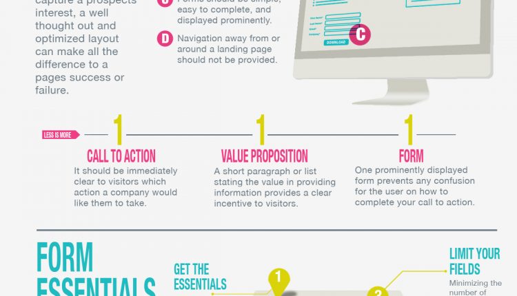
Of course, a different perspective never hurts. So today, we are sharing a landing page infographic created by Pardot, the marketing automation software vendor.
To provide a little more context on this content piece, I reached out to Adam Blitzer, co-founder and COO, Pardot:
MarketingExperiments: Do you have any tips on landing page registration forms?
Adam Blitzer: The form is one of the most important parts of the landing page, because a lot of prospects are intimidated by forms.
Keep it short – we recommend only asking for the essentials, like name and email address. Do you really need someone’s fax number? When you have the basics, you can easily find additional information you might need on sites like LinkedIn or Data.com.
You can also set up smart forms that ask for new data points each time a prospect requests new content, building out a profile over time.
MEx: Are registration forms necessary on every page where you are driving traffic?
AB: With our own content, we like to offer some pieces that don’t even require a form.
Landing pages with forms should be reserved for high-value content, since you’re asking the prospect to provide their personal information.
Shorter collateral pieces and interactive items like videos are best to share freely – but you can still have a form on the page for those who do want to contact you for more information. This gives truly interested prospects a chance to convert without discouraging early stage visitors.
MEx: What is the key takeaway from this infographic?
AB: I think the key takeaway here is that marketers should never stop examining their campaigns. You should always be reviewing your strategy and striving to improve.
With a landing page, it’s very easy to measure success. Are people converting or not?
Tweak one element at a time, whether it’s your content, your form layout or your design, until you start seeing improvements.

Related Resources
Landing Page Optimization: 5 questions to ask for a quick win
A/B Testing: How a landing page test yielded a 6% increase in leads
Landing Page Optimization: Radical redesign leads to 3,566% increase in conversion
Landing Page Optimization: 2 charts describing the best page elements to test and how to test them
Landing Page Optimization: For the best test ideas, look beyond yourself
Landing Page Optimization: Reducing friction results in 266% increase in clickthrough rate


ummm….copy AirBnB’s infographics much?