The opening session of day 2 at MarketingSherpa B2B Summit 2012 focused on four simple changes the audience could make to their landing pages right then.
To open this “Quick Win Clinic,” Dr. Flint McGlaughlin, Managing Director and CEO, MECLABS, said, “You only need to get one win right to get a lift, but if you get all four going right, you now have a treatment.”
So today’s MarketingExperiments blog post will try to help you achieve a quick win by presenting you with one of the quick win opportunities from Flint’s session – headline optimization – and five questions every marketer should ask when optimizing headlines.
Test Background
Flint began the headline segment of the quick win clinic with an experiment that was conducted with one of MECLABS’ Research Partners, Survey Spot.
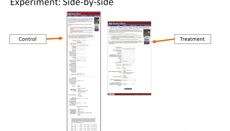
Survey Spot is a company that offers to pay its members to take surveys, and its goal was to increase qualified survey panelist registrations. To aid in reaching that goal, the research team used an A/B multifactor split test approach to answer the primary research question, “Which panelist registration page will have a higher conversion rate?” Here is a picture of the experiment’s control and treatment pages side by side.

The Control
The MECLABS research team was able to identify two primary areas for potential improvements to conversion based on analysis of the control page.
- Registration Form – The team determined that shortening the length of the registration form would reduce friction.
- Headline – The team also determined that adding a clear headline would help to clarify the value proposition.
The Treatment
For the treatment, the team focused on the two areas identified in the control by:
- Reducing the number of form fields on the page from 24 to 15, which significantly reduced the perceived length of the form.
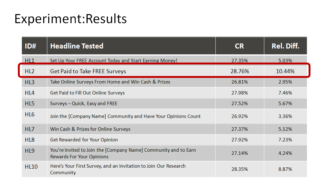
- Testing 10 different headlines (site traffic allowed multiple headline treatments) that help clarify the value proposition.
The Results
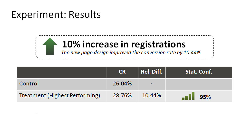
The new page design increased the conversion rate by 10%. When the research team looked deeper at the results, they discovered some of the treatments performed better than others did. This is explained by the difference in conversion resulting from the different headlines, not from the reduction in form fields.
Question #1: Do you have a headline?
One of Flint’s key principles behind headlines is that the goal of a headline is similar to the goal of the opening scene of a movie – a headline should grab the visitor’s attention and convert that attention into interest.
When you look at your landing page, ask yourself if your headline is distinguished enough to be the first thing a visitor sees when visiting your page.
Question #2: Does your headline arrest the visitor’s attention?
Once you have determined whether or not you have a headline, you should ask yourself how that headline is doing its job. How does your headline gain attention and convert that attention into interest?
Question #3: Is your headline clear?
Ask yourself what kind of clarity and tone your headline offers. Is the tone transparent? Does it use words that are quantifiable or qualitative?
Question #4: Does your headline give a visitor a reason to stay on the page?
This is where placing the value proposition in your headline becomes key, given that your headline is now working even harder by answering, “Why should I stay here?” and “Why should I buy from you?”
Question #5: Do you have a sub-headline?
Many great headlines have probably been ruined by weak or ineffective sub-headlines. Think of sub-headlines as a bridge. They connect a headline to the copy below that should appeal to visitor interest even further.
Related Resources:
Copywriting: 5 common headline errors
Headlines on Deadlines (Part 1): How to consistently write effective headlines without working late
Headlines on Deadlines (Part 2): How to consistently write effective headlines without working late


To be fair, your test didn’t reduce the “perceived” length of the form, you actually reduced the number of fields on the form. Not all of us have that luxury. I think it’d be useful to have some tests and case studies around design that might help to reduce the perceived length of the form while keeping the same number of fields.
Hi Emily,
You are correct that in the treatment the team did reduce the form fields from 24 to 15. My use of perceived is in regards to the team reducing perceived costs to a visitor for filling out the form. My apologies for the lack of clarity.
I also agree with you that reducing form fields is not a luxury that all marketers have, one suggestion I can offer would be to look for other instances on your landing pages to minimize friction (steps in conversion, eye-path, tone of the language in your headline and copy, discordant colors and images being used that do not either directly state or support your value proposition)
Also, here is a Youtube link to a MarketingExperiments Web clinic replay that features a case study you might find helpful on reducing friction in which the number of form fields were not reduced that resulted in an increase in conversion of nearly 20% http://youtu.be/Cv_sh8-P3Tw?t=10m37s
Thanks for holding me accountable,
John Tackett
Your post provides a good overview of the MarketingSherpa session. Have you put any of these recommendations into place? What kinds of results have you seen? We’re implementing some of MarketingSherpa’s headline suggestions on our own Contact Us page, to collect some real-life data of whether or not these are good recommendations for us. You can read more about our experiment here: http://bit.ly/OptimizeHeadlines . We’d love to hear if you’ve found any success following the MarketingSherpa guidelines, or if you think they’re only beneficial to certain types of companies.
Thanks,
Jennifer Dutcher
Online Marketing Manager
Whereoware
Hi Jennifer,
First, thank you for joining us at the MarketingSherpa B2B Summit 2012, it was great to meet some of our audience and I hope to meet more of you at future events.
Here’s a link to an excerpt of one of our own headline tests:
https://www.marketingexperiments.com/blog/analytics-testing/headline-testing.html
Also, keep us posted on your testing 🙂
Thank you,
John Tackett