

What else can I test … to improve my lead generation rate?
At our web clinics and optimization training workshops, two of the most frequent questions are: “What else can I test?” and “Do you have a good example?” To answer these queries with practical test ideas and examples, we’re pleased to present our new “What else can I test?” column.

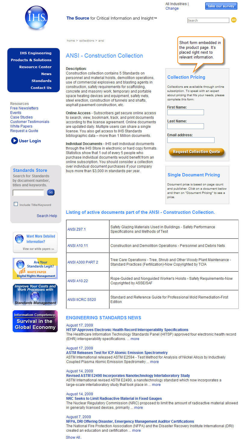
As I wrote in a previous post, optimizing for lead generation is a more complex task than meets the eye. However, one area where you can run tests quickly and easily is with short lead capture forms (see example at right: short form embedded in product page).
3 ways to optimize your lead generation forms

1. Location. If you’re still using the right- or left-hand columns for your forms, it’s time to test the main content area in the center of the page. Because sidebars are mainly used for either navigation, supporting elements or ads, visitors have learned to ignore or gloss over them.
[Example above right shows a form in center of page, end of content; click to enlarge.]
2. Headline and call to action. These two elements together can make a significant improvement to your site’s lead generation rate. However, it’s critical that they communicate value and that there is continuity between them.

Both the headline and call to action can be used to re-state, clarify or quantify the value proposition or emphasize a specific benefit. Continuity refers to how well the page uses the call to action to confirm or reaffirm the promise of the headline and the supporting content elements in between.
What you’ll want to test with these elements can vary widely. But if your page doesn’t have continuity between the headline and call to action, your first test should be changing them so they’re more closely aligned. They don’t need to match word-for-word, but should be clearly and intuitively connected.
[Example above right shows a form headline and call to action with continuity; click to enlarge.]
3. Form design. Some of the best lead capture forms are those that don’t even look like a form. Forms can create a lot of friction for prospects, whether it’s due to the length or the questions and required fields, or just the look and feel. As a result, form design is an area where you have latitude to alter several factors at once.

So where should you start? The more the form can be associated with the surrounding content of the page, the better. You don’t want it to be totally obscured, but to look and feel like a natural extension of the content, leading prospects to take that next step — sign up for access, request or download more information, and so on.
Test removing borders and boxes around the forms, or squares or dark colors that set it off from the content. In the example image, you’ll see that the short lead capture form is embedded in the content to connect with the prospect’s thought process.
[Example above right shows a form integrated with content; click to enlarge.]
Let me know if you decide to test any of these variations with your short lead capture forms, and look for the next column, where I’ll be looking at test ideas for ecommerce shopping carts.
Not sure what you should test next? Want to share your testing ideas, questions or feedback on this topic? Use the comments section below or tweet me at: @anagabydiaz
Point 1 is very astute. Banner blindness is a commonly understood phenomenon, but extending that to form blindness makes a lot of sense too.
By placing the form in the main content area you are also leading the user directly to your desired action using a natural flow.
Another test I like to do for lead gen forms is to test how many fields are being used. Most of the time less is more, but when you test it, you can weigh the business case for extra information against the lower conversion rate to achieve a perfect balance of the number of leads vs the information gathered about those leads.
Thanks, Oli. You provide another good test idea. And as you pointed out, it is important to keep an eye on the balance between quantity and quality.
I notice your form examples uses; ‘first name’ and ‘last name’ fields, can this not be shortened to one field: ‘Name’? We would then use the space character as the deliminator and assume the next string is their last name – this is if we’re pushing the data into a CRM if not we don’t have to be so particular.
Certainly, that is a viable option. Yes, sometimes you need to consider technical requierments so the leads are properly recorded. Thanks for your suggestion.
Also assuming your audience is global, the ‘first name’, ‘last name’ approach breaks many times with GCC and Europeans – writing their last name first and having more then two names. All said and done, just using a ‘name’ field reduces friction and improves usability.
I completely understand that this is an old article (and I might not get a reply) but I’ve read a lot online and can’t figure something out for my website.
I have a blog and want to know how realistic and efficient it is to use left sidebar instead of typical for blogs right sidebar?
Are there any suggestions or testing is the only way to find out?
The sidebar has an offer/value with list sign up on top, social networks connections in the middle, and some navigation links at the bottom.
Thank you for anything.
Hi Max, I’m glad you posted your question even if the post is old, we are happy to answer. We read left to right, and therefore, most of the time any elements on the left side of the page get more attention. It is important that you organize the elements in your sidebar according to clear objectives. The best way to learn what works with your audience is testing. You can use a free tool like Google Website Optimizer to test. Test not only location, but also copy, number and sequence of elements, and colors. Everything can help to capture attention and get a click. Hope this helps.
Gaby, thank you for your response. I am testing the page and have some improvements so far. Experimenting more every week.
Thank you very much for the tool. I’m looking forward to using it and doing test with it.
I guess my original concern was if having left sidebar for blog was weird for most visitors.
Conversion rate for sign ups might be better with left sidebar but I’m wondering if that effects user experience.
Because if using left sidebar is confusing to visitors I don’t want to sacrifice that for conversion rate, I think.
I’ll definitely test and see what results I get.
I just don’t see many blogs using left-sidebar and wonder why.
Hi Max, certainly, it is a good idea to test the side bar on the left side. Keep an eye for your metrics (conversion, page views, bounce rate, etc) to determine if the change improved conversion and did not affect your users’ experience. Good luck!