

Mobile Marketing: 4 takeaways on how to improve your mobile shopping experience beyond just responsive design
We all know by now that mobile has become an important tool for ecommerce consumers.
However, do we treat it with the same level of investment that it deserves? What experience are we giving our customers: a desktop replica or something better?
In Q1 of 2015, 59% of all retail time was spent on mobile devices, according to comScore’s State of the U.S. Online Retail Economy in Q1 2015. That’s right — consumers spent more than half of their online shopping time on their tablet or mobile device.
Yet, only 15.4% of total digital commerce dollars came from mobile sales.
That leaves a lot of opportunity for marketers and designers when it comes to the mobile shopping experience.
At the MarketingSherpa Media Center at IRCE 2015, Daniel Burstein, Director of Editorial Content, MarketingSherpa (sister company of MarketingExperiments), spoke with Gregory Casey, User Experience Designer and Architect, eBags, about how eBags goes beyond normal responsive design to create a truly mobile-adaptive experience.
Watch the interview or read on for four takeaways Gregory shares.
Takeaway #1. Be an anthropologist
While usability testing in a lab is useful, it does miss some of the real-world environmental factors that play a part in the success of a website. This type of testing alone didn’t create a clear enough picture for Gregory.
“After we had designed our mobile and tablet experience, I wanted to run some contextual user research, which basically meant seeing how people used it in the wild, seeing how people are using it in their homes. So that’s exactly what I did,” Gregory said.
He found consumers willing to open their home to him and be tested in their normal environment. This meant factors like the television, phone calls and other family members played a part in how they experienced the eBags mobile site.
“During these interview sessions, a lot of times we were interrupted by, say, a child coming over and the mother having to do something for the kid … The experience isn’t sovereign. It’s not something where they just sit down, work through a particular user flow and complete their interaction,” Gregory said.
By watching users work through the site as they would in their everyday life, Gregory got to see what parts of the site they actually use.
Takeaway #2. Go beyond responsive to “adaptive” design
Typically responsive design is focused on making your website content fit on the screen it’s being viewed on. That means the user doesn’t have to pinch to zoom. It’s more about optimal viewing than it is about optimal experience.
“That’s great. It takes you a very long way in making your site accessible. But it also ignores the mental model of the user. It ignores the fact that users expect certain types of interaction behaviors on tablet or mobile,” Gregory said.
For example, mobile and tablet users are used to doing more than just tapping. They also use the swiping motion. This is an aspect typical responsive designs ignore. Mobile and its different types of interactions open up new ways to engage customers.
“What we did for adaptive was we found the places where … we had the greatest opportunity to mimic the conventions that people are used to. So that it’s not just adapting your content; it’s adapting to your technology,” he said.
Takeaway #3. Analyze different customer segments for special adaptive opportunities
When looking at user data, Gregory and his team discovered luggage customers and handbag customers shop very differently.
Those looking at luggage knew the exact features and characteristics to filter with to find what they wanted. They were typically “searchers.”
Meanwhile, handbag customers set out on a different purchase path. They didn’t search but rather they shopped or browsed.
“I think a lot of times in ecommerce, we tend to think of shopping and searching as synonymous,” Gregory said.
This realization coupled with the data enabled eBags to create a custom mobile shopping experience for their handbag shoppers.
Takeaway #4. Be useful, usable and instill a delight
Many times user experience design is focused on usefulness and usability. However, Gregory spoke about the importance of that unexpected feature that can instill delight in the user.
The team used its insights about handbag customers to instill a little delight into their mobile experience.
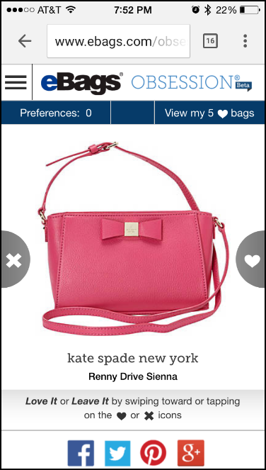
Now in beta is eBags Obsession, a site where users can browse through handbags galore with a swipe of a finger. The “love it” or “leave it” approach creates a fun, interactive shopping experience not typical on your normal ecommerce website.
A swipe to the right means you “love it” and it will be placed in a library of good finds, while a swipe to the left means “leave it.” With each swipe, another handbag immediately pops up.
Users can also choose preferences of color, style and occasion to personalize the experience.
These features not only make the eBags mobile site more exciting to navigate, but also add another layer of usability and utility.
Learn more form the MarketingSherpa Media Center at IRCE 2015.
You can follow Selena Blue, Manager of Editorial Content, MECLABS Institute on Twitter at @SelenaLBlue.
You might also like
E-commerce Marketing: Top takeaways from the MarketingSherpa Media Center at IRCE
Responsive Design Tested: What a recent experiment reveals about the potential ROI of mobile design [From a MarketingExperiments’ Web clinic]