

E-commerce Testing: Redesigned order page, shortened shopping cart drive 13.9% lift in conversion
It’s August, the sounds of sleigh bells are in the air, and the menorah lights are twinkling. Well, in the minds of consumer marketers at least. This is the time to nail down your holiday marketing plans. So to get your marketing juices flowing, I’m sharing an e-commerce optimization test we ran last holiday season.
Which order process leads to more conversions? A simple, fundamental question every e-commerce site (and, frankly, every lead generation site) needs to answer.
And the primary research question of the test we’re sharing in today’s blog post…
CONTROL
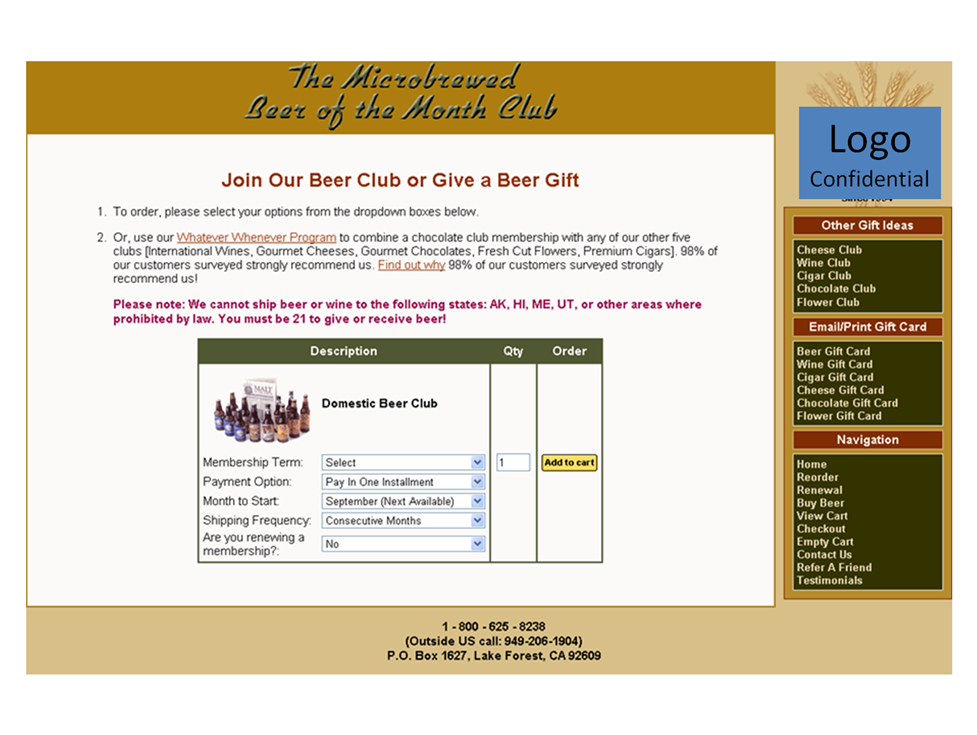
This Research Partner is an “of the month” club that offers an ongoing subscription to products like wine and cheese. In this case, the product was the “The Microbrewed Beer of the Month” club. Here is the original landing page…

That led to this shopping cart…

And then this step in the shopping cart…

And then to the billing information step in the shopping cart…

And then to the payment information step in the shopping cart (see a pattern forming here?)…

And then, finally, to the order confirmation screen. And exhale. Whew!

TREATMENT
Tony Doty, Senior Research Manager, MarketingExperiments, created three treatments to tests against the control. In each of these optimized paths, he redesigned the order page and shortened the shopping cart from multistep to a single-step process.
But to keep this blog post as simple as possible (if simplicity is possible at this point at all after showing the control order path), I’ll just show you the highest-performing treatment path. Here is the landing page…

And the (single-step) shopping cart…

RESULTS
The optimized landing page and cart path resulted in a 5.1% lift in clickthrough rate and a 13.9% lift in conversion (at a 97% level of confidence). Not surprisingly, the Research Partner left the winning treatment up as the active page.
As impressive as these results were (remember, any lift in the shopping cart is hugely valuable since it’s at the bottom of the funnel), keep in mind that this test was conducted during the holiday shopping season. When you break out post-holiday traffic, the lift looks even better – a 23.7% relative increase in conversion rate.
That’s an important factor to note, because the testing timeframe posed a validity threat (history effect, to be specific). After all, holiday traffic is highly motivated and would basically make it through even the most broken process.
HOW TO IMPROVE YOUR LANDING PAGES AND SHOPPING CART
But, as with any test, the bigger question is always, “Why?” Why did B perform better than A? And most importantly, what can you learn from this test?
Here is some expert speculation on the possible causes of the test outcome that you can use to optimize your own landing pages and cart processes:
- The treatment reduced Friction in the steps and the process. The landing page was laid out in a simpler, more straightforward fashion making it easier for the visitors to understand what to do. And many steps were removed from the cart process.
- Many of these “…of the month” sites lack credibility. They don’t answer the “Why should I trust you?” question. Incorporating the image of the owner/person in charge of the product, as well as an actual piece of copy written by this owner, helps establish that credibility.
- Using the owner also helped connect a passionate audience with the passionate people behind the company, essentially saying, “You’re here because you love beer. Guess what, I love beer, too, so you can trust my selections.”
- And, in the end, people buy from people, not from websites.
SUGGESTED FOLLOW-UP TESTS
Of course, this was just one test in an overall testing-optimization cycle. Here’s a look at some future tests our research team is considering (hopefully it will give you some test ideas as you optimize your own pages and processes):
- Move top portion of the page, and use as actual product page (the step prior to what we were testing). Consider using only process on this step (bottom portion).
- Reduce number of questions per step, match control in path length but add value messaging and imaging on each step.
- Simple accordion process, without leaving page, shows how many steps there are, what these steps are, and possibly how long it’s expected to take to finish.
RELATED RESOURCES
E-commerce: When should you reveal the price in your shopping carts?
E-commerce: How long should a shopping cart be?
Shopping Cart Abandonment: How not being annoying can get you 67% more cart completions
You turned the frog into the beautiful princess. 6 steps to convert!!! I guess only true beer fans were able to cope with the task.
When I took over e-commerce operations for a site that did about $3.5 million in annual online sales, I inherited a 6-step checkout process with unfriendly cart screens that were text- and instruction-heavy. I cleaned up the user interface, removing extraneous text, and redesigning the process to two steps. I saw our completion rate shoot from 15% to 43% in the following two weeks — a 28 percentage point reduction in shopping cart abandonment rate. User experience matters.
There are a lot of shopping carts, but most of the people prefer the best from them.Once in a while the order page of the cart can be redesigned.The billing information can reduced so that the customer don’t get irritated by filling up fields.Many payment gateways can be provided so that it gives a lot option to the customers.Also the customers should be able to navigate to the shopping carts easily.
hi guys! I took your LPO certification in Vegas (which was outstanding!) and we used this site as an example.. which is why it is even weirder, when I go to the site now, to not only see that they are not using this higher converting checkout.. but worse.. replaced it with an “accordion” style check out, which you have taught time and time again universally DECREASES conversion.
what gives?