

In a recent Web clinic, Austin McCraw, Senior Editorial Analyst, and Adam Lapp, Director of Services Operations, both of MECLABS, revealed how marketers at an Italian cosmetics website increased conversion 20% by testing the usability of their category page.
But first, let’s review the research notes for some background information on the test.
Background: Italian e-commerce website offering cosmetics. The researchers were focusing on testing different approaches to the “body” category page.
Goal: To increase conversion rate.
Primary Research Question: Which landing page will generate the highest conversion rate?
Approach: A/B variable cluster test
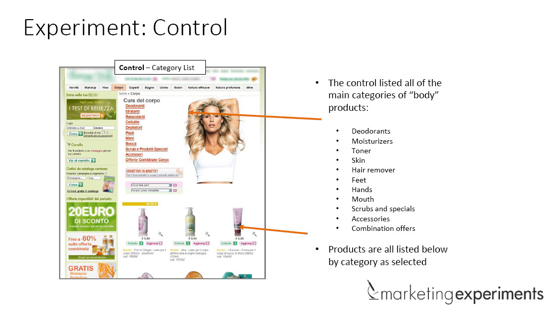
Control: Category list

Here’s a screenshot of the control page that listed all of the main categories of body products.
According to Adam, the team analyzed the control and hypothesized that testing usability would help determine if the category list at the top of the page is the most user-friendly way to present products and information to customers.
Treatment 1: Configurator design

For Treatment 1, the team tested a configurator design that enabled visitors to enter the criteria for the products they were looking for.
“What we wanted to do is test several different usability tactics out there that you might commonly see,” Adam explained.
Treatment 2: Visual categories

Treatment 2 focused on making the page easier to use by removing the category links and simply featuring the main categories with images.
Treatment 3: Navigation links (text)

Treatment 3 was a radical approach designed to make the process easier by removing the “body” category page altogether. The design enabled visitors to choose their categories within a drop-down feature in the navigation.
Treatment 4: Navigation links (visual)

Treatment 4 was similar to Treatment 3; only it added images to the drop-down navigation menu.
What you need to know

The configurator design in Treatment 1 outperformed the control and other treatments by a relative difference of 20%.
So why did this design increase performance? Why did the configurator beat all of the other methods? Was it the usability?
At the end of the day, all usability should be tested
One of the key discoveries Austin mentioned from the experiment is that placing overemphasis on usability can confuse the end goal of a product page, which is conversion.
“The goal of your website is not for people just to use the site, but rather to say ‘yes,’” Austin explained. “The goal of our websites is not usability, but rather ‘buyability.’”
To learn more about how to optimize your product pages for buyability, watch the free on-demand MarketingExperiments Web clinic replay of “The Top 5 Marketing Discoveries of 2013.”
You may also like
Value Proposition: 3 steps for laying your value prop testing groundwork
LPO: 2 types of security seals that can help you reduce customer anxiety
Landing Page Optimization: 3 template design changes to help you serve multiple customer types