

Email marketing has come a long way since the early days before CAN-SPAM laws and double opt-in email lists. Back then, it was easy to build a list and quickly get them to your offer pages. The average email recipient wasn’t bombarded with dozens, or even hundreds, of messages every day that need sorted or deleted.
Now, with email users being incredibly wary of any promotional email, most of the email we send gets deleted.
How do we ensure our emails get read and acted upon by the people on our list who need what we have to offer?
It essentially comes down to email messaging. If you can clearly communicate enough of your offer’s value in your email to earn a click, then you’ll more than likely see a significant increase in clickthrough (and ultimately profit).
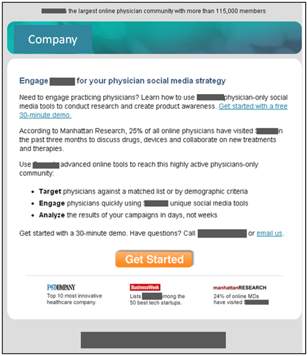
We recently ran an email test for a research partner (anonymized in the emails) that needed to increase their number of leads from a rented list. One of the email treatments generated a 104% increase in clicks over the other. Here are the treatments:
Email A:

Email B:

Which Treatment Received 104% more clicks?
Go ahead and study the two email treatments and let us know in the comments which email you think performed the best and why. We’ll choose three of the respondents who we think were closest in the “why” department and recognize them as marketing experts on the blog.
UPDATE: The results are in
As unanimously voted on in the comments, version B was the victor in this case. The 104% lift was most likely due to the clarifying of the derivative value proposition, less commitment in the CTA, and the control and flow of the thought sequence through the email. Thanks to all our brilliant commenters who got it right. And a special congratulations to those 3 marketing experts who (in our opinion) gave the best reasons why email B outperformed email A:
Related Resources:
Email Messaging: How overcoming 3 common errors increased clickthrough 104% – Today’s Web clinic from 4:00-5:00pm EDT
Test Your Marketing Intuition: Which landing page achieved a higher conversion rate?
Marketing Intuition (Contest): Which homepage generated more conversions?
Marketing Intuition (Contest): Which email is more engaging?
I’m going to go with #2.
Though it lacks #1’s preheader text, which would help the open rate, the copy is much more concise and the call to action is more prominent and undiluted by secondary links in the copy.
Email B won for sure.
There’s many reasons why “B” won but here are two:
1) “A” has a very vague headline while “B” has very specific value proposition
2) Call to action on “B” is much more specific, and the word “see” on CTAs is a very powerful CTR booster.
B won:
1) exact number in Headline rise credibility
2) clear “immediate” benefit for target audience in descriptive Headline
3) there are more “real” numbers in body to keep on (68 specialities, 35.000 hours)
5) clear layout is easier to read – everything is visible at one first look
4) testemonials are more visible on the right than at bottom
5) stronger call to action with “…today”, and “see…”
Email B is the clear winner.
A few reasons why:
B has a benefit oriented headline that is also specific (120,000 physicians), while providing urgency (immediate access). In addition, the headline tells visitors what they’ll get, right up front.
The opening paragraph is to-the-point, telling visitors who they are, what they do, and the benefit they’ll get by working with them.
The bullets are in real-time, action oriented, and very clear on the benefit users will receive.
There is a clear call to action with “Start connecting with physicians today”
The action on the button is clear and less generic than A – a proven strategy to get more click throughs.
Proof has been added to the side, where it is easily seen.
The phone number at the top is also a form of proof (and great for mobile users).
And last but not least, the clean and easy design reduces “friction” for the user, as they move down the page to the action button.
Thanks for another great test!
Thanks for the comments guys. Looks like B is pulling ahead 4-0. 🙂 Anyone for A?
Email B is the winner because;
1. Email A in the first Header is already asking me to take action; “Engage”. Email B says ..”gives you”. They are speaking to me early, and is preceded by “gives”. They are not asking for anything they are giving – Win
2. Email A opens with “Need to engage….?” They have already given me an opportunity to say no and I haven’t even gotten to the second sentence. With a “no” answer, I am hitting delete without getting to their value statements. Email B uses the first paragraph to get right to the point. Numbers like 68 and 35,000 automatically grab my attention in a sea of text, and sandwiched between words like “specialties, drugs, products, procedures” the email is becoming more targeted.
3. The section of bullets preceded by “engage” in email B and “use” in email A, although subtle, speaks to me in a softer more suggestive tone, as opposed to a harsh directive like “use”. I do however like the bold first words of each bullet in email A. “Target, Engage, Analyze” all words that speak to value and draw me to read the rest of those bullets, where email B does not enunciate key takeaways. For example I would have to like to have seen “real-time, observe, and stimulating” highlighted in some way.
4. Email B has a “Call Us Direct” CTA at the top of the email. That is always nice to be able to pick up the phone without needing to Google the customer service phone number. Granted you will have to go through an automated system for 20 minutes to speak to someone, sometimes that is more comforting than waiting for a response to an email reply. And although email A does offer this option with a phone number, it is at the end of the email, and however insignificant that might appear to the 104% clicks delta, the benefit of having it in the top right corner of the note adds another advantage to conversion for email B.
5. Closing CTA – “Get Started” email A vs “See How it Works” email B – “See How it Works” implies a non invasive discovery process dictated by my own direction. “Get Started” implies give something. Give your email address, personal information, maybe even a credit card #. I don’t want to “Get Started” just yet, I want to first “See How it Works”. Speak softly to the “awareness” part of the sales funnel as you attempt to add value and move the lead to “consideration”.
6. The endorsements that are listed on the bottom of email A and the right side of email B, are interesting. Despite the perception of added credibility, I’m not sure that I agree with the use of endorsements in this type of email. I would be interested to know if email B was tested with or without the endorsements, which garnered more click throughs. With that being said, I’d more prefer to see the endorsements used at the bottom in the footer as email A did. They appear to be distracting me from the value statements in email B. This minimal advantage to email A is still not enough for me to say that it out performed B.
7. The header of email B is more appealing to me than A. It is clean, colors left out. Keep that simple and subtle.
8. A few questions I would ask are; What were the subject lines of the emails? And was one CTA button within view or above the fold if the other wasn’t?
Keep up the great work!
@AaronMandelbaum
@Paul Cheney
Paul, probably should have asked before I answered, but when you say “clicks” you are referring to clicks on the “See How it Works” or “Get Started” CTA’s correct?
I believe e-mail B received the most clicks because it focused on what the company would do for the client.
@AaronMandelbaum
To answer your questions, the subject lines were –
Control: Sermo Surveys: On-demand MD insights
Treatment: Reach 120,000 Physicians through Social Media
As far as “clicks” are concerned, we measured clicks in general. So any click made in either of the treatments counted as a “click.”
I would guess B because of two main reasons.
First of all, at this early stage I am not interrested enough to spend 30 minutes watching a demo. And If I’m not interrested now I’m not likely to want to “Get started” at all… ever. This makes E-mail A uninterresteing
Two, the CTA “see how the company works” would trigger me much more because I would want to know why they do things. “people don’t buy what you do, they buy why you do it”
Without reiterating everything which has already been said, I believe “B” had more clicks for two additional obvious reasons. The verbiage in email “B” was straight to the point and easy to understand. No industry jargon. The CTA “See how XXXX Works” requires less of a commitment then “Get Started”
Thanks to everyone who commented! The results are posted above.
the headline in B screams “WIIFM” (what’s in it for me) and the call to action button makes you curious which makes hard for the reader to resist clicking on it.
Lots of interesting theories in the comments, but I think the decision comes way before you read (and comprehend) anything, including headlines. “A” looks like an ad, “B” looks more like it provides information.