In our July 21st Web clinic, Live Optimization: What we’ve learned from 200+ experiments each year distilled into three basic principles – plus live-optimization examples, Flint McGlaughlin and the MarketingExperiments team will spend a full 45 minutes optimizing audience submissions to help you identify changes you can make today, based on our research, to improve conversion.
Send us your pages for a chance at free optimization advice during that Web clinic, or right here on the blog. Thanks to Regions Bank for submitting this landing page for optimization…
I don’t know about you, but I have opened very few checking accounts in my lifetime. I probably co-signed for an account when I was twelve or thirteen. Then when I was eighteen, I thought it imperative to have my own account (sorry mom, I don’t need you for that kind of stuff anymore). And since then, I’ve switched bank accounts only one other time.
So that adds up to three in my entire lifetime. I would guess many people share a similar situation. I mean, who wants to go through the hassle of transferring money, updating online billing, and waiting around in a cramped and cold office behind a rather large desk while an account manager slowly pecks at their keyboard.
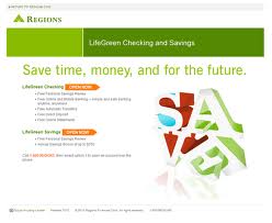
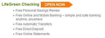
With that said, my anecdotal evidence indicates that opening a new bank account is a big decision. I mean, most people will buy more automobiles than open bank accounts in their lifetime. So when I am at the precipice of making that decision, I am going to need a little bit more information than five short bullet points and a weird graphic that I think spells the word “save.” (click image for larger version)
Don’t get me wrong, short and succinct landing pages can be very effective…for selling a free Facebook account. But for banking, I just need to understand a little bit better what I am getting myself into.
So, how can we improve this page? We will get to that in a second, but first I need to communicate one caveat. Every idea, suggestion, or recommendation that anyone provides (including myself), or that you read online, absolutely and positively needs to be tested. You will never know what really works unless you measure and compare different strategies.
And I would not recommend anyone make any dramatic business decisions without the confidence that data provides. Changes to your web page must be measureable or you are just flying blind out there and most likely leaking dollar, dollar bills y’all.
Exeunt Adam from stage right carrying his soapbox
Headline – Is it providing value?
When a visitor arrives to a page, you must immediately begin a conversation with them. The best place to initiate this conversation is with the headline. It should be the largest font on the page, near the top left of the page directly in the natural eye-path, and the first primary page element a visitor sees. Regions Bank gets this part right. Their headline is big, bright and immediately visible.
However, its meaning does not provide much, if any, value. Saving time and money for the future are sort of standard for banks right? The first impression Regions Bank makes to their visitors is that we offer the same value every other bank does. They are pitching their visitors a commodity. It’s like Exxon saying “Our Gasoline will Run Your Car!!!” Really? Wow, next time I need gas I’m going to hold out until I see an Exxon station.
Adam rolls his eyes sarcastically
The headline needs to tell me why I should get this bank account instead of any of the other ones out there. The Internet allows me to comparison shop within seconds. With the touch of a button, I can quickly see that BB&T is willing to give me $100 just to sign up. Hmm, I can save time with Regions or get a c-note from BB&T for basically the exact same offering. I wonder which I will choose.
Body copy – Are you differentiating?
After the headline, the area that communicates the most value is the body copy. This is your opportunity to differentiate. It’s your chance to tell me about the company, establish credibility, and clearly explain why I should entrust my hard-earned dollars with you.
What do I get instead? Five little, teeny-weeny bullet points that only make me say to myself, “That’s it?”
First of all, the name of the account is a little bit confusing. I’m not sure if “Green” is a reference to Regions Bank’s branded color or if this account is good for the environment. This is not made clear. If I dig a little deeper by going to the main website, I see that it’s a reference to both more money and the environment, neither of which is clear on the landing page.
Bullet points – Are your bullet points just empty shells or do they hit the target?
Below the account name, Regions Bank fires off several rounds of bullets before they’ve even taken aim at the customer. You can’t just list a few bullet points and expect that to sell somebody. You must lead them into the bullet points with a headline that piques their interest and an introductory paragraph that engages them with your offer. This is called “Sequence of Thought.”
Even if you effectively control your visitor’s thought sequence, holding their hand as you guide them through the page, you won’t have much luck firing empty shells. Look at these bullet points and let me know one that just makes you want to run kicking and screaming into a Regions Bank to open an account.
Adam stands there waiting for the audience to respond
You’re right, there is not one. A free personal savings review? I’ll take the $100 cash. Free online banking and online statements? Doesn’t everyone have that?
I’m not trying to bash this page too much, but rather just trying to get my point across that there is just not enough meaningful information to make me execute on such a big decision as opening a new bank account. The truth is that Regions Bank does have some great benefits that are specific to this account. Unfortunately they are not on the page. Looking at the main site, I would recommend using some of the following features in place of or in addition to the current bullet points:
- “Platinum Visa Check Card with rewards including gift cards, fine-quality merchandise, and travel”
- “Access to over 2,300 ATMs (this can be really important as visitors consider the $2.50 charge they will have to pay for each withdraw with a bank having fewer ATMs)”
- “Overdraft protection”
- “First order of checks printed on eco-friendly recycled paper”
Let’s assume this page effectively sells the visitor on the value of the LifeGreen account. Should this be the only value on the page? I’m not sure, but it’s definitely something I would recommend testing.
This test concept would broaden the focus of the page which is usually not a good practice for landing pages. However, I know that if I were to look for a new bank, I would not only consider the primary checking but also the home and auto loans, credit cards, and investment services. Many consumers are going to want to go to one place for all of these services, so it may be wise to provide just a little bit of information about them.
Supporting images – Are they adding value?
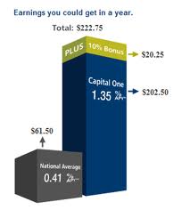
Last but not least, this page could definitely benefit from a better supporting image. You don’t only communicate value in copy, but also in logos, colors, tone, and images. Once you’ve tested your way into effective copy, I would recommend an image test. You need to find an image that not only supports your main content, but also has inherent meaning. Visitors should be able to look at an image and immediately perceive value. For example, Capital One has a graphic on their landing page that clearly explains the earnings you will get in a year by choosing to bank with them.
I hope this feedback gives you new test ideas on trying to communicate value. If you try any of them, be sure to let us know the results.
Related Resources
Clarity Trumps Persuasion: How changing the first seven seconds of user experience drove a 201% gain


This landing page needs more clarity in the call to action and a strong reason to take action.
The call-to-action needs to be something like “Open an Account Online Now” with supporting explanation about how quick and easy this will be online.
The strong reason needs to be a stand-out thing about opening the account now. Doesn’t need to focus too much on how this bank is better than others because the site visitor is already in this bank’s space on their website. The compelling reason could be how quick and easy it is.
Really nice critique on the Regions Bank landing page. I think your points are generally right on, but I think there’s a bigger point that’s not being discussed: I don’t think Switching Bank Accounts is a realistic Call to Action.
As Adam points out, most people change bank accounts a few times in their entire life – the best landing page on the planet is probably not going to persuade me to change.
The landing page should use some of its most compelling points to simply capture a few pieces of contact information, including e-mail, and start me on a Drip marketing campaign. Get me to subscribe to a newsletter, give me a ‘Guide to What Makes a Good Bank’ … they should simply try to get visitors engaged in a conversation for asking for such a large commitment.
Adam –
Thank you for reviewing our LifeGreen Checking landing page on your blog.
We very much appreciate your comments and candor.
Regions is constantly striving to provide a better customer experience in
everything we do. In fact, we’ve taken your suggestions to heart and have
created a new landing page which we would like to share. You may preview
the new page design here:
http://luckie.com/clients/regions/landingpages/mobile_lp.png
We look forward to the webinar Wednesday.
Best regards,
Regions Digital Marketing Team
+1 for Jon Patrick’s point about Switching Bank Accounts being very ambitious for a Landing Page.
Maybe invite the site visitor to open an EXTRA bank account with Regions Bank – then show him/her just how superior your service is / how convenient your branches are, etc.