

The elements on a product page are often one of the most underutilized tools a marketer has at their disposal. I say this, because let’s be honest, I’d wager few folks think of design elements on a product page in a “tool mindset.”
But in some respects, that’s exactly what they are, and ultimately, that’s how you will determine the kind of customer experience you build in ecommerce.
In this MarketingExperiments Blog post, I wanted to share three elements you can tweak to help emphasize important products and maybe even increase your revenue along the way.
Element #1. Size

Here’s an excellent example of how resizing a product image can help you place emphasis on it.
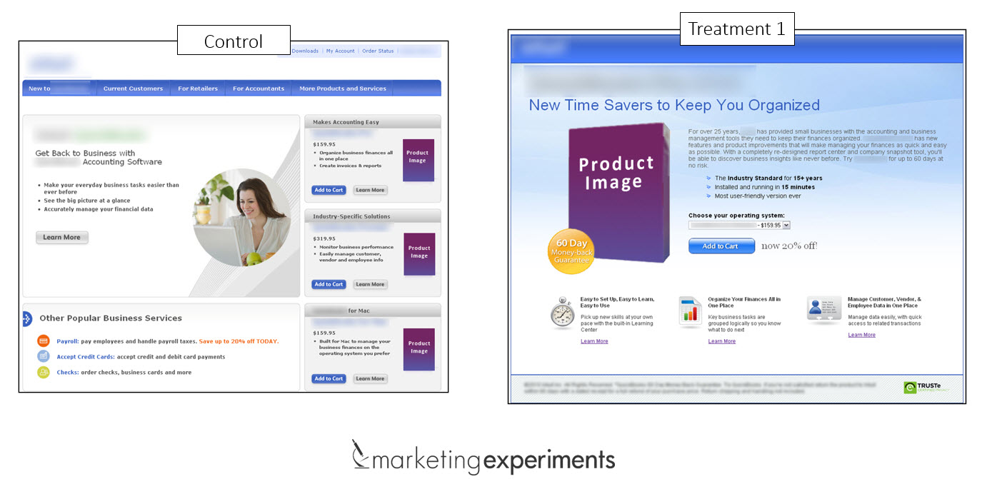
In the control, there were three products on the right sidebar and they were all equally weighted – that is a problem.
Nothing really stood out, which made drawing a clear conclusion for customers a little difficult.
In the treatment, instead of having three separate products on the page, the marketers hypothesized that a single product with a dropdown selection for a computer operating system would increase conversion.
Their hypothesis was right – the results from the tests included a 24% increase in revenue.
Element #2. Color

Here is another example of using elements in an email that you should pay close attention to because products are not trapped on pages in storefronts.
That perception is far from reality.
According to the MarketingSherpa Ecommerce Benchmark Study (download a complimentary copy at that link), email is one of the biggest drivers of ecommerce traffic.
In the treatment, the number of products were reduced, and bright red copy was used as supporting emphasis. I’m not fluent in Italian, but in any language, that is a good thing.
As you can see, color emphasis and copy now drive this email. From the changes in the treatment, I can intuitively understand the desired outcome:
- I can order something at a great price
- I get something free (gratis) as a thank-you gift
- It only takes three easy steps to order
The treatment delivered a 24% increase in revenue with the right changes needed to have a powerful impact.
Element #3. Motion

Some products have functionality that text and images just can’t express.
This is where you can take a cue from Dell. The team used a GIF to share how their product moves, resulting a 109% increase in revenue.
One caveat I would offer using with GIFs is that they can be a gamble, so stick with placing the emphasis on movement and use them where it makes sense for what you are marketing.
If a GIF is just not going to cut it, don’t forget video – it’s one of the most powerful tools on the planet for motion emphasis.
Tested elements are effective elements
I love the idea of elements on a product page as tools because the concept empowers you with an active approach for using them versus a passive acceptance of them.
At the end of the day, you can have tools to help with emphasis, but you have to make sure they work.
Testing and optimization can help you do this because those elements are used to build a customer experience, and the quality of the materials you use to do that is up to you.
You may also like
Landing Page Optimization: What a 29% drop in conversion can teach you about friction [More from the blogs]
Online Testing: 3 resources to inspire your ecommerce optimization [More from the blogs]
A/B Testing: Product page testing increases conversion 78% [More from the blogs]