Whether your market is B-to-B, B-to-C, or both, testing and optimizing even a few key aspects of your landing pages can provide major gains for your lead-gen efforts.
The principles of the MarketingExperiments Conversion Sequence serve as a guide to optimizing your pages and your sales or lead-gen process to improve conversion and ROI.
This Brief examines three tests we conducted with our research partner to demonstrate how you can use Incentives and Friction to generate more leads.
For extensive training and professional certification in the fundamentals of online testing, we recommend interested marketers consider our Fundamentals of Online Testing course.
The audio from the Web clinic on this topic can be downloaded here:
Filling the Pipeline: How a LeadGen Test Strategy Achieved an 86% Increase
The Impact of Friction and Incentive on Lead-Gen
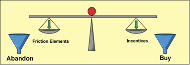
Friction and Incentives are two of the most vital elements of the conversion process. Friction is balanced against incentives because in every process there is inherent friction.
Friction: Psychological resistance to a given element in the sales process.
Incentive: An appealing element introduced to stimulate a desired action.
You can’t eliminate all Friction and capture a lead, because you are eventually going to ask people for something. The key is to have your value proposition tuned properly so that what you ask them for is compensated by what you are offering — and sometimes that requires you to add an incentive.
Three principles to bear in mind with regard to Friction:
- Principle 1: One of the most effective ways to increase Conversion is to decrease Friction. Our experiments suggest that reducing Friction produces a disproportionately high return on invested effort.
- Principle 2: The objective is to minimize—not eliminate—Friction.
- Principle 3: Once Friction has been minimized, seek to overcome the remainder with Incentive.
CASE STUDY 1: Incentive vs. No Incentive
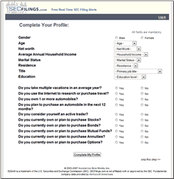
We ran a sequential test with the goal of increasing conversion rate on a form page that requested demographic information.
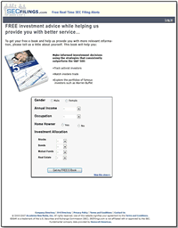
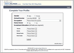
In the first phase of the test, the control offered an Incentive (e-book) and the treatment did not.
Primary research question:
- Which page will produce the higher conversion rate?
Secondary research question:
- What is the impact of an incentive on completion of the form?
| Form Page | Conv. Rate |
|---|---|
| Control — e-book incentive |
54.13%
|
| Treatment 1 — no incentive |
78.87%
|
| Relative CR Difference (Control vs. T1): |
45.69%
|
What you need to understand: The treatment page outperformed the page with the e-book incentive by 45.69%.
Conclusions
- The e-book incentive did not increase conversion on this page. Despite the pages 54% conversion rate, the incentive had a negative effect compared to the treatment.
- Was it the content? Its possible that the “5 hidden investment opportunities” did not have a high enough perceived value.
- However, the page headline and design led to confusion about the pages objective: Instead of asking visitors to complete a profile, it asked them to get a free e-book — even on the submit button.
- The presentation of the incentive confused the offer.
Key point: Never use an incentive that requires you to sell it, before you can sell the main offering.
Using (or Not Using) Incentives Effectively
Incentives must be tested until you’ve found one that provides a major boost (the “ideal incentive”).
Even good incentives can fail due to presentation errors, such as:
- Weak copy
- Design or image-related issues (hero shots)
- Limited relevance to, or confusion with, the primary offer
- When testing lead-gen incentives like white papers and e-books, examine their perceived value as products as well as how they are presented on offer pages.
Use incentives in proximity to the call-to-action to overcome Friction and encourage sign-ups.
CASE STUDY 2: INCREASING FRICTION
In the next phase of the sequential test, we ran the winning treatment from phase one against a new treatment.
The primary research question was the same:
- Which form will produce the higher conversion rate?
With no incentives on either page, our test sought to determine the impact of using a longer form with more demographic questions.
What effect would a longer form — with additional Friction — have on the conversion rate and amount of demographic data submitted?
| Form Page | Conv. Rate |
|---|---|
| Treatment 1 — short copy with no incentive |
78.87%
|
| Treatment 2 — long copy with no incentive |
61.34%
|
| Relative CR Difference (Control vs. T1): |
-22.22%
|
What you need to understand: The longer version of the form reduced the conversion rate by 22.22%.
Conclusions
- Increasing the number of fields also increased the amount of Friction and substantially reduced conversion.
- Other factors besides form length might have played a role and could be tested further, for example:
- Language (all fields are “mandatory” vs. “required”)
- Comfort level on some questions (net worth, marital status)
- Button text (“submit” vs. “Complete My Profile”)
- Although the longer form yielded fewer conversions, 61% of visitors still completed the form and provided more demographic information than the short version.
Key point: Friction is typically a negative factor — but not in every case. There are ways to use it to your advantage.
Using Friction to Your Advantage with Lead-Gen
Scenario: You want to increase the quantity of leads your offer page generates, but you also want to capture high quality leads — and you want an easy way to segment them.
- Test breaking your offer page into a two-page process:
- This “two-dial” process can increase lead quality and volume. You can continue to adjust the level of Friction on either or both pages to get the desired results.
CASE STUDY 3: INCREASING FRICTION
We conducted a separate, radical redesign test for the same research partner. The key goals were to increase sign-ups for targeted email alerts as well as registrations.
Primary research question:
- Which page generates the most e-mail alert sign-ups per unique page view?
Secondary research questions:
- Which page generates the most registrations per unique
page view? - Which page generates the most page views per visitor session?
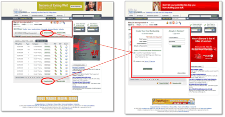
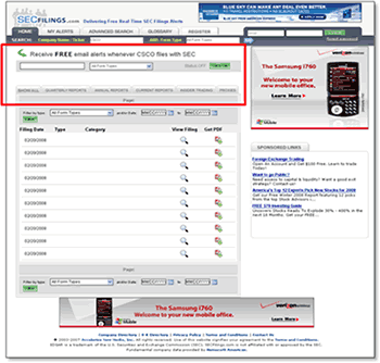
Control Version
Here are the original versions of the pages and registration process:
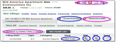
STEP 1: Decide what to do: email alert? RSS? View it? Get it in a PDF format? RTF format?
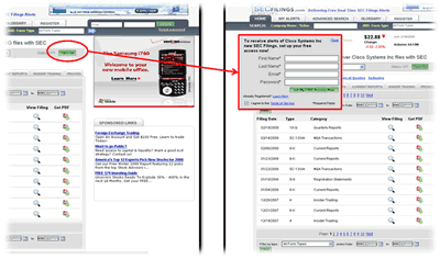
STEP 2: Fill out registration form in pop-up window.
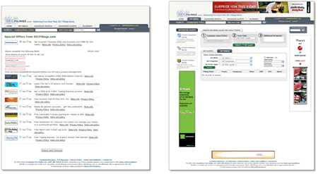
STEP 3: Decide on additional offers.
STEP 4: Fill out the alert request.
Test Design
Channel traffic from the partner was sequentially fed and split between:
- the Control path, and
- the streamlined Treatment path.
Treatment Version
Heres how we optimized the pages and registration process:
STEP 1: Decide what to do and click the call-to-action button.
Key changes:
Decision points have been greatly reduced:
- RSS feed option removed
- RTF format option removed
- Row of icons removed
- Stronger Call to Action copy
- Call to Action button says “Turn On” the email alerts
Clicking on the “Turn On” CTA button now takes the visitor to
STEP 2, a combined Registration and Alert sign-up form.
STEP 3: The same special offers page.
STEP 4: Confirms the alert has been created.
| Sessions | Alerts | Alerts/ Session% |
Page Views |
Page Views Session |
Registrations | Registrations/ Session% |
|
|---|---|---|---|---|---|---|---|
| Control |
79,487
|
52
|
0.07%
|
136,237
|
1.71
|
590
|
.74%
|
| Optimized |
14,161
|
268
|
1.74%
|
32,846
|
2.32
|
195
|
1.38%
|
| Relative Difference: |
2,559%
|
35%
|
86%
|
||||
What you need to understand: Our radical redesign treatment increased:
- alert sign-ups by 2,559%,
- page views per session by 35%, and
- registrations by 86% per unique page view.
Conclusions
- The new path significantly reduced Friction by combining the Alert and Registration sign-up into one step. It made the registration process a less demanding, more natural process.
- The simplified design and options reduced “unsupervised thinking,” made it easier for prospects to make a choice, and offered them immediate action — which increased page views and registrations.
- Areas to test in the future could include:
- Changing headlines based on logged in/out status
- Button copy and design (color, size, shape)
- Additional options at sign-up (format/delivery preferences)
Key point: Friction occurs at the page level and throughout the lead-gen process itself. Look to reduce it in both areas.
- Testing the elements of Friction and Incentive on your offer
pages and lead-gen process can provide significant gains. - Adding an incentive does not automatically pull more leads
or conversions. Find the “ideal incentive” first and examine how effectively it is presented with your offer. - Friction is typically a negative factorbut not in every case. Look for ways to use it to your advantage, such as sorting leads and improving lead quality.
- Friction occurs at the page level and throughout the lead-gen process itself. Try to reduce it in both areas, then consider adding an incentive to further increase conversions.
Related Marketing Experiments Reports
- Finding the Ideal Incentive — How We Increased Email Capture by 319%
- Improving Conversion by 162% — How to Overcome Value Inhibitors
- Increasing Conversion by 150% and Lead Gen by 2,379% with an Effective Call-to-Action
- Lead Generation — Is Your Sign-Up Process Costing You Leads and Conversions or Maximizing Them?
- Creating Effective Incentives — The Science of the Art
As part of our research, we have prepared a review of the best Internet resources on this topic.
Rating System
These sites were rated for usefulness and clarity, but alas, the rating is purely subjective.
* = Decent | ** = Good | *** = Excellent | **** = Indispensable
- B2B Lead Generation Blog***
- 10 strategies for enticing visitors to buy or act ***
- Ten Tips for Lead Generation Landing Pages**
- 9 Quick Tips to Optimize Online Sales Lead Gen**
Credits:
Managing Editor Hunter Boyle
Copy Editor Frank Green
Contributor(s) Flint McGlaughlin
Peg Davis
Bob Kemper
Paul Clowe
Boris Grinkot
HTML Designer Cliff Rainer
Mel Harris
Email Designer Holly Hicks


