When your digital media business depends largely on page views, anything you can do to increase those views also increases the chance of long-term success. For Car & Driver, one set of pages in particular drives a significant amount of revenue – the vehicle research section.
It was true in 2008, when they ran this A/B test, and it’s still true today. In fact, the discoveries from the A/B test here have been carried over through the years into today’s designs.
Here’s some background:
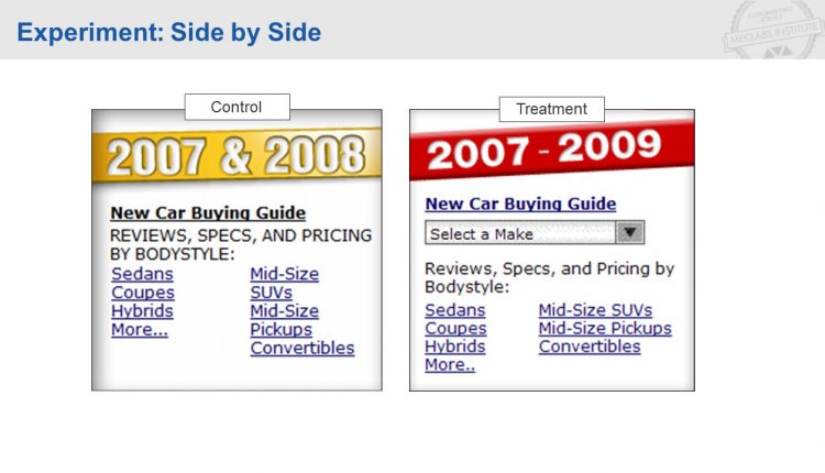
The control widget was a simple block of creative on the homepage that linked to the various pages within the vehicle research section.
The treatment widget took a different approach. In order to increase engagement with the widget, and eventually page views to the section, the treatment added an element of interactivity via a simple drop-down functionality. In short, they made the content useful to the customer.
The result was a 74% increase in page views in the vehicle research section of the site.
But what is truly interesting about this test, and illustrates the true value of testing, was that Car & Driver learned something important about their customer. Something so important, in fact, that today, eight years later, this approach is used to create an even more effective page design.
By simply making a set of links, more useful to the customer, Car & Driver was able to not only increase engagement for the vehicle research section, but they learned a system to give themselves a long-term edge.
Below is the full, downloadable slide presentation for this test.
You might also like:
Millennials something Snapchat something something
5 Call-to-action examples that increased conversion rate (just by being helpful)
Call-to-Action Button Copy: How to reduce clickthrough rate by 26%


