Email marketing is not limited to email. There are several factors that create an effective campaign — not least of which is the email’s landing page.
Too many marketers design fantastic emails only to link them to generic pages, such as product pages.
Our research has shown that email-to-landing page continuity is vital to conversion. If you don’t answer three key questions in the first seven seconds, your visitor is likely to bounce.
Yet, according to Kelly Lorenz, Email Marketing Strategist, Bronto, many marketers are skipping this important step. “In my experience, I would say 95% of online marketers who use email don’t use custom landing pages.”
Experiment after experiment has shown that it is essential to increase relevance between the landing page and the subscriber’s motivations for clicking the email. If a subscriber clicks an email to learn more about a sale and the landing page does not emphasize that sale, then the subscriber is leaving — quickly.
The best way to maximize email conversions is to create a dedicated, optimized landing page for each campaign. As Lorenz noted: “Email is not the destination. It’s how you get there.” However, not every marketer has the resources to create new pages for each effort.
Test a consistent message
In 2009, David Kaplan had a suspicion that his team’s email marketing suffered from ineffective landing pages. Unfortunately, creating new pages was not an option.
“We’re a medium-sized retailer, so we don’t have a huge IT infrastructure. A couple of years ago, a landing page for us was either the homepage or just a product-category page.”
As VP of Marketing at Tafford Uniforms, a medical apparel retailer, he knew that dedicated landing pages would be ideal. His team just didn’t have the resources.
Instead, he wanted to test altering Tafford’s current landing pages to make them more relevant to arriving email subscribers. This would require less work than creating completely new pages for each campaign, and the team could test if the concept improved conversion rates.


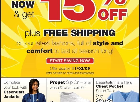
For each email campaign, the team would create a text-based banner ad that highlighted the offer. Subscribers who clicked an email would arrive at a landing page and see a banner that reinforced the offer.
“To test, we split the traffic 50-50 and half of them saw that (banner) and half of them didn’t. We saw a lift in sales just by repeating the message in text,” Kaplan says.
The test achieved a 5% increase in revenue over the control. The team started using the system for each email campaign.
Improve the consistent message
Kaplan knew there was room for improvement. The team’s system restricted the banner’s design to a blue background with white text (as featured above). This design did not always match the emails and undermined the connection between them.
This winter, Kaplan’s team tested using the same strategy with a stronger visual connection between the email and the banner. As you can see below, they have the same background, font and offer.


Furthermore, the email itself had only one call to action and did not include secondary options as in the first message. Our research has shown that focusing on a single call to action is an effective way to increase conversion rates.
Results
This approach pushed revenue per campaign more than 10% higher, more than doubling the increase of the previous test. The team has since incorporated the tactic into its email strategy.
The results of the tests illustrate that focusing your emails and connecting their designs to your landing pages can improve your conversion rates. Even if your team does not have the resources to create unique landing pages for every campaign, there are steps you can take to improve the connection.
Related resources
Webinar Replay: Increase the strategic value of your email marketing programs
Email Marketing: Merging German and American tactics
Web Page Optimization: Consider this post the help desk for free trial landing pages
Monetate — vendor the team used to test personalized pages


