“What else can I test?” This is one of the most comment questions we get asked at MarketingExperiments. Perhaps only after… “What should I test first?” and “How do I test?”.
Before I help you determine what to test next, you must honestly determine if you really have exhausted your own test ideas. Testing is both a meticulous and iterative process, so there are no short cuts. There are no silver bullets. If “Page Z” is the most effective webpage possible (most effective at the moment, since the universe is most certainly not static), then you need to test A, B, C, D…and so on in order to get to Z. By going directly from A to Z you will miss small subtleties and large revelations that would have influenced your design of page Z.
In order to exhaust your test ideas, there are two important stages to consider in a testing process:
- Radical redesigns
- Fine tuning
A shrewd procedure to adopt as you begin testing is to “Go radical, then fine tune.” This can apply to landing pages, home pages, shopping cart processes, etc. It’s an effective way to gain decisive knowledge in a short period of time.
Radical Redesigns
An intelligent test design includes a hypothesis that one page will respond very differently from another. By testing radically different strategies, your test will elicit much clearer and decisive results.
So what radical redesigns should you test? I suggest that you develop treatment pages that are a categorical shift from your current page. An example of a radical redesign may be:
- Divergent messaging (“set up free access” instead of “register”)
- Free trial instead of pay up front
- New layout
- New color scheme
- One-step checkout instead of a three-step process
In other words, once you get your testing budget approved, I implore you not to start with a button color test. Sure, a green button may be better than your current grey button, but you have to ask when designing the test, how much better is it? Test elements that you are confident will have a noticeable difference. Even if it’s negative, at least you will learn your grand new idea is actually not grand and you shouldn’t bring it up in front of the board at the next quarterly meeting.
Radical redesigns should save you time as well. In terms of time efficiency, the worst thing you can do when testing is design a test where only minimal difference in behavior is possible.
Fine Tuning
After you’ve ruled out the radical designs that don’t work and you feel you’ve arrived at your best strategy, then it’s time for some fine tuning. This includes:
- Tweaking the headline
- Small copy changes
- Button color/copy
- Order of your bullets/New bullets
- Images
However, you must consider one caveat when testing small elements on your webpages – it can be extremely time consuming. Finding the perfectly worded headline, then determining what color the button should be, then identifying if your primary image should be a man, woman, group… tested individually, fine tuning these elements could comprise hundreds of tests.
Multivariate tests are a way to test multiple small changes simultaneously, thus speeding up your optimization schedule to increase profits as quickly as possible.
Nowadays multivariate tests are easier and easier to conduct. So I’d encourage you to use them to your benefit as you begin the fine-tuning process. Choose a set of variables (headline, image, button), then choose their corresponding values (button: green, blue, red), and launch the test to determine the best combination.
What Else Can I Test?
Now that I’ve given you the background necessary to determine where you fit in the testing-optimization cycle, let’s revisit that juicy “What else can I test?” question.
Today, I will discuss a few strategies to consider for both e-commerce sites and lead generation pages. I will make a few caveats though.
First, these should not be the extent of your testing. These are just a few quick examples to get your brain percolating with test ideas that may deviate just a tad from the norm.
Second, some of these ideas might be quite radical, so I would proceed with caution if you decide to execute something similar.
Third, not every idea works for every site, company, industry, etc. You have to test to see what works for you. And you have to continually test because the Internet, the economy, and customer preference are all constantly evolving.
E-commerce – shopping cart
So often I go to an online clothing or electronics store and see, very prominently displayed, that I have no products in my cart. Well, I sort of know that because I just got here and have not added anything. Really, what’s the point of telling people “you have 0 items in your shopping cart”? It seems quite pointless when you think about it.
 What if you used that space more effectively?
You could code that area of the page to communicate value or promotions whenever nothing has been added to the cart. Adagio Teas is a great example of this. They communicate in this space that you get free shipping with orders over a certain amount and that if you order within the next XX amount of time that your products will arrive on XX day. Two great pieces of information that are much more valuable than knowing I have zero products in my cart.
E-commerce – dynamic navigation menu
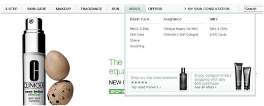
The things you can do with a top or side navigational menu these days are incredible. Bye-bye to the days where you just clicked on a category or chose a sub-category from a simple dropdown menu. This space can be used in place of category pages. It can be used to promote new products or items on sale. You can use it to guide visitors to the most popular areas or even to sections that are most profitable to you.
When visitors hover over the tabs on the Clinique site, they see a user-friendly menu that lists areas to dig deeper into the site. This type of menu allows your site to direct people to areas beyond simple sub-categories. In Clinique’s case, you can navigate to trends, tools, gifts, etc. Below these options, there is also plenty of room to promote free shipping, new products, or even an offer for a skin consultation.

Lead generation – technology
So often you arrive on a lead gen page that has the same old boring form. Name, email, phone, address…on and on. Well, I say spice it up a bit! There are many simple development techniques that can make your forms more user-friendly and also more visually appealing.
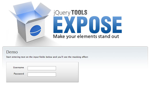
Here is an example of applying jQuery Expose to a form field. The form initially looks pretty run-of-the-mill:
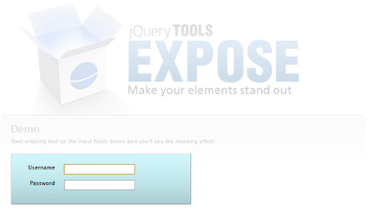
 And then when you click on one of the fields:
 You may not be able to notice, but the entire page becomes lighter and highlights the singular objective you want the visitor to accomplish. This focuses the visitor’s attention on the form and hopefully away from any links, images, and most importantly that “red x” at the top right of the page.
Lead generation – Focusing attention to the middle of the page
One popular way of focusing attention to the middle of the page these days is the modal popup, or entrance popup. If you’re reading this blog post, you’ve probably seen it when you enter MarketingExperiments.com
Although it’s a popup and sometimes annoying, the reason why this strategy works for many people is that you eliminate all the distractions caused by copy, links, ads, images, and other shared real estate a homepage usually has, and forces visitors to look at one thing. Hopefully it’s something that is impactful to the business.
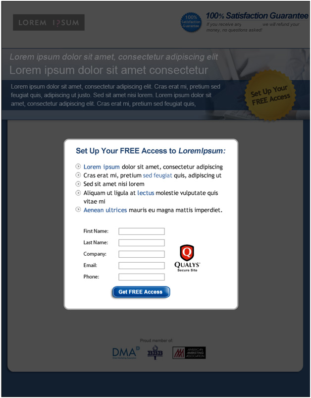
Question: What if we executed this “idea” completely differently? What if we made a complete paradigm shift? The following is a PPC landing page in which we tested the “idea” of the entrance popup (page anonymized):
The page looks like an entrance popup. It eliminates distraction like an entrance popup. It focuses the user’s attention on one objective like the entrance popup. But, it’s NOT a popup.
The text, images, and background colors have all been dimmed to place primary focus on the central objective. I know this is an extreme example, but if used judiciously, this strategy can be very effective.
Our test treatment received a 19.6% relative increase over the control. And what did the control look like? It was almost the same design but without the pseudo “entrance popup” strategy.
I hope you received some value from these test ideas. Stay tuned to the blog for more ideas from the ongoing “What else can I test” series to hear new ideas from many different researchers in the MarketingExperiments lab.
Related Resources
What else can I test … to improve my lead generation rate?
What else can I test … to reduce shopping cart abandonment rate?


 [click image to enlarge]
Thanks for using our shopping cart as an example. We’re always happy to hear when we are heading in the right direction.
Hi Adam:
Very well written post. I loved the organization.
I agree that testing the fundamental assumptions and testing radical ideas always help. I have experienced it so many times, that you don’t know what you don’t know even if you think and assume you do. So, that’s definitely a way to go.
The landing pages ideas are good too. One key thing I have seen working is to keep the flow linear. Don’t give them too many options, or too many decision points. Minimize the distraction on the landing page. That always help. And then don’t try to cover more than one objective on the page, particularly when they are for different use case, or product/service, or a totally different persona.
Thanks for writing this.
-Deven
Great ideas! I would never think about it – especially with this basket. How does it look like from technical point of view?
Hello Adam,
I’m happy you were able to share this article, as I recently looked for relevant material I could share with others in my line of business (conversion rate optimization). It seems a lot of marketers believe in A/B testing but Google Web Optimizer can only take them so far. I’m a huge believer in testing every marketing stimulus that I can, given the opportunity for producing better results across the board. A/B testing is baked into our marketing platform so retailers can take advantage of performing the experiments you mentioned in your article!
-Josh