It’s no surprise folks everywhere like choices.
From the car you drive to the shoes you wear, paper or plastic, and the classic … would you like fries with that?
Choices are good, and having lots of them is even better.
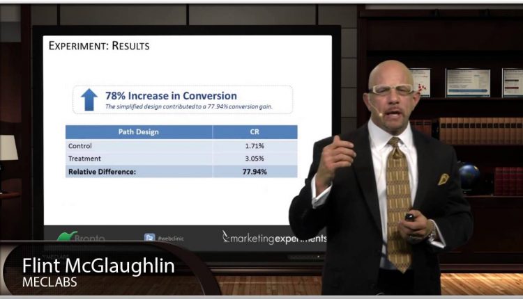
So, it would make sense giving customers as many options as possible would be a sound principle of Web usability – or is it? Watch the below video for a MarketingExperiments discovery about presenting options to your visitors.
As Flint McGlaughlin, Managing Director, MECLABS, said, “People don’t need many options. They need the right options.”
You can watch the full free Web clinic – “The Usability Myth: 4 surprising discoveries we learned after testing the most common usability principles” – to see Flint reveal three other surprising findings from our optimization testing and experimentation.
Our goal is to show marketers key principles to use as a framework to aid usability and optimization efforts.
Related Resources:
Web Usability: Long landing page nets 220% more leads than above the fold call-to-action
Email Optimization: A single word change results in a 90% lift in sign-ups


This is something I find myself screaming until I am blue in the face. I frequently find myself presented with websites which contain not only a high number of options but also a high number of similar of options making the choice a user should make even less evident.
I also enjoyed listening to Flint – Very passionate and knowledgeable!