Background: B2C company offering package vacations. In this test, we focused on improving the checkout process.
Goal: To increase cart completions
Primary research question: Which cart page will generate the highest completion rate?
Approach: A/B split test (variable cluster)
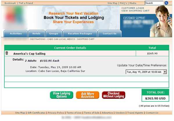
CONTROL
(Please Note: Some details have been obscured to protect Research Partner’s competitive advantage).
The original cart was simple, but it included three equally weighted options from which the visitor had to select:
- “View Lodging Options”
- “Add More Activities”
- “Checkout Without Lodging”
This made the checkout process more cumbersome than was necessary.
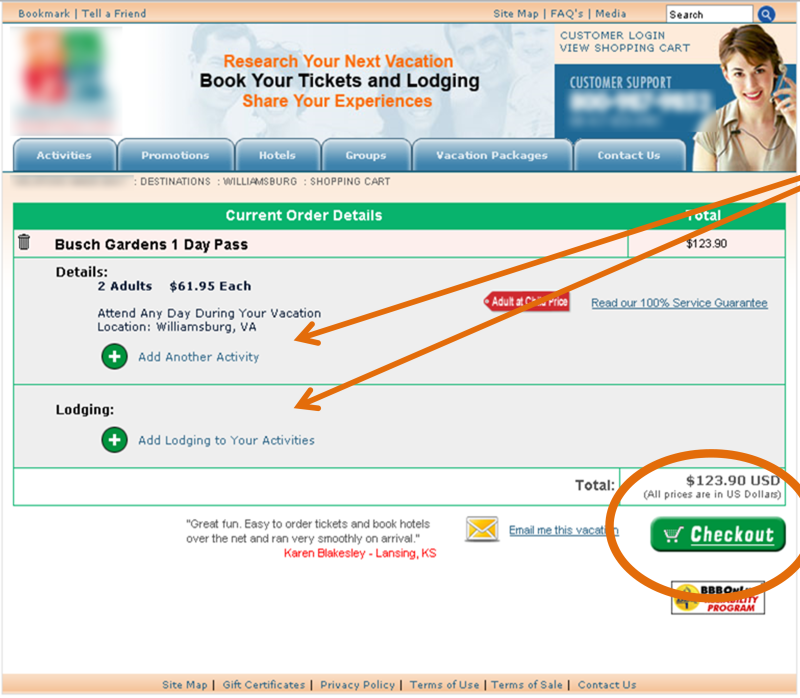
TREAMENT
The team de-emphasized and integrated the additional options into the product details, using an image of a plus sign along with the words:
- “Add Another Activity”
- “Add Lodging to Your Activities”
And they visually focused the visitor on one main call-to-action – “Checkout.”
RESULTS
By simplifying and sequencing the options to choose from, the treatment shopping cart generated 36.5% more cart completions.
To learn more about this experiment, you can watch the free video replay of “Optimizing Shopping Carts for the Holidays: 6 last-minute changes you can make to your shopping carts to increase conversion.”
Related Resources:
Shopping Cart Abandonment: 7 simple steps to completing the sale
E-commerce: 6 quick cart changes
E-commerce Shopping Carts: How a redesigned checkout process led to 13% increase in conversion rate


Do you have any more information about the effect on the average order size?
Sorry Philip. We are unable to share that info. Thanks for reading though, and it’s a good question.