Plenty of marketers use microsites to communicate the value of specific products or services to potential customers.
But, is it possible to say too much on a microsite?
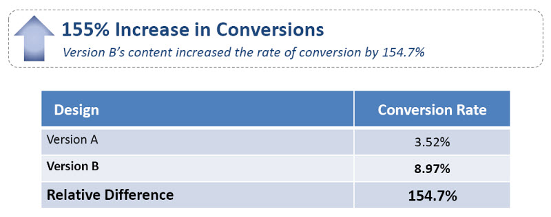
Answering this content question was at the heart of a recent experiment. In today’s MarketingExperiments Blog post, we’ll take a look at how the MECLABS research team reduced the content on a microsite, resulting in a 155% conversion increase.
But first, let’s review the research notes for a little background on this experiment.
Background: A physician-only social network that allows medical product companies to conduct firsthand research on potential purchasers.
Goal: To increase the number of leads from the microsite.
Primary Research Question: Which microsite content approach will result in the largest lead rate?
Approach: An A/B split test.
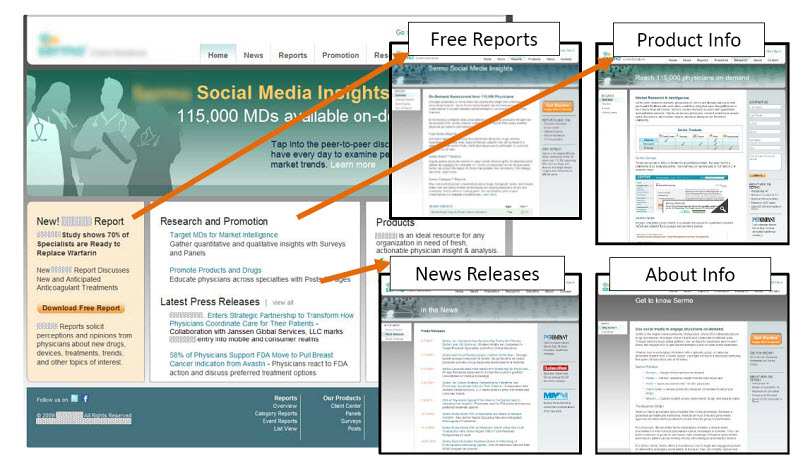
Control
In the control, the research team hypothesized the original page was designed to connect visitors with all of the information they might need to make a decision.
However, it also required visitors to take multiple steps to see the information they wanted.
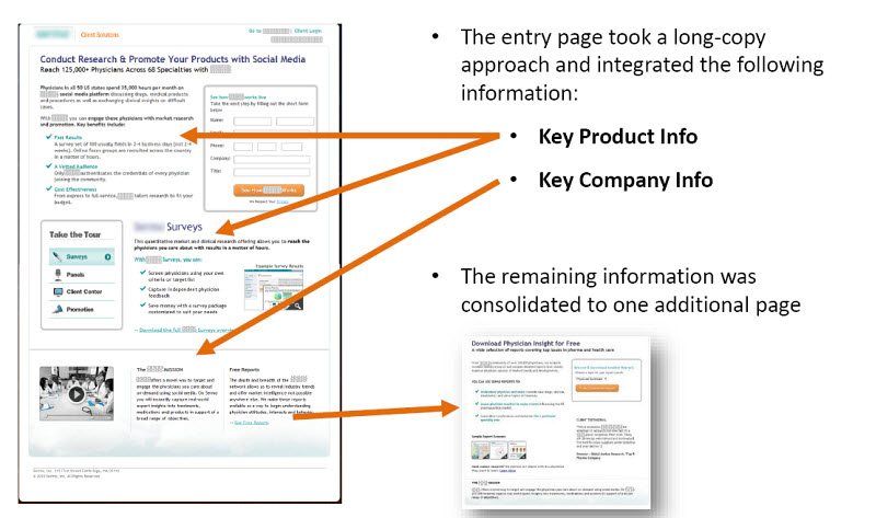
Treatment
In the treatment, an alternative design of the microsite was tested that integrated the majority of the information into a single page.
The treatment design also focused on integrating essential product and company information into a long-copy strategy while consolidating remaining information on one separate page.
Results
What you need to understand
The change in the amount and sequence of microsite content resulted in an increase in leads without negatively affecting SEO. You can watch the full free Web clinic, “Microsites Tested,” to see Jon Powell, Senior Manager of Research and Strategy, MECLABS, reveal the two most common design mistakes that can impact conversion.
Related Resources:
Email Marketing: Subject line test increases open rate by 10%
Email Marketing: Learn from 3 A/B test results to set a firm foundation for your next campaign
Lead Generation Optimization: Two simple changes increase lead rate 166%


