What are some common characteristics successful people share in common?
Is it having a natural curiosity fused with a creative wild spark?
Or perhaps, it’s the end result of dialing into just the right mix of leadership and perseverance to see things through when the going gets tough?
It’s difficult to point to one particular trait that determines success, however you can look for some patterns.
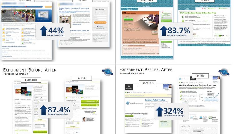
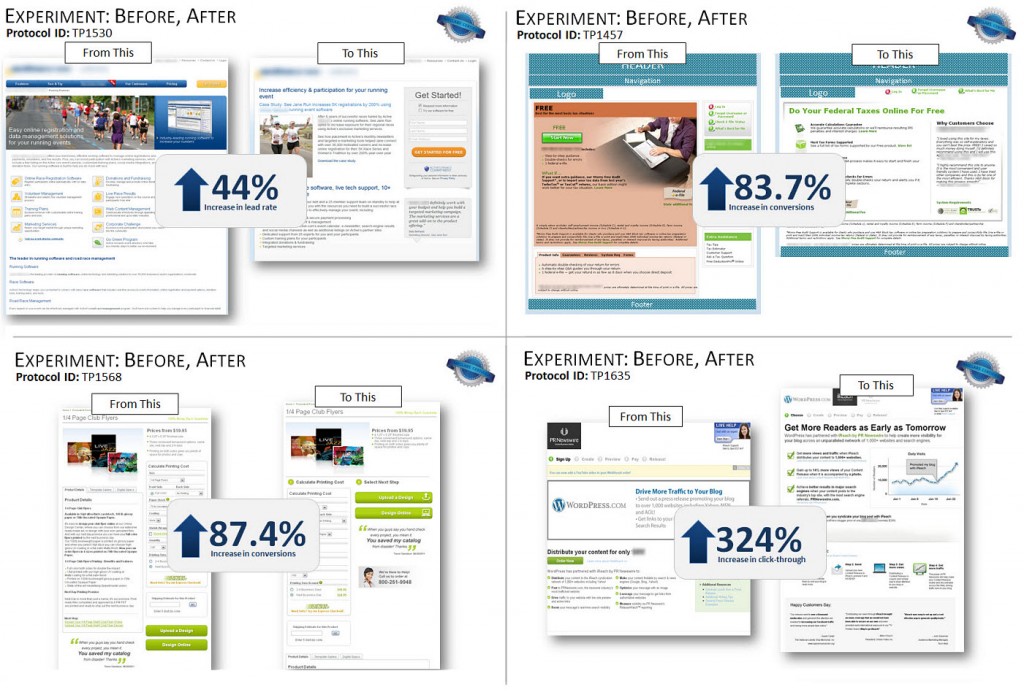
For example, in a recent Web clinic, Jon Powell, Senior Manager of Research and Strategy, MECLABS, asked the audience to look at these before and after screenshots of control and treatment pages from a few experiments to see if they could find any patterns.
“What are the patterns you’re seeing across all these different experiments,” Jon asked.
From pattern to framework
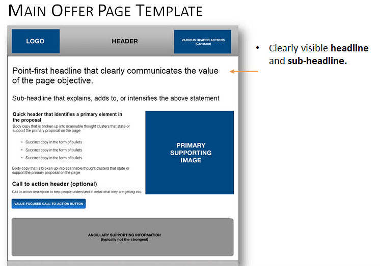
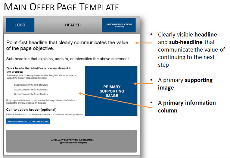
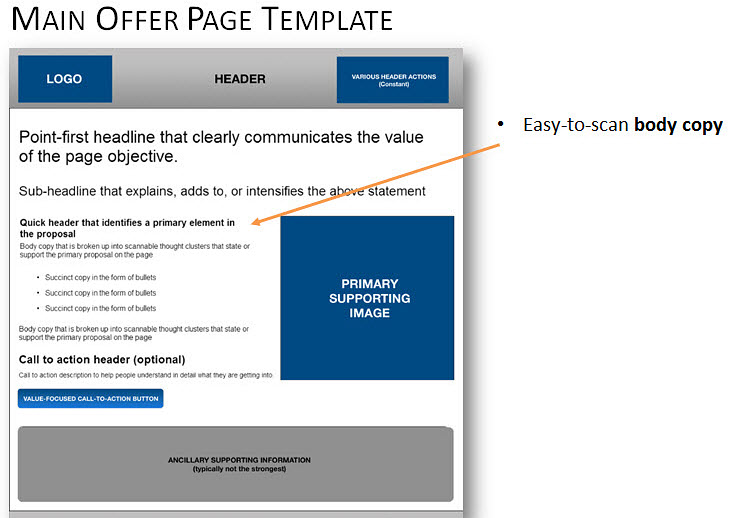
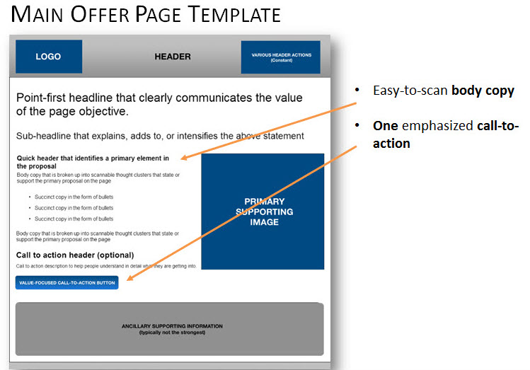
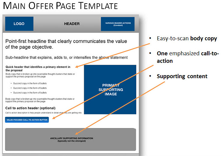
Jon also explained if he were to try and capture the patterns displayed across the experiments and place them into a wireframe based on their commonalities, that wireframe it would have the following traits:
Trait #1. A clear headline and sub-headline
The first trait Jon mentioned is a clearly visible headline and sub-headline communicating the value of continuing to the next step.
Trait #2. Supporting image
A primary supporting image that’s instantly recognizable and support the value on the page is also be present.
Trait #3. Primary information column
Jon also suggested including a primary information column to “help create linear flow through the page and minimize confusion.”
Trait #4. Scannable body copy
He recommended using easy to scan body copy to propel the force of the value proposition for the primary offer.
Trait #5. An emphasized call-to-action
The fifth trait is a call-to action that appears clickable and communicates exactly what the customer will get by clicking. “It doesn’t mean you can’t have multiple calls-to-action, but you want to have one that’s emphasized,” Jon explained.
Trait #6. Supporting content
Jon also recommended placing supporting content further down the page. “This type of content could be more copy, supporting images, testimonials or reviews to reassure hesitant visitors or educate detail-oriented visitors.”
But at the end of the day …
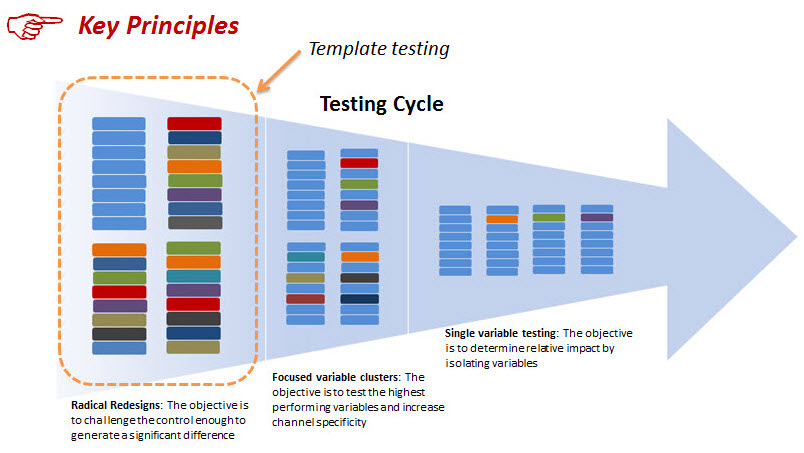
Although these traits have been found among high-performing templates, Jon emphasized you still have to test your way to discover what works for your customers.
You can watch the full free Web Clinic, “Page Templates that Work,” to see Jon reveal three high-performing site templates that consistently increase conversion across multiple industries.
Related Resources:
Transparent Marketing: 3 tips to help build your online credibility
Landing Page Optimization: Simple pop-up overlay increases conversion 63%
Landing Page Optimization: Simple color change increases conversion 10%



Interesting. There is definitely a certain underlying logic to the pattern here, as it helps funnel the user down from the general headline, through the benefits and toward the final call to action, with the image and additional supporting information strategically placed to support the overall process.
I wonder what the “mobile” variable does to this, however? With the limited horizontal space on smaller devices, how does the supporting image and content fit in?
Hi Matt,
Great question.
I followed up with Jon Powell, Senior Manager of Research and Strategy here at MECLABS (who is also featured in the Web clinic) and shared your thoughts on the mobile variable. He mentioned that the meta analysis did include a mix of mobile traffic, but not at 100%. So people on mobile devices would see the page the same as those on desktops and laptops, and no performance anomalies were immediately evident for that particular segment of traffic.
Jon also explained that in terms of a mobile style page for 100% mobile/tablet traffic (where the dimensions are fixed or dynamically adjusted to a mobile device), another meta-analysis would need to be performed to learn which sections of “form” in this type of page presentation tactic are more sensitive as there would be less room for supporting imagery, etc.
I hope this help shed a little light on the mobile factor.
Great question!
Thanks,
John Tackett
Great job outlining the most important elements of a landing page.
I used something similar for a client of mine and it worked wonders. The only difference is that I used video instead of body copy.
Now I am doing the same with another client of mine and can’t wait to see the results.
Hi Jim,
Thanks for you comments.
Keep us posted on the results as well.
Best,
John Tackett
Thanks. I’ve been wondering for a while what sort of effect a responsive layout would have on conversion. I hadn’t found much info until now so this was helpful.
Aaron
Hi Aaron,
Thank you for the comments,
Glad we could help! 🙂
Best,
John Tackett
although i went through these clinics more than a couple of times, this post is great, clear and very helpfull.
in my case a much longer copy is required, and i always struggle regarding the call to action position = in my case it’s a contact form .
if i want it to be in the first page it mught be too early.. if i put it at the buttom it might be missed .
i know the answer is TEST , i just want to know what you think .
Hi Tomer,
Thank you for your comments.
Although the default answer is to test as you mentioned, I’d like to draw your attention to a blog post written by Daniel Burstein that features a really great perspective on the long copy vs. short copy discussion:
https://www.marketingexperiments.com/blog/research-topics/copywriting-research-topics/long-copy-vs-short-copy.html.
Also, keep us posted on your results!
Thanks again and happy testing,
John Tackett
Thank you John, there is one thing i find missing and i didn’t know where else to post this :
since we are dealing here a lot with conversion tracking and a lot of other thechnical abilities
that practicly goes down to your building platform abilities ,
for someone who is building his site from scratch or for someone like me who want to move to a platform that will enable me to TEST properly ,
do you have a list of reccomanded website building platforms ?
i know it cannot be general, but it sure can save a lot of investigation time for some of us.
Thank you.
Tomer Shahar.
Hi John,
I am a new member here so still looking around. I enjoyed your post and learnt a bit from it. I am in the process of completing my website, so I am going to use your templates as a ‘checklist’ for my webpages.
Thanks again,
Joe