Category pages play a key role in e-commerce, yet they are often left to the mercy of limited, if any, best practices and minimal testing.
In today’s MarketingExperiments Blog post, we’re going to take a look at how the MECLABS research team tested a category page that led to a 20% increase in order rates.
First, let’s review the research notes for some background information on the test.
Background: An e-commerce site offering strength training and conditioning tools for professional athletes.
Goal: To increase order rate.
Primary Research Question: Which category page will generate the highest order rate?
Approach: A/B variable cluster test
Control
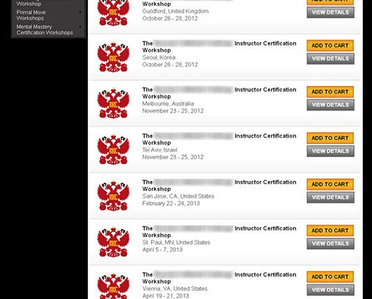
In the control, the MECLABS research team hypothesized critical pieces of information were difficult for customers to locate.
Here were some of the critical information pieces they identified:
- The focus of the workshops
- Location(s)
- Date(s)
Treatment
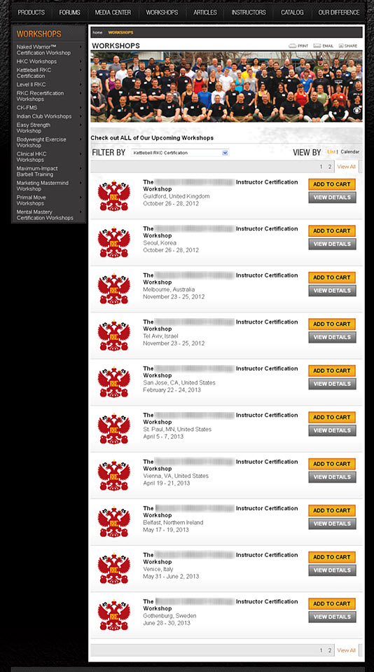
In the treatment, the team designed a category page that included the missing pieces of information identified in the control.
The team also changed the layout of the page to flow along a more natural eye-path.
Results
What you need to know
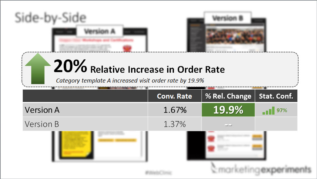
By including the missing pieces of information identified in the control and changing the layout to flow along a user’s natural eye-path, the treatment outperformed the control by 20%.
To learn more about how category pages impact the sales funnel, you can watch the free MarketingExperiments Web clinic replay of “Category Pages that Work.”
Related Resources:
Marketing Questions: Making claims for new products, e-commerce landing pages
E-commerce: Checkout page test sells 36% more vacations
Landing Page Mistakes: E-commerce sites treating new and returning visitors the same


John;
Great article. We will start using the missing pieces of information in the control and layout and see how we do. Thanks again.
Teri Green
Atlas Biomechanics
Hi Teri,
Thanks for your comments, I’m glad we could help.
Keep us posted on your testing results.
best,
John Tackett