If you were watching last year, we revealed some research on a Web clinic concerned with responsive design, specifically the effect of a mobile and tablet-based form page design for mobile and tablet specific users.
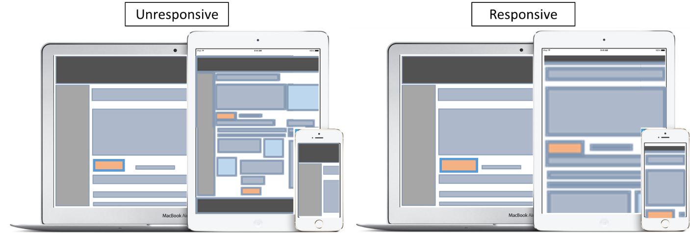
If you’re unfamiliar with responsive design, the general concept is that a page is coded to adapt its viewing experience to fit the size of the device you’re using.
While the results were interesting, we still had many questions:
- Can those findings be applicable to all page types?
- What about articles and landing pages?
- What about emails?
As part of our quest to continue to get a better picture on the effect of mobile design on a rapidly growing world of mobile users, my team had a desire to perform a responsive design test on a type of email where responsive design would prove extremely valuable to readers — the email newsletter.
The team’s hypothesis made sense: A significant number of visitors are not acting on the [desktop style] email because it is too difficult to read and process. The fix? Use a responsive design template to make things readable.
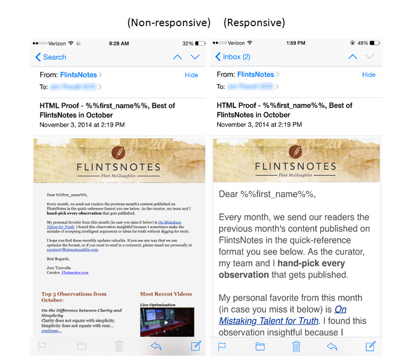
A closer look at the two versions reveals the following about the responsive template:
- The text is much clearer
- It’s easier to navigate (just swipe down instead of pinch, zoom and scroll)
- It’s more aesthetically appealing
The only sacrifice the responsive template makes is that it takes about 5 to 6 more swipes to navigate to the end. Regardless, the team hypothesized that the sum of benefits would outweigh this perceived cost.
When we looked at the results, however, we found something quite different:
The result was puzzling: Why would an email newsletter that is more difficult to read outperform one that is easier to read?
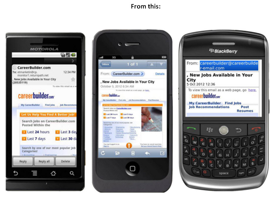
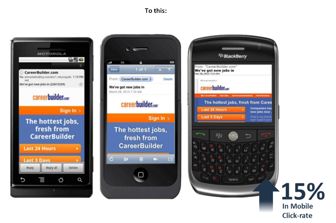
What’s even more puzzling is that this finding does not generally fit the pattern I’ve seen in mobile design email tests, specifically case studies like this one from CareerBuilder on MarketingSherpa:
Puzzled, we went back to our test metrics to examine our results more closely for any additional clues. When we looked at the unique click rate (as opposed to click rate), we were presented with another interesting result:
There was no statistically significant difference in the number of people who clicked. The non-responsive viewers are simply clicking more per email then the responsive viewers.
That still left us with a final question: Why are the non-responsive users clicking more?
The answer, we believe, was hidden in this final metric:
Viewers of the non-responsive design are reading significantly less than those viewing the responsive version. But why?
- Maybe it is just easier for viewers to tap to learn more on the non-responsive version than it is to pinch, zoom scroll and then read to learn more.
- Maybe people found the responsive email more appealing to read, thus reading more.
Bottom Line: Which email is better?
Well, that depends on how you measure success.
If you want to attract people who will have a real interest in the deeper troves of content your site has to offer (and thus be more qualified for a paid offering), the responsive email in this case would be most effective in helping you accomplish the greater objective.
Why? Because someone looking at the non-responsive version may click on the links out of curiosity to learn more about the heading because they don’t want to take the time to pinch and zoom.
While that might get you more traffic in this case, the tradeoff is that the extra traffic will involve:
- Higher bounce rate
- Lower average pages per session
- Lower average time per page (depending on the quality of content)
The result?
This is a skewed total metrics picture, requiring multiple steps in your analytics platform to ensure that you’re not grouping that motivation of audience with another that has a real interest in deeper content. In addition, it might require changes on the template to attract the change in motivation level to continue on the site.
Ultimately, I have two top takeaways:
- As I have said in a previous post, greater gains and understanding comes with a greater granularity in measurement.
- The quality of motivation you attract is connected to the quality of experience you provide.
Don’t let responsive, or non-responsive, design be your end-all be-all. Learn how it affects customer behavior and use it as a lever to effectively move them closer to the ultimate goal you have for your business.
You can follow Jon Powell, Senior Manager, Executive Research and Development, MECLABS Institute on Twitter at @jonpowell31.
You might also like
Email Marketing: 24% higher CTR for CareerBuilder’s responsive design [MarketingSherpa case study]
Email Marketing: Taking advantage of responsive design [Video] [More from the blogs]
Mobile Marketing: Ecommerce site uses responsive design to achieve an 8% lift in cart abandonment campaign [MarketingSherpa cases study]
Email Design Panel: Responsive email design with multi-device customers in mind [MarketingSherpa video archive]


Really insightful stuff here. I like how you’re drilling down into the statistics to really figure things out. I too have found the same thing when it comes to email reader engagement on mobile vs. desktop, using analytics from Litmus. I’ve found that even though opens from mobile users are lower, those that do open are spending longer on the email reading it. So while the percentage of mobile opens may be smaller, I still feel like optimising for mobile, and creating responsive emails, is still hella worth it. To keep these users engaged.
Good info – seriously, is anyone not designing for mobile these days?