A popular method to acquire new customers for online subscription models is through free trials. The hope is that by using a service or product, prospective customers can fully experience and appreciate the value you have to offer.
However, before the experience begins, you must first get them to see the value of the trial. After all, it can be a friction- and anxiety-filled process since many trials require credit card information at the time of sign-up.
Increasing the completion rate for the trial sign-up process was one of three steps the Euromoney Institutional Investor team took to revamp its strategy and increase conversions. The team accomplished this through online testing after seeing that 60% of traffic in the funnel did not complete the process.
At MarketingSherpa MarketingExperiments Web Optimization Summit 2014, Ben Eva, Global Head of Conversion Management, Euromoney Institutional Investor, shared three online tests his team used to learn about their customers and to increase that completion rate.
What is the best layout/design of the offer page?
Euromoney publishes over 200 online information services — which equals a lot of potential for testing. Because each audience varies, sometimes the same type of test is needed to find the best result for each audience.
Ben shared two tests that revolve around page design and how to best communicate the value of the publications and their free trials.
Test #1
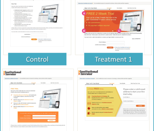
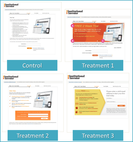
The team wondered if the value was organized and laid out in the most effective manner for the trial details and the first step of the trial sign-up process. They tested three treatments against the control.
In the end, Treatment 3 won despite being a last-minute addition to the test — proof that sometimes our marketer instincts don’t match up to what customers like best. It saw the most improvement over the Control, with a 36.4% lift in conversion. The team was then able to use that discovery on more than 11 of its websites.
Test #2
The second test Ben shared also looked at the first step of the trial process. In addition to the layout of value information, some of the treatments also tested variations of the usage of breadcrumbs.
The winner? Treatment 1 won, with a 20% increase in conversion. This discovery was also rolled out on more than 11 of the other sites.
Can reducing the number of steps increase conversion?
With each step in any process, you’re leaving another opportunity for customers to exit the funnel. One extra step could be the additional friction that prevents customers from finishing the process.
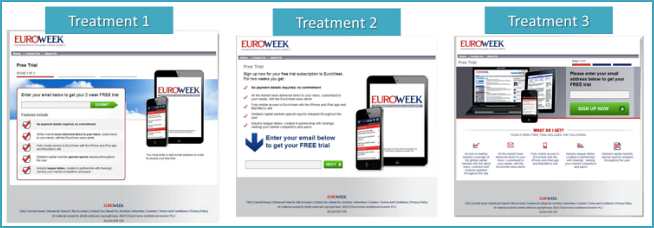
With that in mind, the Euromoney team wanted to see what effect combining steps #1 and #2 would have on trial prospects.
Combining steps #1 and #2 performed better than the control, increasing trial conversions by 26.1%. The team has since then built this discovery into the Web product development process.
Beyond the sign-up process
This excerpt only shares one of three steps Ben and his team took. Watch Ben’s entire MarketingSherpa MarketingExperiments Web Optimization Summit 2014 presentation, “Funnel Optimization: How a subscription-based business transformed its testing strategy and increased conversions by 121%,” to learn more about the rest of his testing strategy revamp.
You can follow Selena Blue, Manager of Editorial Content, MECLABS, on Twitter @SelenaLBlue.
You might also like
Optimizing Subscription Paths: Recent research reveals a radical webpage redesign that produced a 173% lift in customer response [Replay from a MarketingExperiments Web clinic]
Subscription Checkouts Optimized: How experimentation led to compounding gains at the revenue level [More from the MarketingExperiments blog]
Personalization Marketing: In-trial messages increased online registrations by 15% for a B2B SaaS [From MarketingSherpa]


