Simple, direct and bare. When your company and process is known around the world, a blank page with little competing content can not only work, but it can work really well.
Simplicity is key. Take a look at Google’s homepage:
What about new visitors? Imagine coming to this page for the first time, with little to no context of the company. What is this company? If I type something in that text box, for example, where will it take me?
Simplicity is not always a key to effective website optimization.
“Leaders must grow comfortable with paradox and nuance. Clarity does not equate with simplicity. Simplicity does not equate with easy.” — Flint McGlaughlin, On the Difference between Clarity and Simplicity.
Simplicity is the reduction of friction, but clarity is the optimization of the message. A simple message is not necessarily a clear message.
Take a look at a test we ran with a physicians-only social network that allows pharmaceutical companies to conduct survey research and promote products to their audience. The goal of this A/B split test was to identify which microsite would generate the most total leads.
Check out the control below. Can you find the value proposition?
There are a couple of points that speak to product-level value, but nothing that addresses primary- or prospect-level value.
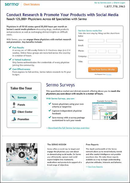
The treatment test that the team put together focuses on the primary-level value and clearly presents the “ask” of the page through a form field.
Notice that the treatment has significantly more text and length, but clearly states the value proposition and the intended next step. Remember that, according to Flint McGlaughlin, “clarity does not equate with simplicity.”
In clarifying the value proposition, we saw a significant increase in lead rate:
The treatment outperformed the control in lead rate by more than 154%. This informed our team that by presenting content clearly, not just simply, visitors are more likely to understand the value proposition and complete the lead generation process.
We don’t all have to take after Google. Simplicity is not always key; it is clarity that adds force to your value proposition.
Have you experienced an increase in your metrics with added clarity? I’d love to discuss how you have made your landing page’s purpose more clear for visitors in the comments below.
You might also like
How Communicating Value Lead to a 30% Increase in Overall Site Revenue [More from the MarketingExperiments blog]
How to Recover from Failed A/B Testing [More from the MarketingExperiments blog]
Website Analytics: How to use data to determine where to test [More from the MarketingExperiments blog]
Online Course: Landing Page Optimization [MECLABS Training Course]


Excellent post, Kylie!
In his renowned work, “The Republic”, Plato points out through the character of Socrates how men who try to persuade through clever articulation are like sophists and should be detested.
Marketers who seek to find true value and clearly describe it in their landing pages and marketing campaigns are approaching truth which Socrates describes as the greater good.
“Clarity trumps persuasion” sums this up pretty nicely.
Awesome work Kiley! You are an amazing scientist!
@Kevin Soisson
Thank you Kevin! Reach out if you have any questions on specific examples you come across.
@Alex Abell
Thanks Alex! Clarity can absolutely trump persuasion, as we say.
I was actually discussing your Plato example earlier today! Beyond whatever clever tactics we, as marketers, can come up with to sell a product is the essential message or, really, the product itself. Our goal is to lead consumers to the right product for them at the right time. This is where simplifying, layering and sequencing come into play.