To understand online advertising, you must understand women’s haircuts. To wit, have you ever heard this line: “How do you like my new haircut?”

Gentlemen, you’ve probably been in this same boat before (and ladies on the other end of it). Your wife gets a new haircut. You don’t notice. Consequences ensue.
But as a man, I can attest that we only notice huge changes in things that vastly interest us. She had hair before. She has it now. What’s the difference?
However, if the wide receiver you’re starting on your fantasy team has even the slightest limp, you’ll instantly notice. Because you’re just that interested.
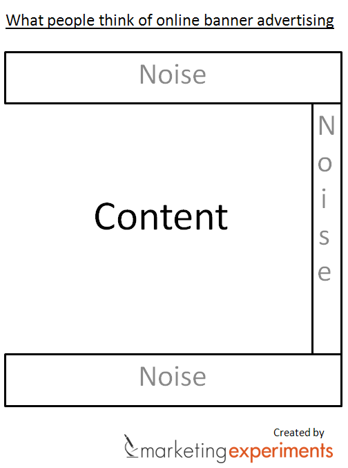
And I have news for you – your online advertising is not something that your audience is hugely interested in. “Visitors view Web pages as content in the middle with noise all around it. That noise is banner ads,” says Dustin Eichholt, Research Analyst, MECLABS.
So, how do you stick out among that noise and grab attention? Do you always want to? I had a discussion about that with our researchers at one of our recent Content Meetings (These are fun and educational meetings. A chance for the editorial team to pick our analysts’ brains. Think “Real Time with Bill Maher” meets “Science Friday with Ira Flatow.”) Here’s what they had to say…
How to overcome banner blindness
Perhaps the most successful part of this meeting for me is that it inspired Jon Powell, Research Manager, MECLABS, to write a blog post about the three obstacles you must overcome to create an effective banner ad. In it, he discusses the six elements that can help your ad capture attention and, essentially, overcome banner blindness. It’s a much better blog post than the one you’re reading now, so click that link and give it a few moments. I’ll wait. I’m not going anywhere.
…Read it? OK, let’s move on.
I’ll give you an example from our own work of how we put those principles into practice. On our Optimization Summit landing page, we had a “call for speakers” link. At first, when it was not an important objective, that link was just plain text, like the “view sponsorship opportunities” link above it.

However, when it became a more important objective, we emphasized that link by using three of the six elements – color, size, and shape.
One element we always had working for us was position. We placed it right at the beginning of a bulleted list, a natural breaking point. As Jon says, “When you have control over placement, you should put the banner ad by natural exit points – the end, after the first paragraph, at the beginning of a break in format, or by the most boring parts of the article.”
But be careful. You can go overboard. As Dustin says, “Some banner ads are just a desperate attempt to get a click.” Those words bring to mind the horrible flashing ads that seem like the Vegas strip on steroids…annoyance marketing at its finest.
When you want banner blindness

Sometimes, perhaps counter-intuitively, you want banner blindness. Like a zebra, you’d prefer to get lost in the herd. “If you’re
paying for clicks, you don’t necessarily want to draw attention to your ad,” according to Phillip Porter, Data Analyst, MECLABS. In other words, you don’t want curiosity clicks because you have an interesting ad. You want people that were so motivated, they hunted through the pack, found your specific ad, and just need to know more.
Another example is when you have complementary information that you want people to be able to find if they’re really looking for it, but you don’t want to distract from the main message. An example is the MarketingExperiments Web clinic slides.
We put the Twitter hashtag #webclinic in the lower left of every slide of the presentation, slightly deemphasized. While we love the lively interaction we get on Twitter during every Web clinic, we don’t want to distract from the main messages of the presentation. In this case, banner blindness is helpful. People who forgot the hashtag and are really looking for it will hopefully find it. Others, we hope, won’t be distracted.
Banners? Where we’re going, we don’t need banners.
Of course, the future of marketing is all about inbound marketing, right? Sometimes, as we often learn in our experimentation, you don’t want to optimize the marketing tactic, you want to try an entirely new approach.
“The most effective banner may be no banner at all,” says Adam Lapp, Senior Optimization Manager, MECLABS. “Write a blog post or an article about the product instead.”
Related Resources
How to optimize your banner ad performance while complying with new privacy regulations — Webinar, Thursday, March 31, 2011, 1-2 PM.
Online Advertising: The 3 obstacles you must overcome to create an effective banner ad
This Just Tested: PPC vs. banner ads?


