With winter firmly in our rearview mirrors, spring is officially here. Daylight savings time is upon us. March Madness is in full swing. And baseball’s opening day will have taken place by the time you’ve read this (Go Cubs!).
What better time then than to do a little spring cleaning of our webpages?
Don’t worry, at MarketingExperiments, we’ve got you covered. For more than a decade, we’ve been hosting Web clinics to help you — the marketer — maximize the effectiveness of your collateral. And, as we’ve seen again and again throughout the years, it’s often the smallest tweaks and cleanups that lead to the biggest results.
Read on to learn how you can harness your inner-Danny Tanner, grab your HTML mop and bottle of marketer’s 409, and turn that cluttered mess of a legacy page into a squeaky-clean, highly effective conversion machine.
Five key elements
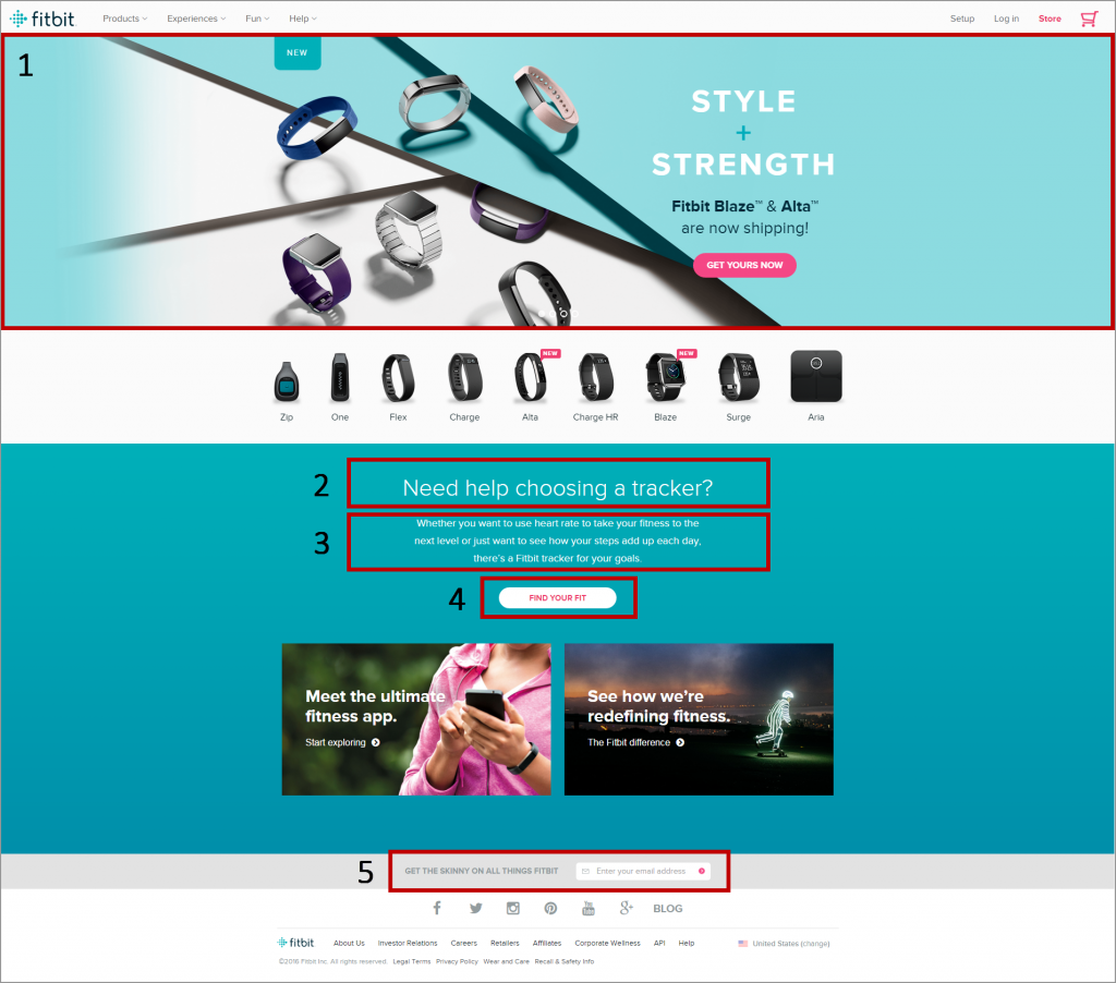
To help get you started, I’ve identified five common elements of most webpages:
- banner
- headline
- copy
- call-to-action
- form
Your page may not have, or need, all five of these elements, but chances are it will have most.
Here’s an example of these elements, from Fitbit’s website:

Element #1. Site Banners — Engage, don’t advertise
In March’s Web clinic, we were joined by Mike Loveridge, Head of Digital Test and Learn, Humana, to discuss site banners, when to use them and how to best leverage this key real estate on your page. Watch the replay to learn how to design site banners that are dedicated to your value focus, aligned with customer motivation and invite customers to engage.
Watch the Web clinic: “Site Banners Tested: How minor changes led to a 433% increase in clickthrough for Humana”
Element #2. Headlines — Don’t bury the lead
Last September, the MarketingExperiments team brought you this 35-minute Web clinic focused solely on headline optimization. Based on a meta-analysis of 15 years of research by our parent company, MECLABS Institute, this clinic includes more than a dozen real-world tests demonstrating the power of clear, customer-centric and value-first headlines.
When these headlines are aligned with customer motivation and given the proper graphical weight, these simple changes – often just a couple of words – can yield outsized results.
Watch the Web clinic: “How to Write Headlines That Convert: Key discoveries from a meta-analysis of 15 years of behavioral research”
Element #3. Copy — Arrest attention with clarity, not creativity
In November, we dedicated our Web clinic to copy.
Specifically, we aimed to build a webinar that could help the viewer significantly strengthen their copywriting skills in less than one hour. Watch the replay to learn how to write clear copy, quickly arrest the attention of your prospect, build the problem before presenting the solution, and ruthlessly eliminate text that you may be attached to but adds nothing of value to your page.
Watch the Web clinic: “Strengthen Your Copy in 35 Minutes: Proven strategies to boost the effectiveness of your words”
Element #4. Call-to-action — Make the right ask, at the right time
In March 2014, Jon Powell, Senior Manager, Executive Research and Development, MECLABS Institute, carried out an in-depth meta-analysis of more than 100 statistically validated call-to-action tests to bring you, the MarketingExperiments reader, this popular Web clinic.
View the session to discover how Jon learned that calls-to-action must not be viewed in a vacuum, but must instead be looked at in context of the entire conversation occurring in the customer’s mind. Then, leverage these five simple principles to strengthen your CTAs.
Watch the Web clinic: “The Most Effective Calls-to-Action: 5 principles discovered for increasing customer response”
Element #5. Form — Create value, not cost
Does your form gather only the information your company really needs? If not, is there a way to reduce the number of required fields or regroup existing fields to decrease length-based friction? Or, if you’re looking for higher quality leads, is there a way to increase the number fields?
This Web clinic from May 2014 will equip you with the knowledge you need to increase the perceived value of every field in your form, and present your form in a way that logically guides the visitor through the process of completing it.
Watch the Web clinic: “Optimizing Web Forms: How one company generated 226% more leads from a complex Web form (without significantly reducing fields)”
But remember — Testing is key
Don’t just blindly trust us, every audience is different.
Test these principles on your pages, analyze the results and apply the learnings. Not only will you enjoy increased page performance, but you’ll build a more sophisticated customer theory.
You can follow Ken Bowen, Managing Editor of MarketingExperiments, MECLABS Institute, on Twitter at @KenBowenJax.
You may also like
MECLABS Landing Page Optimization Course
Marketing Experiments April Web Clinic — Digital Subscriptions Boosted


