Exploring Online Shopping Behavior: How website characteristics affect likelihood of purchase and basket value on ecommerce sites
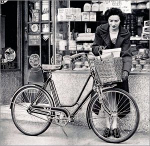
Traditionally, brick-and-mortar stores have displayed their products in their windows, enticing passers-by to come in and learn more, perhaps meet and talk with the owner and other shoppers, and, ultimately, fill their shopping baskets and purchase the goods.
Today’s digital stores (ecommerce websites) are striving to achieve the same goals as their brick-and-mortar counterp arts, with varying scopes of products ranging from unprecedented breadth (e.g., Amazon) to narrow specialization (e.g., your local cupcake bakery).
Though ecommerce stores come in a myriad of types, and specific factors influence how customers shop at different websites, they all share one thing in common: Store owners are always on the outlook for some generalizable principles and ideas to test in their specific conditions in hopes of maximizing revenue.
Which website characteristics increase the likelihood that a visitor will make a purchase? And, since shipping costs are a considerable expense, how do you increase the likelihood that a customer will spend more money per shopping session?
Let’s look at a recent study exploring the effects of website characteristics on online shopping behavior and basket value, and how those effects depend on product characteristics.
The study
In March 2016, professors Girish Mallapragada of Indiana University, Sandeep R. Chandukala of Singapore Management University and Qing Liu of University of Wisconsin published the results of a study exploring the effects of product and website characteristics on customer shopping behavior and basket value.
The authors analyzed the shopping behaviors of 2,000 consumers over one year, collected from the ComScore Web Behavior Panel. The data encompassed 773,262 browsing sessions and 9,662 purchase transactions at 385 online retailers across 43 product categories.
Method
The researchers scored all websites on product variety offered and on two types of functionality: navigation and communication.
Navigation functionality captured the extent to which a website facilitated browsing through content, site maps, layout and updates.
Communication functionality captured the extent to which a website offered communication features such as email, chat rooms and message boards.
They also scored the products on their hedonic and utilitarian characteristics using a previously developed scale.
Hedonic products (e.g., jewelry) would be rated highly on items like “fun,” “exciting” and “delightful.”
Utilitarian products (e.g., office supplies) would be rated highly on characteristics like “effective,” “functional” and “necessary.”
Results
Which factors predict likelihood of purchase?
In the browsing stage, the researchers found that the following factors are significantly related to purchase:
- Previous purchase (previous customers are more likely to buy again)
- Session duration and page views (more engagement leads to increased likelihood to purchase)
- Broad scope of products (more variety leads to increased likelihood to purchase)
- Communication functionality (more communication features lead to decreased likelihood to purchase)
Which factors predict higher basket value?
Among the customers who made a purchase, the researchers found that the following factors are significantly related to basket value:
- Page views (more page views were associated with higher basket value)
- Session duration (longer sessions were associated with lower basket value)
- Broad scope of products (more variety associated with higher basket value)
- Communication functionality (more features associated with lower basket value)
- Navigational functionality (more features associated with higher basket value)
However, the effects of navigational and communication functionality depended on the characteristics of the products consumers were shopping for. Namely:
- Communication functionality lowered basket value for utilitarian products, but not for hedonic products
- Navigational functionality lowered basket value for hedonic products, but increased basket value for utilitarian products
The authors suggest that people buying utilitarian products might be looking for relevant information about the product on the page instead of communication functions, which might be perceived as clutter and add to friction. On the other hand, people buying hedonic products might be looking for self-affirmation through engaging in a dialogue with others and find communication features helpful.
Key takeaway
If you are selling utilitarian products, your page might benefit from rich navigational functionality, while if you are selling hedonic products, your page might benefit from rich communication functionality.
In both cases, you want to entice your customers to engage with your pages and check back often, which would ultimately lead to more purchases and higher basket value. Having a variety of products to choose from, and earning the loyalty of returning customers also helps increase the likelihood of purchase and basket value.
You might also like
Exploring the Effects of “What” (Product) and “Where” (Website) Characteristics on Online Shopping Behavior [Executive summary from the Journal of Marketing]
Ecommerce Chart: How a low conversion rate can be a good thing [From MarketingSherpa Chart]
B2B Marketing: Customer-focused site design for book ecommerce drives order volume up 211% in three years [From MarketingSherpa Case Study]
Ecommerce Marketing: Time spent on site boosted by 50% with transition from flash sale to retail for fashion site [From MarketingSherpa Case Study]


