

Earlier this year I reached out to a friend of mine who manages training with the Salesforce Marketing Cloud (previously known as ExactTarget) to get a sense of what questions everyday marketers were having concerning email.
“Preheaders,” was her quick response. Specifically on “using a preheader, not using a pre-header — what should be in the preheader.”
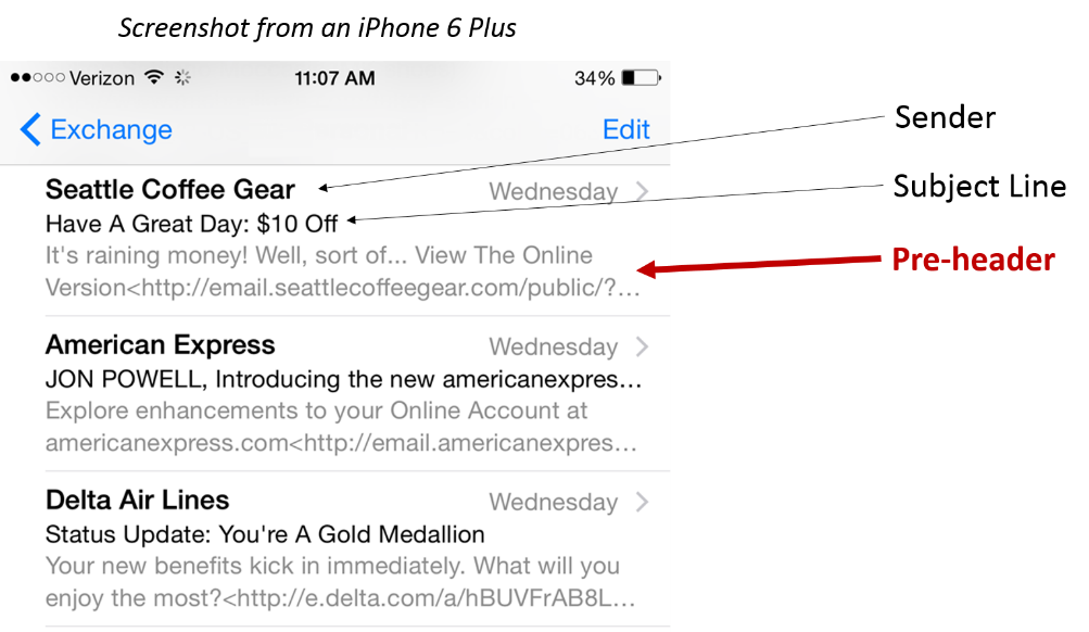
Just in case you’re not familiar with a preheader, it is the line of preview text you find below the subject line on mobile device email apps and even in the Outlook preview pane.

Focusing on that piece of information, I took to the database and decided to do some looking around.
Surprisingly, I didn’t find as many tests as I usually find. This is an item that has just started to get the attention of marketers as of late. Additionally, when I searched on the Internet, I could not find a single experiment published on the subject with statistical significance.
I decided to oversee some tests myself, hoping to solidify some of the initial patterns I was noticing from my initial view of the database.
This is what I discovered: Preheaders can indeed have a significant effect on your email performance metrics. However, I still had some questions:
- With what metrics?
- In what way?
- By how much?
To help answer those questions, I’d like to reference two recent examples for the same type of email:
Example #1:
In this test, we wanted to understand if having text in the preheader would make a difference compared to not having text. The control simply brings in the URL to the first image visible in the email, while treatment shows a specific piece of text.
Here’s the creative:

The Results
The treatment preheader achieves a statistically significant 104% relative increase in clicks with no statistically significant difference in opens.
Example #2:
In this test, we wanted to understand if the substance, or focus, of the text would make a difference in performance. The control brings in some general link text from the email template, while the treatment uses the first article headline in the newsletter as a teaser.
Here’s the creative:

The Results
The treatment preheader achieved a whopping 12% relative decrease in clicks (statistically significant) with no statistically significant difference in opens.
Interpretations
These preheader tests and others have helped me gain a few key insights when it comes to crafting copy for the newly coveted area below the subject line.
Insight #1: It’s not about having preheader text — it’s about increasing clarity of value for the customer
Having a preheader crafted by a human does not guarantee a positive response.
In fact, in Example 2, the preheader actually limits a person’s perspective of the value in the email. Who wants to learn about a farm’s quest to justify something? In another test here in the database, we added similar text to what you see in Example 1. When viewed by the customer, it felt repetitive and distracting, resulting in a similarly sized decrease in response.
Insight #2: Preheader performance patterns seem to match subject-line performance patterns
What I’ve discovered from the hundreds of subject line tests that I’ve seen, as well as those that I’ve personally conducted, is that a well-crafted subject line may increase opens but will always at least double the impact on clicks. The same appears to be true of preheaders. Why?
One brand-side marketer, Amanda Gagnon, former Education Marketing Associate, AWeber, and current Content Marketing Manager, Proscape Technologies, discovered the same thing in her own marketing and explained it to our reporters at MarketingSherpa. They have since written an entire case study on it.
Here’s a quote from that study:
“My theory is mindset,” Gagnon said. “People decide whether or not to open an email based on so many factors, and what the subject line says, I think, has a far smaller effect than how much time someone has available … but [the subject line] can influence the people who would likely have opened the email anyway.”
Insight #3: The size of preheader performance gains and losses appear to be tightly connected with the number of readers using mobile optimized apps to read emails
No surprise here. This hypothesis is the whole reason why preheaders have been gathering steam lately, especially because mobile optimized applications have been putting the preheader in a place of greater prominence, which has coupled nicely with the overall increase of mobile use and dependence in daily life.
What have you discovered with preheaders in your A/B split tests?
You might also like
A/B Testing: How to improve already effective marketing (and win a ticket to Email Summit in Vegas) [More from the blogs]
Email Marketing: 24% higher CTR for CareerBuilder’s responsive design [MarketingSherpa case study]
Email Marketing: 4 steps to optimize a mobile experience for better conversion [More from the blogs]
Email Marketing: Simplifying email content increases open rates 48% for B2B company [MarketingSherpa case study]
Hey Jon. It would be interesting to see you test a more value-based subject line with a congruent pre-header. Those two examples used pretty vanilla subject lines.
For example:
Subject: 3 ways to kill your email response…
Pre-Header: #3 will shock you!
Jon, this is very good. Thanks for taking the time to write this….
Thank you for sharing this info. The importance of looking at value to the customer takes a new meaning after example 2. While I see how many of my inquiries come iPhones, I did not tie that observation to my emails. My eyes have been opened–again from your testing of emails. Many thanks!!!