At the heart of email marketing campaigns, it often seems as if a tug-of-war is being waged.
On one side, you have gaining attention as a tactic and on the other, you have using conversation.
But, which of these is truly effective?
Let’s take a look at how the MECLABS research team tested a promotional-style email design against a letter-style and what we can learn from the results.
Before we get started, here’s a quick review of the research notes for a little background on the experiment.
Background: A large international media company focusing on increasing
subscription rates.
Goal: To increase the number of conversions based on the value proposition conveyed through the email.
Primary Research Question: Which email will generate the highest conversion rate?
Approach: A/B multifactor split test
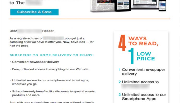
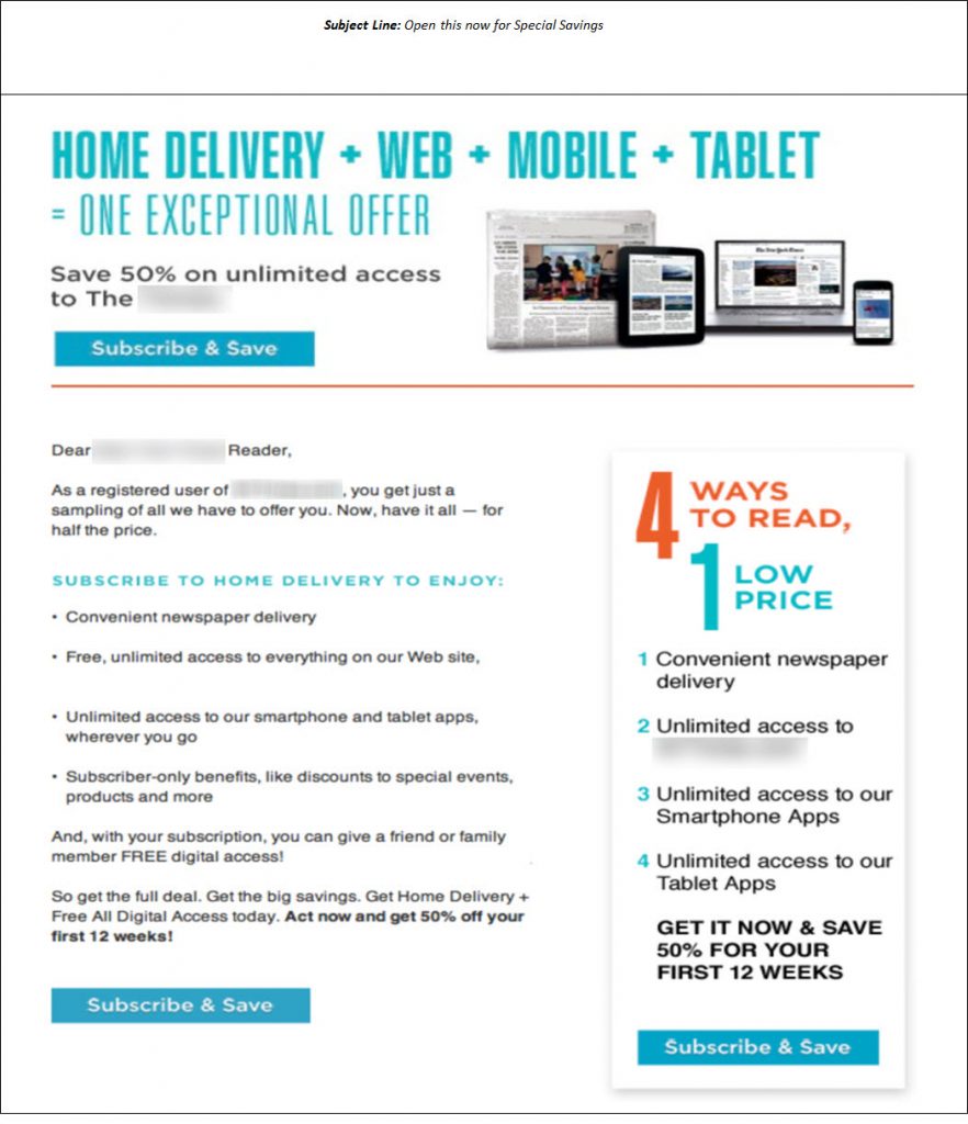
Control
The research team hypothesized the control featured popular design principles to create balance and hierarchy on the page.
The promotional-style email also featured heavy use of images and graphics to catch the readers’ attention and multiple call-to-action buttons for increased points of entry.
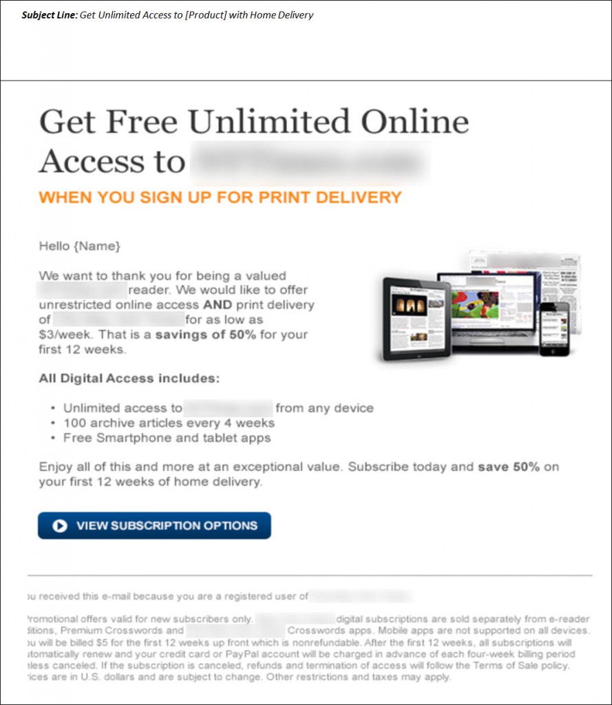
Treatment
In the treatment, a letter-style email was designed to look and feel more like a personal letter. The design limited the use of graphics and images and featured a single call-to-action button.
Results
What you need to know
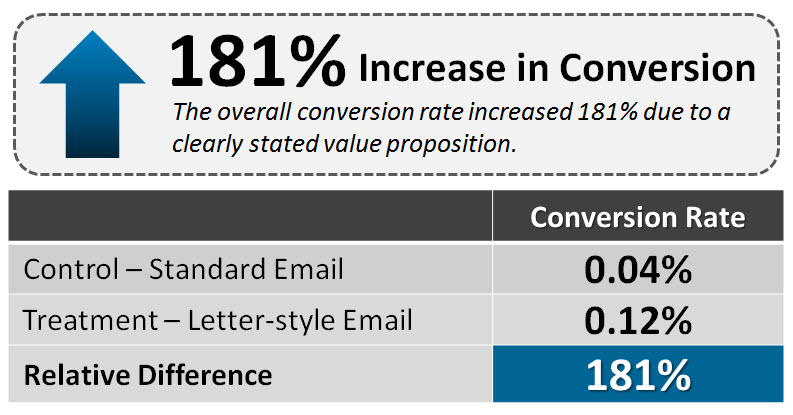
By limiting the amount of graphics and focusing on engaging the customer in a conversation, the treatment outperformed the control by 181%. To learn more about why the letter-style email beat the promotional-style design, you can watch the free on-demand MarketingExperiments Web clinic replay of “Are Letter-Style Emails Still Effective?”
Related Resources:
Email Marketing: 7 resources for email optimization
Email Copywriting: Tips from 3 of your peers
Email Marketing: Learn from 3 A/B test results to set a firm foundation for your next campaign


I have been wondering about which type of email converts better recently, so finding your article was very helpful. Thanks!
It seems to me that your target audience will affect whether you choose a promotional or letter-style email. New York Times subscribers are probably motivated by different CTAs, etc. than someone looking to purchase debt consolidation services, for example.
I worry about this test.
If I put cereal in front of my kids each morning(control) they deal with it and assume it to be norm. Throw bacon at them(treatment) and they perk up. Even tell mom(share) that dad made bacon. A/B testing in 1 thing and this test just seems like you compared apples to oranges.
With that said. 181% conversion when you put Oranges infront of your audience is awesome and should probably spend more time putting variety on the table.
(Is anyone else hungry?)
Here’s why the letter style email received a higher click – through and conversion rate: it specifically described what service the company provides to the reader, and specific benefits the reader would receive by responding to the company’s subscription
offer.