

Whenever I work with a Research Partner that is involved in e-commerce, I always come across problems with the product details page. A potential customer’s experience here should not be much different from the moment you pick up an item at a store and look at it. Imagine it:
- You’re browsing the aisles of your favorite store, going from category to category
- Finally, you see something that gets your interest
- The price doesn’t stop you from picking it up – you could buy it today, or come back next week when you get your paycheck
This is it…
- Do you put it in your cart or put it back?
- If you put it back, why? Does the price now start to look expensive seeing what you actually get compared to what you’d pay?
- Do you put it down and pick up a competing brand? Or do you look at both at the same time?
- Or do you decide it’s worth the money? Do you see yourself using it, feeling good about the purchase?
This happens on e-commerce sites just as much as it happens in stores. The only difference online is that the website is usually the one responsible for the final packaging/presentation of a product, whereas in a retail store they are mostly just responsible for placing the already packaged product on a shelf.
The challenge with e-commerce product template pages
We discovered this was an area of opportunity with one of our well-known e-commerce research partners last year. You could easily add one of their many products to the cart without having to understand all its details, but a number of visitors were actually visiting the product detail pages and then NOT converting.
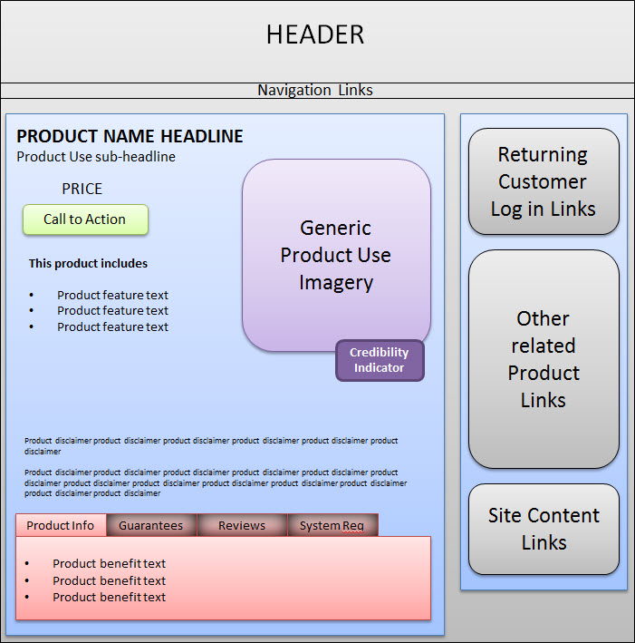
Here’s what their product details page looked like: (to protect their privacy, I’ve re-created the page in wireframe format)

Major areas for testing
I used the MarketingExperiments Conversion Index to determine what to test:

Here is what I determined:
- Headline only contained the product name and nothing else (-v)
- The call to action comes before the product value (-v)
- Credibility indicators are out of the proximity of the call-to-action (+a, -v)
- Primary product benefits, guarantees and testimonials are trapped in tabs out of the primary eye path that require an extra click (-v, +f)
- Product imagery is generic and does little to add /support its value (-v)
- Page tone was very technical and not conversational (-v)
The preliminary research question
Was the product no longer worth the price once they looked at its value? Or were visitors simply not able to see all the true value of the product BECAUSE of the Web page?
The test was designed to answer these questions. Since these particular products were part of our Research Partner’s signature line, we wanted to be sure that the product didn’t need optimization before the presentation. This was our way of finding out.
Will a radical, clear presentation of existing product value result in an increase in sales?
A new presentation approach
I remember brainstorming with our lead designer, Charlie Moore (to whom I owe much of my success), on this one. How could we take the existing product value and represent it so that potential customers don’t have to search and click to figure out if they want to make the purchase?
It wasn’t just the value itself that wasn’t being presented properly; it was the tone of the page as well. We had to take what looked like a very technical page and turn it into a product presentation that an everyday consumer could connect with emotionally.
This is what we came up with: (to protect their privacy, I’ve re-created the page in wireframe format)

Major changes:
- Used the primary product benefit in combination with product name for the headline (+v)
- We moved ALL the product benefit, guarantee and feature copy to the primary eye-path (+v, -f)
- All un-related links were moved to the header/footer area (-f)
- Supporting content found in the tabs were moved into the supporting column (+v)
- We used visual indicators to support value for visitors that like to quickly scan and improve the tone
- We focused each header on a primary benefit and supported with feature specific copy
- The call to action and product price was moved after the product value (+v)
- Credibility indicators were placed in closer proximity to the call to action (-a, +v)
Note: The only content we substituted in this treatment was visual indicators (for the generic imagery) and page colors. The rest of the content was available in some form or fashion on the control.
Promising Results
It only took us ten days to discover that there was a difference between these two pages statistically. The treatment outperformed both the control and double control with an 83.79% increase in product sales (not just add to carts).A double control is a technique high-traffic, high-converting use (essentially splitting traffic to two identical control pages as well as a set of treatments) to determine normal variance as well as defend against validity threats, such as instrumentation effect.

I wanted to run some follow-up tests to try and understand exactly which elements had the most impact on these particular consumers (was it the visual indicators, the testimonials, etc.?) but ultimately I learned that the combination of these elements, all related to quick, clear product presentation, resulted in more sales – sometimes the most important things you can learn from a multivariate test.
Just like in re-creating that perfect cup of coffee, I desire to try and re-create the experience by understanding just how much cream, sugar and black coffee (at what concentration) goes into that perfect, addicting taste with further testing. But at this point, we had driven a significant sales gain, and the battle was won for the day.
Are you paying attention to your product pages?
If you’re in e-commerce, pay attention – The product details page template often times has the most influence on the product purchase decision.
While customer demographics, interests and motivations will vary, what remains constant is that customers must be able to quickly and clearly judge if your product is worth the price you put on it. The more roadblocks you place in their way to making this decision, the more likely they will run away from your product prematurely.
Related Resources
What Else Can I Test…On My E-commerce Or Lead Generation Website?
E-commerce Shopping Carts: How a redesigned checkout process led to 13% increase in conversion rate
Homepage Optimization: Creating the best design to quickly meet multiple visitors’ needs
What Else Can I Test to Reduce Shopping Cart Abandonment Rate?