Through many tests, we have learned that it is critical to give people a reason to click. If we want visitors to contact us or add a product to the cart, we have to provide them with valuable information upfront. Positive and benefit-oriented calls-to-action, for example …
- “Get your free trial”
- “Secure checkout”
Tend to perform better than simple and command-oriented calls-to-action, for example …
- “Submit”
- “Click here”
Almost all of the time. (I say “almost all of the time,” because there are always exceptions to the rule.)
Are your social media calls-to-action benefit oriented?
The same logic should apply to social links on our websites. It’s true, social media logos can be placed anywhere on the site and people will, for the most part, know what they are for. But, try to put yourself in the shoes of your customer for a moment, look at your social media buttons and ask yourself these three questions:
- Will they know why specifically they should follow or like you?
- What if they knew upfront what you offer?
- Would you gather more relevant fans/followers?
What is the value proposition of your social media channels?
If growing your social media following is an important company goal, I think it critical to test social media calls-to-action.
By doing so, you would have to necessarily go through the exercise of defining a specific purpose for each of your social media channels.
As a bonus, this kind of testing will help you identify what connects better with your target group. In result, you will be testing the value proposition of your social media channels. To help give you some ideas for your next test, here are some examples …
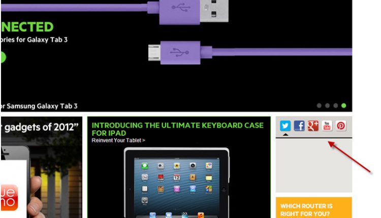
NOT THIS
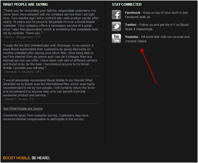
BUT THIS
Have you tested your social media links? Let us know what has worked for you in the comments section of this blog post.
Related Resources:
Social Media Optimization: Engineering contagious ideas
Social Media Marketing: A quick look at Facebook EdgeRank
Social Media Marketing: Going viral is so easy it’s hard
Social Media Marketing: Is in-stream e-commerce possible?
Social Media Marketing: 4 questions to ask yourself about social media buttons


This is a great post and it caught my eye because I just wrote on the same topic of social media buttons, although my post was focused on the idea that having fewer of them is better than crowding out the page with 10+ social buttons. What you point out compliments that idea very well. Therefore, I think the perfect solution is to have a FEW social buttons WITH a call-to-action on the page. Great article!
Once social buttons are on the website, highlighting that social use sometimes falls to the side. Writing content that drives traffic that way, such as highlighting a twitter conversation, reminds people it exists but also provides great incentive to look at and follow the account, since they’ve now seen it in action.
Thanks for this insight. Now I know why my social media buttons never are being used! The next problem is though where to find room on my webpage for all this text, because now I consume only limited space with only buttons. I have to experiment with this.
Many thanks for this.
I know my social buttons are hardly used.
I’m going to have a rethink of things.
Great article. I have to rethink how to use my social media buttons on my website. Thanks.
Great Article. We have just tested all our social media buttons and reviewing the anyltics