

Taking a cue from our clinic participants’ feedback, and heeding our own advice, we tested a “radical redesign” with our February 11, 2009 live optimization web clinic.
The focus was strictly B2C landing pages, a departure from our typical all-inclusive approach. With that audience in mind, the MarketingExperiments team also lightened up the science with a contest, live audience voting (“Optimization Idol”?), and a variety of prizes for participants.
Result? Most of the audience rated the clinic fun, informative, and highly interactive—the test was a success. And though it’s impossible to recreate that live event in a written research brief, we’ve summarized the critiques and takeaway ideas here, and augmented the session with five additional B2C landing page analyses on the MarketingExperiments Blog.
In addition to the print–friendly research brief below, you can:
The Landing Page “Optimization Idol” Contest
We asked clinic registrants to submit a landing page, the top performing channel for the page, and the page’s target audience.
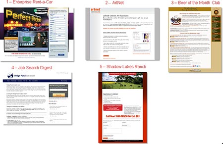
From the dozens of submissions, our team selected a group of five finalist landing pages that were optimized during the live clinic by Aaron Rosenthal, Director of Channel Research, and Jimmy Ellis, Director of Optimization Research. We also sought feedback from the live audience.
Five other contestants that made it to the “elimination round” were optimized by our analysts; those landing page analyses were posted to our blog.
To evaluate each page and channel, our team used the MarketingExperiments Conversion Sequence to determine if the objective of the offer was developed throughout both channel and page.
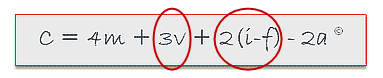
Wherein:
“C” = Probability of conversion.
“m” = Motivation of user (when).
“v” = Clarity of the value proposition.
“i” = Incentive to take action.
“f” = Friction elements of process.
“a” = Anxiety about entering information.
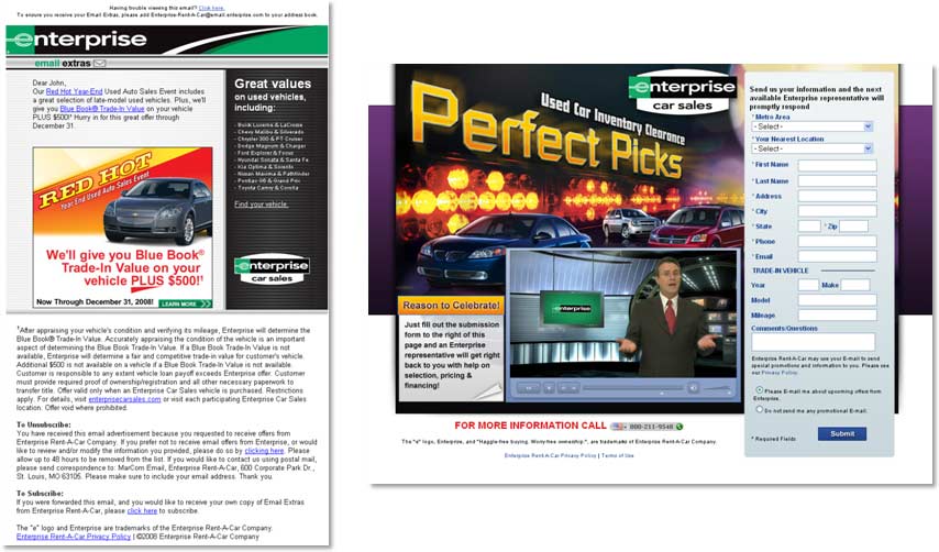
Contestant 1: Enterprise Rent-a-Car
Company name: Enterprise Rent-a-Car
Submitted by: Sarah Ruot
Primary channel: Email
Ideal prospect for this landing page: Potential car buyers
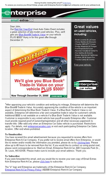
Email:
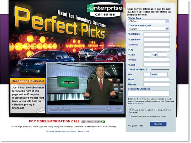
Landing Page:
Aaron Rosenthal: The first thing I notice is that this page offers multiple calls to action to get users to click but no call to action is specific or clearly identified. Asking people to click on the banner or click on hyperlinks is not a clear call to action. Also, after the top 50% of the email, all I see is legalese, which translates to reasons why you don’t want me to come to your site, and “How can I unsubscribe?”, which totally puts me on edge and scares me from clicking through on this email.
In the transition from the email to the landing page, there’s an immediate disconnect and, once I get to the landing page, I’m not even sure that it’s the right place I clicked through on. My motivation for clicking through was red hot deals and saving as much as $500 but now I see “Perfect Picks” and this gentleman down at the bottom of the page who’s part of a video you want me to watch. It just doesn’t connect with the messaging I clicked through on.
Jimmy Ellis: In terms of email, you’re going to hear from us over and over again: the objective of your email is just to get the click. And the simplest, clearest way that you can communicate your offer and not overwhelm your prospect with options is often the most effective way just to get a click.
Along with the multiple calls to action, I’d point out that the banner image looks like a third-party ad and people may not realize it’s a place they can click. If you’re looking at the ad, you’re expecting to see a “Red Hot End of Year Sale Event” and to “Get your Blue Book Trade-in Value plus $500!” So, when you get to the page, you want to see something that references the year-end sale and the blue book values. If I don’t see that on the landing page, you’ve just lost me.
Instead, when I go to the landing page, suddenly I see “Perfect Picks.” Immediate disconnect. Then, instead of learning more about the offer, I see a form that I have to fill out.
Aaron Rosenthal: The form says, “Send us your information and we’ll have the next available rep contact you.” But why do I need to give all this information? To contact me, you could use a much simpler, less detailed form. Much of the information that’s on the form now is information that Enterprise should be asking for further along in the lead cycle. And, when you ask them to give personal information, give them a reason as to how you can help them further in return. For example, when asking for a physical address, say, “Help us determine if there are any cars in your area.”
Jimmy Ellis: My guess is that they already had the “Perfect Picks” page and, when they began the special blue book deal, they combined the email with the already established page.
Recommendations:
Jimmy Ellis: A company with resources like Enterprise should spend the effort to do a dedicated landing page for each email. You must match up emails and pages and have continuity in what you’re doing.
Aaron Rosenthal: I agree. The disconnect between these two is so strong that it’s like one email was supposed to go to this landing page and this email was supposed to go to another offer.
Contestant 2: ArtNet.com
Company name: ArtNet.com
Submitted by: Boris Bauer
Primary channel: PPC
Ideal prospect for this landing page: Art lovers and art collectors
PPC:
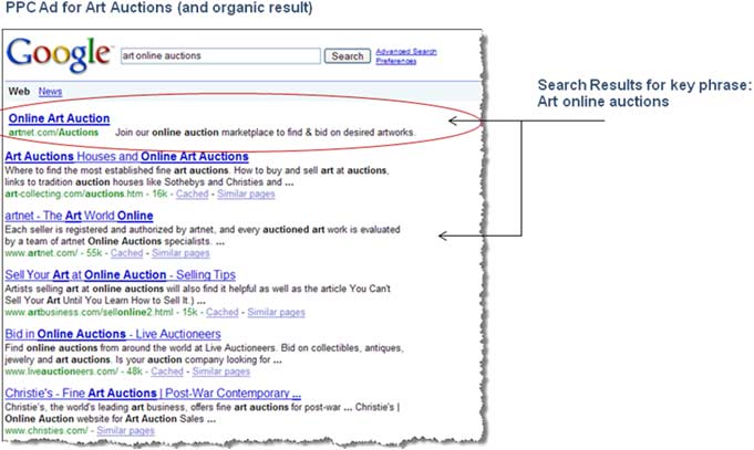
Aaron Rosenthal: My initial feedback on this ad is that it is well written and you’re matching up the motivation to the body copy, but you’re not doing a great job of telling me why I want to click. You’re not telling me what you do better than any of your competitors. What makes you different from any of the other online art auction houses on Google?
Jimmy Ellis: Let’s say you had 1,000 keywords that you wanted to use to get people to click but you could only write one ad to use for every single one of those keywords. This would be the ad. The problem with this is that this strategy simply does not work. Research shows the more specific you get with your key words in both your ads and your landing pages, the better results you’re going to get.
Also, your ad copy says “Join” and that sounds like I’m going to have to pay to join your online auctions as opposed to just participate in an online auction.
Landing Page:

Aaron Rosenthal: Unless I’m familiar with Artnet.com, your headline doesn’t give me very much to go on. Your sub-headline is well-written copy but any one of your competitors in the marketplace could make that very same statement.
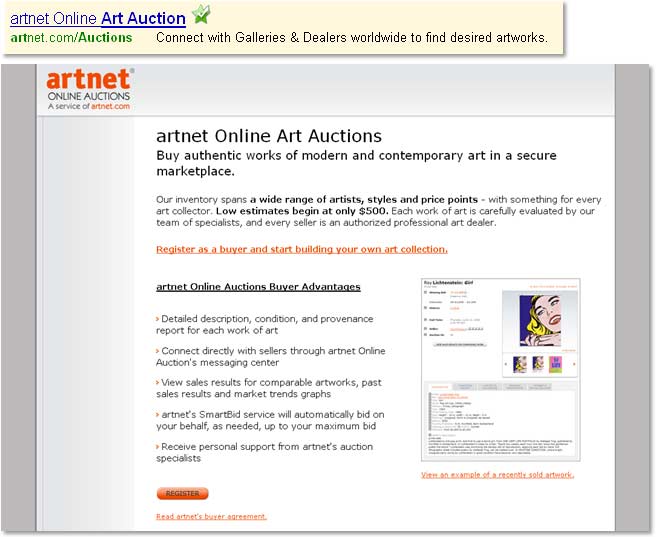
Recommendations:
Jimmy Ellis: I’d recommend some simple changes involving your registration form. The word “Register” implies that people are going to have to pay to join. Consider changing your button to “Get Free Access” or something similar and I think your registration rates will really improve. Also, if there is a registration form, consider moving it to this page, instead of a second page, so you can simplify the process.
Aaron Rosenthal: One of the first things you need to do is do some soul searching and understand what it is about your company that makes you different from other online art auction houses. Then you need to work on communicating that through your value proposition.
A second thing I’d recommend is to test specifics in your ad copy and on your landing page. Work with quantifiable numbers. How many pieces of art have you sold to satisfied customers? What kind of art do you specialize in? How many auctions do you run in a given period of time? I’d test an ad that specifies that you have auctions starting under $500 and see what sort of response you get.
Contestant 3: Beer of the Month Club
Company name: C and H Clubs USA, Inc.
Submitted by: Jason Sweeney
Primary channel: Email
Ideal prospect for this landing page: Former gift giver/receiver, customers from all our clubs
Email:
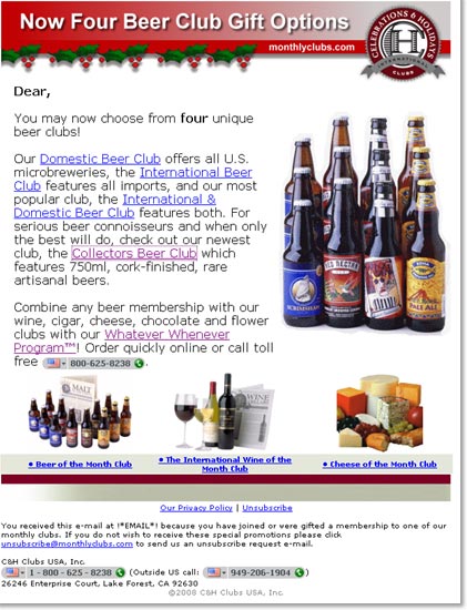
Aaron Rosenthal: The problem I have with the email is that it’s not focused enough on a specific need. The stated purpose of this email is to re-engage customers who have already been to your site before but this email gives lots of different offers for different products. The way that you want to re-engage customers is to speak to them specifically about what they purchased from you last time, especially with what they liked about that order. Offer them a promotion or a discount that builds off what they may have found successful about a previous order. At first glance I would have thought that this email was going out to a mass email list that the company has rented.
Jimmy Ellis: The first thing you want to do is remind customers that they have an ordering history with you and build on that existing trust. If possible, add the specific order history to the personalization: “Dear Aaron Rosenthal, Last spring you gifted your friend Jimmy Ellis with 47 cases of beer and this year we’d like to offer you a discount of ”
Landing Page:
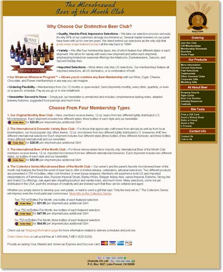
Aaron Rosenthal: You’re trying to do too much with this landing page. Your email was a “reconnect” email and it needs to go to a specific reconnect landing page. Be aware that you have a very light-colored page but then your right navigation bar is this very heavy color that draws people away from the primary message of your page that you want them to see.
Also, when you’re offering different membership types, you want to be very specific about what you get with each of these different types. This is something that applies to any marketer offering different products or different levels of service. What exactly do you get when you’re spending $8 more a month or $12 more a month?
Recommendations:
Jimmy Ellis: If we have to show different levels of membership on a single page, we often use a chart or a graph to visually demonstrate the differences between the levels. Another thing that’s worked well on past tests is that if you emphasize an offerthe one that’s worked best or the one that makes the most money for youmake it very clear by using a graphic or highlighting it more. Emphasize one and, if there’s not a huge difference in price, you’ll often find that you’re selling more of the one that is emphasized.
Aaron Rosenthal: If you’re looking for a good example of the kind of chart that Jimmy’s referring to, a lot of times web-hosting companies use them because they have multiple packages.
Contestant 4: Job Search Digest
Company name: Job Search Digest
Submitted by: David Kochanek
Primary channel: Organic search
Ideal prospect for this landing page: Hedge fund professionals looking for an analyst job
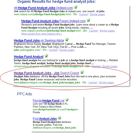
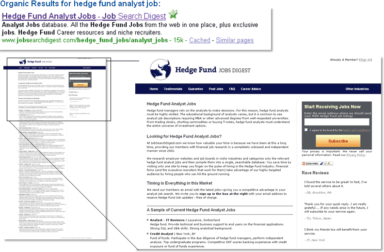
Organic Search Results:
Landing Page:

Jimmy Ellis: When I get here and I scan the page, I see hedge fund analyst jobs, which is good, because you’re making the connection from your listing, but there’s absolutely no value proposition here that’s clear. The headline is weighted evenly with the sub-headline all the way down the page, nothing stands out, there’s no bullet points that I can scan, and there’s no connection as to why, even if you guys offer jobs, I should use your service to find them.
The only call to action on the page is in the top right, there’s not a single call to action on the left-hand column. If you look at the call to action, you can see that it says give us your email now and we’ll send you a free listing of hedge fund jobs. So they’ll send you FREE job listings but you don’t know that until after going through the evenly weighted list and column and reading the fine print underneath the subscribe button.
Aaron Rosenthal: This page looks like someone used the results of a natural search page and turned them into copy, trying to appeal to the Googlebot and get people to come to your page. This page reads very analyticallynothing is weighted more than the sentence before it. Play with headlines, sub-headlines, and bulleted copy to guide the visitor down the page.
Recommendations:
Jimmy Ellis: Start with a headline that mentions the free offer and the precise number of jobs. I’d also make sure that your page includes specific details such as ratings, testimonials from satisfied customers, and credibility seals. Since your call to action is free, consider whether or not you really need all that copy.
Aaron Rosenthal: Another thing I would do is take your call to action and embed it two or three times within the long copy. And, as one of our clinic participants suggested, change the copy on your button so that it says “Subscribe for FREE” or somehow emphasizes the free nature of your offer.
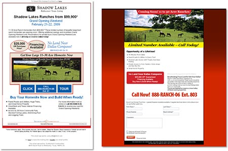
Contestant 5: Shadow Lakes Ranch
Company name: Shadow Lakes Ranch
Submitted by: Julie Pitts
Primary channel: Email
Ideal prospect for this landing page: Male/Female 45-65 years old, interested in acreage community for primary residence, retirement or investment
Email:
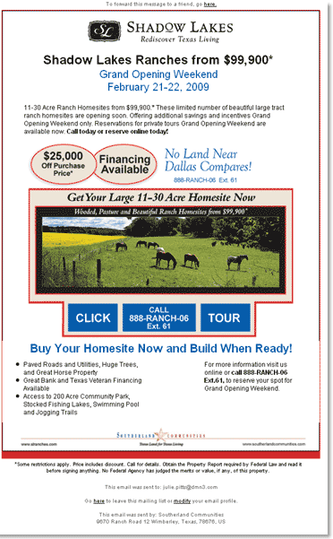
Jimmy Ellis: Determine the objective of your email and your landing page. Typically you want your email to get a click and the landing page to do the selling and heavy lifting. This email looks like a landing page and is doing too much selling. I can’t figure out what I’m supposed to do on this email because it says “call today” or “reserve online” and when I look for “reserve online,” I can’t find it. The blue boxes in the middle I guess are links but I can’t tell. Then you mouse over and find out that “click” and “tour” are clickable and the phone number is not but they are identically designed. So for the email, not a single element looks like a link or button and they are trying to do too much.
Aaron Rosenthal: All the terms and conditions of this offer are on the email when they should be on the landing page. You can always do a better job of selling on your landing page because you’re not limited by all the constraints placed upon you by email.
Landing Page:
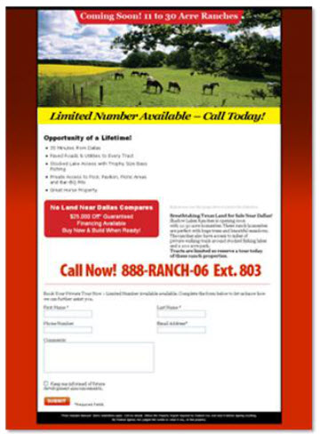
Aaron Rosenthal: This is a great example of trying to do too much in the email and not enough on the landing page. On the landing page, instead of supporting your offer, you’re just asking people for their personal information.
Jimmy Ellis: Landing page… Instant disconnect. The email says “Grand Opening Weekend” and the landing page says “Coming Soon” as in “they are not done yet”. Email says “Shadow Lakes Ranches”, but the landing page does not even mention the name on the page.
The peaceful scene of the ranches with the horses that initially makes you think this is a serene, relaxing place is now met with an annoying yellow flashing banner. Basically your image says one thing and your banner is contradicting it.
The layout and flow of the page is not simple and easy to digest. The intro top image, while good in some instances (like this where it communicates value prop), is still taking up too much space and pushing the main offer down the page. I don’t know how to process the page because you have some sort of headline, strong image on the right, strong red box below bullets, additional text below image on the right, etc. For a relatively simple page, it “feels” pretty complex.
Recommendations:
Jimmy Ellis: The strongest recommendation I could make would be to work on the continuity between your email and your landing page. For one thing, the backgrounds don’t match and, for another, you mention the price and the name of the ranch in your email but do neither of those things on the landing page.
Aaron Rosenthal: I notice that there’s a short form on this page so I assume that you’re collecting information. Do your sales team a favor and start to pre-qualify leads by asking simple questions on this step and asking additional, qualifying questions on the next step to help your salespeople better follow up with leads. If people fill out the second page and they answer a certain sequence, your salespeople will know that they have a hot lead and they’ll follow up with those leads right away.
The Final Vote—Live Poll
We asked our audience to vote for their favorite landing page from among the five contenders.
The Winner
The winner of the audience poll, with 39% of the vote, was the Beer of the Month Club. While their product may have given them an edge with the audience, the site also had the strongest potential for effective optimization through relatively simple changes in copy and design.
Our Grand Prize Winner—The Audience Favorite—won a Landing Page Assessment, valued at $5,000.
What is a Landing Page Assessment?
- An intensive point-by-point breakdown of your current landing page using the MarketingExperiments Conversion Sequence
- Specific recommendations for testing and improving this page and relevant channels
- One-on-one meeting with a research analyst who will walk you through the recommendations
- A recording of the meeting and recommendations that you can share with your team
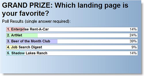
ArtNet.com, the online auction site, came in second. Clinic participants noted that, for an art site, it was visually uninteresting but that images and a clear value proposition would make it more accessible for prospects.
Enterprise Rent-a-Car and Shadow Lakes Ranch, two very different landing pages (one with a high-tech feel and one emphasizing the virtues of rural life), tied with 14% of the vote each.
Finally, Job Search Digest netted 9% of the vote, possibly because their offer is very niche-specific and required very little optimization outside of emphasis on their primary offer.
The four runners-up chose either:
- Two passes to our Landing Page Optimization Workshop in Miami on March 15, a $2,000 value or
- One MarketingExperiments online certification course, a $1,000 value
Transferable Principles for B2C Landing Pages
- Review your pages to determine if your value proposition and calls to action are explicit (look for how you declare them in headlines, subheads, buttons and images), rather than implied.
- Maintain continuity between channel and landing page to fulfill visitor expectations and increase the likelihood of clickthrough.
- Increase prospects’ awareness of your value proposition by emphasizing the quantifiable virtues of your product or offer.
- Test length and placement of forms with the ultimate goals of improving eye path and easing friction for your prospects.
Related MarketingExperiments Reports:
- B2C Landing Page Optimization — Live Clinic, continued (Blog)
- Marketing Blueprint 2009
- Value Proposition
- Optimizing Headlines and Subject Lines
- Optimizing PPC Ads
- Optimizing PPC Ads, Part 2
- Clarity Trumps Persuasion
- Finding the Ideal Incentive
- Email Optimization
- Lead Generation
As part of our research, we have prepared a review of the best Internet resources on this topic.
Rating System:
These sites were rated for usefulness and clarity, but alas, the rating is purely subjective.
* = Decent | ** = Good | *** = Excellent | **** = Indispensable
- Landing Page Tutorials and Case Studies ****
- 10 Landing Page Optimization Tips ***
- Landing Page Optimization **
- Landing Page Optimization, Part 1 **
- What to Expect After a Site Relaunch **
Credits:
Managing Editor — Hunter Boyle
Writer(s) — Anna Jacobson
Contributor(s) — Flint McGlaughlin
Jimmy Ellis
Bob Kemper
Aaron Rosenthal
Production — Austin McCraw
Cliff Rainer
Amanda Mehlhoff