At MarketingExperiments, we define friction in a conversion process as a psychological resistance to a given element in a sales process.
If you’ve ever waited in a long line at a theme park in July, that’s friction personified. It’s the hot and sweaty agony that makes a customer ask themselves, “Why am I doing this?”
I should also add that not all friction is avoidable, but a large concentration of it can be reduced through a little testing and optimization.
In today’s post, I wanted to share with you a recent experiment to identify and reduce friction, which you can enjoy with no lines or waiting.
Before we dive in, let’s review the background notes and give the experiment a little perspective and context.
Background: A large news publication.
Goal: To increase clickthrough rate.
Primary Research Question: Which landing page will generate the most clicks?
Approach: A/B multifactorial
Side-by-side
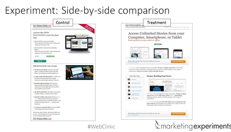
Here are the pages in the experiment together.
During a preliminary analysis of the control, the MECLABS research team hypothesized the control page’s long-form layout style was impacting performance.
As you can see, the bullet points help organize the copy, but their sheer number creates a wall of text.
For the treatment, the team organized those bullets into a tabbed navigation, allowing the customer to click on what is relevant to them in an effort to help guide the conversation toward a subscription.
They also removed the video and added a second call-to-action.
How did the treatment stack up?
Results
The treatment outperformed the control by 173% at a 99% level of statistical confidence.
What you need to know
The short and sweet here is friction exists in every element on your landing pages, and you have to work relentlessly to identify and reduce it.
I say this because, ultimately, customers are not just subscribing to your product or service; they are subscribing to an expectation of an amazing experience.
This experience, might I add, is best built with as little friction as possible (and hopefully no turnstiles).
To learn more about how friction factors into your efforts to convert subscribers, you can watch the on-demand Web clinic replay of Optimizing Subscription Paths:
You may also like
Landing Page Optimization: Leveraging perception to tip the value scale (Part 1) [More from the blogs]
Landing Page Optimization: Leveraging perception to tip the value scale (Part 2) [More from the blogs]
Why Subtle Changes in Button Copy Can Significantly Influence Clicks [More from the blogs]


