Data is officially everywhere. It’s even infiltrating the design of emails — and for good reason.
“The more you know about your audience, obviously the better you can tailor an email design to someone,” Justine Jordan, Marketing Director, Litmus, said.
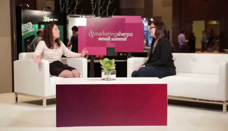
Justine sat down with Courtney Eckerle, Manager of Editorial Content, MarketingSherpa (sister company of MarketingExperiments), at MarketingSherpa Email Summit 2015, to discuss what tools marketers can access to better their email creatives.
When asked what is the biggest asset email marketers have when designing their next email, Justine answered data.
“Data can be a really powerful tool for helping a designer decide how to layout their campaigns,” she said.
Watch the whole interview here:
How can data make design better?
In the interview, Justine shared a few types of data that can benefit email designers:
- What people have looked at in the past
- What kind of email services people are opening up
- What type of content has resonated with clients in the past
When asked how one of these could be applied to campaigns, Justine talked about technical compatibilities. For instance, GIFs don’t work properly in Outlook 2007. By using past data, you can know beforehand if a portion of your readers use that email service. If they do, and you use a GIF, then your email campaign won’t be as effective as it would have been if you had segmented that audience to use a more Outlook 2007 friendly design.
How can testing make better designs?
Justine went on to discuss more than just data. She also talked about the power testing had for marketers and her team of designers.
“I love to design creative because I think it empowers designers to really see they’re not just creating art, [but] they’re creating something that helps the bottom line of their business,” she said.
According to Justine, the testing possibilities are limitless, but some of her favorites are button and imagery tests.
For buttons, consider testing color. Color can greatly impact how your audience interacts with an email or webpage. Research analysts at MECLABS, parent company of MarketingExperiments, have done research on this. To learn more, watch the Web clinic replay, “How Do Website Colors Impact Conversion? New research reveals 5 critical mistakes designers make with color.”
Our teams have also tested around imagery, including an experiment that tested a product image against stock photos of different ethnicities.
You can follow Selena Blue, Manager of Editorial Content, MECLABS, @SelenaLBlue.
You might also like
MarketingSherpa Summit 2016 Call for Speakers — Share your story next year from onstage
Watch Justine Jordan as part of a panel session on the elements of email at Email Summit 2015, along with HD video of 14 full sessions from the event
Email Marketing: Dell lifts revenue 109% via GIF-centric campaign [More from MarketingSherpa]
Email Research: The 5 best email variables to test [More from the blogs]


