Happy Halloween to our MarketingExperiments audience, (and Sláinte ar Samhain) for those of you who are really into it!
Today’s holiday is a chance to highlight a great point that comes to mind when using an evidence-based approach to your email marketing. Increasing conversion through testing can seem almost indistinguishable from magic when done right.
Let’s take a look at how the email necromancers on the MECLABS research team tested a simple color change in an email design and what we can learn from the results.
Before we get started, here’s a quick review of the research notes for a little background on the experiment.
Background: An Italian e-commerce site offering natural beauty products.
Goal: To increase the clickthrough rate of email campaigns.
Primary Research Question: Which email design will yield the highest clickthrough rate?
Approach: A/B split test (variable cluster)
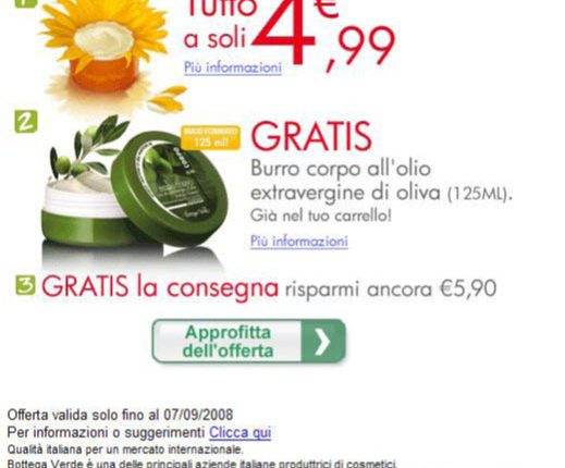
Control
In the control, the MECLABS research team identified a key incentive was the offer of free shipping.
The team hypothesized the color emphasis placed on the free shipping element in the control email underutilized its full value to potential customers.
Treatment
In the treatment design, the team removed the free shipping from the ordering sequence. They also included a shipping box image set against a green background and changed the color of the free shipping copy from red to white.
Results
What you need to know
By using color to change the emphasis on the incentive, the treatment outperformed the control by 48%.
To learn more about research discoveries that explore the relationship between color and conversion, you can watch the free MarketingExperiments Web clinic replay of “How do Website Colors Impact Conversion?”
Related Resources:
Email Marketing: Promotional vs. letter-style test increases conversion 181%
Email Marketing: 7 resources for email optimization
Email Marketing: Learn from 3 A/B test results to set a firm foundation for your next campaign


