Radio buttons or dropdowns?
The question is arguably on the borderline of arbitrary, but as we discovered, this choice is far more important than one might think.
During a recent Web clinic, Austin McCraw, Jon Powell and Lauren Pitchford, all of MECLABS, revealed the results of an experiment that put button options to the test.
So, let’s take a closer look at the research notes for some background information on the test.
Background: A large people search company catering to customers searching for military personnel.
Goal: To significantly increase the total number of subscriptions.
Primary Research Question: Which subscription option format will produce the highest subscription rate: radio buttons or a dropdown menu?
Approach: A/B single factorial split test
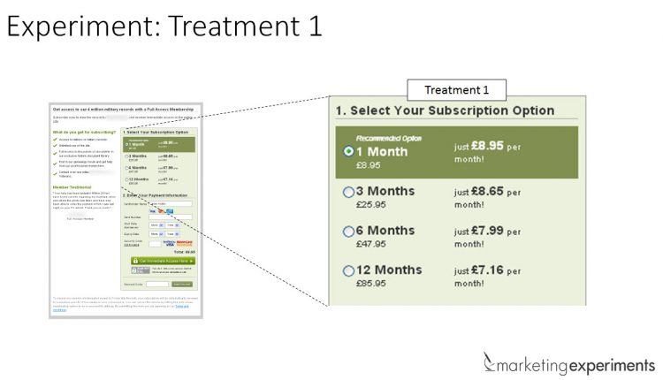
In Treatment 1, the research team hypothesized that the length of the radio button layout was a source of user friction in the form.
Editor’s Note: For the purposes of the MarketingExperiments testing methodology, friction is defined as “a psychological resistance to a given element in the sales or signup process.”
In Treatment 2, the team tested a dropdown style option selection to reduce the perceived friction in the display.
What you need to know
In this case, the radio button option outperformed the dropdown by a relative difference of almost 15%.
Although we usually feature testing that statistically validates at 95%, this is a great reminder of how testing and optimization works when applied in the real world.
Ultimately, it’s all about how confident you are in your results or as Anuj Shrestha, Data Scientist, MECLABS, explained in a previous post, “The reason statistical significance is so important in experimental testing is it quantifies the amount of risk that one is willing to take in drawing inferences from a test.”
To learn more about why the radio button outperformed the dropdown layout, watch the free on-demand Web clinic replay of “Radio Buttons vs. Dropdowns” for testing insights from the MECLABS research team you can use to aid your own conversion rate optimization efforts.
You may also like
LPO: How many columns should you use on a landing page? [More for the blogs]
Radical Redesigns: Lifts vs. building customer theory [More from the blogs]
Prominence: Design and layout lessons from Windows 8 [More from the blogs]


Thankful for MECLABS and others that share test results for others to consider and experiment with as well.
Any reason for stopping this test at 92% statistical significance rather than 95%+?
Hi James,
Great question! I followed up with the research team on your question and they explained that one of the reasons fueling the decision to end the test at 92% is that these were only two out of three pages being tested. Basically, a test within a test. Consequently, the Research Partner did not want to shut down the underperforming control prior to having a treatment set up to fully accommodate their business needs.
So a confidence level of 92%, (while not the typical 95%) was a high enough confidence level for the business to make a decision based on the results.
I hope this helps. 🙂
thanks,
John Tackett
Thanks for the response John.