The start of a new year gives savvy marketers another chance to push exploring your customer’s theory even further. In today’s MarketingExperiments Blog post, I want to welcome 2015 by sharing with you a simple product page test from our last Web clinic you can use to aid your marketing efforts.
Before we dive in further, let’s look at the background on the experiment:
Background: A mid-sized furniture company selling mattresses online
Goal: To increase mattress purchases
Research Question: Which design will generate the most online purchases?
Test Design: A/B variable cluster test
Side-by-side
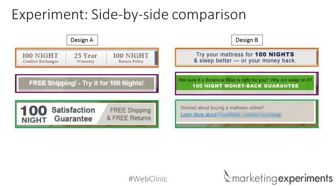
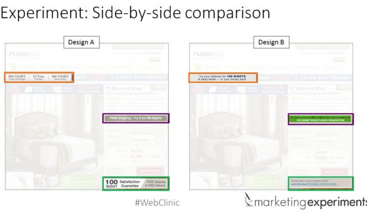
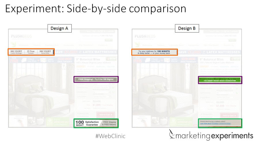
Here’s a side-by-side split of the two designs and the variables being tested to help give a little context to their placement on the page.

As you can tell from the comparison here, Design A was centered on an approach that used less text, with copy that placed emphasis on a low risk trial, free shipping and returns as well as a 25-year warranty.
The copy in Design B takes a more conversational tone, with prospects to help reduce anxiety and provide reinforcement on the money-back guarantee.
Results:
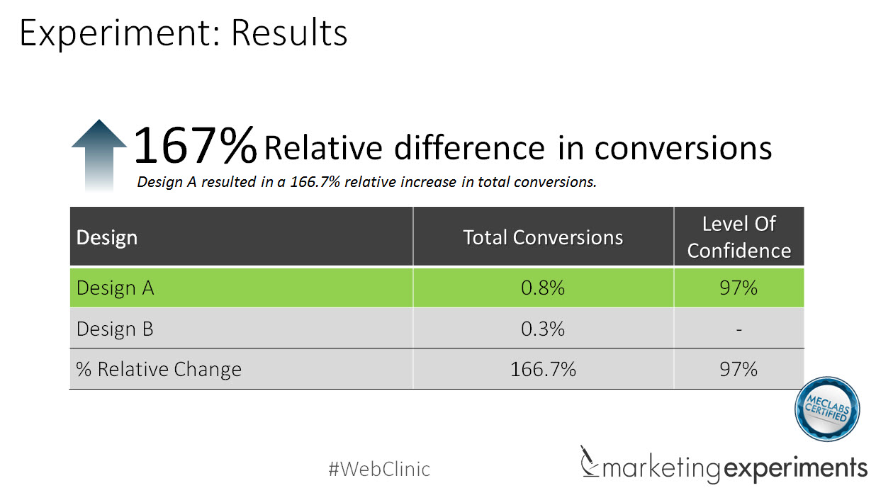
Design A outperformed Design B by a 167% relative difference in conversion that validated at a 97% statistical level of confidence.
As Flint McGlaughlin, Managing Director and CEO, MECLABS Institute, explained in the Web clinic, “The first thing to note is that’s a dramatic difference and not a near difference. Something very important is going on here.”
What you need to know:
If you want to blow their minds, starts with designing tests intended to blow their minds.
At the end of day, it’s not the degree of changes on a page that drive a difference. We could test 10 more design versions chalk full of adjustments and get nowhere or see an even bigger lift.
Driving a true impact from testing ultimately means placing all the focus on discovering changes that impact the minds of your customers. That means taking a customer-centric “look” at your site and possibly even reaching out to someone who isn’t familiar with your site design or navigation, such as friends or family, or even conducting some informal research with engaged customers to understand their challenges or frustrations for the page you are testing.
If you’re interested in learning more about how testing and optimization can aid your marketing efforts, feel free to check out today’s newly released Web clinic, “Special Live Optimization Session.”
You may also like
Email Marketing: How content and testing boosted revenue 114% at IAC subsidiary HomeAdvisor [MarketingSherpa case study]
Email Marketing: Education group utilizes A/B testing to increase open rates by 39% [MarketingSherpa case Study]
Testing and Optimization: How to get that “ultimate lift” [More from the blogs]


John, maybe I’m not seeing enough of the details of this test, but I would think the link in Design B (“Learn more about…”) would very likely cause a drop in conversions. A good follow-up would be to test the new control against the same creative, but with Version B having the link sending them off this page, with no other changes.