Imagine for a second that you’re running a banner ad campaign on a website with a black background. Now, if you were going to choose a color for that banner to get more clicks, would you choose a dark shade of blue or bright yellow?
If you’re like me, you would have guessed yellow. Unfortunately for our marketing intuition, a recent test we ran with a Research Partner proves otherwise.
For this test, we ran two different versions of a banner offering a large financial institution’s branded version of a credit card, alongside a $50 gift card incentive. Essentially, if the visitor applied for the branded credit card (the same brand as the site on which the banner ad appeared), they could get a $50 gift card after making qualifying purchases. The test itself was an A/B sequential test.
–
First, the control:
–
–
And the treatment:
And the, the treatment
–
And, finally, the results:
–
-A
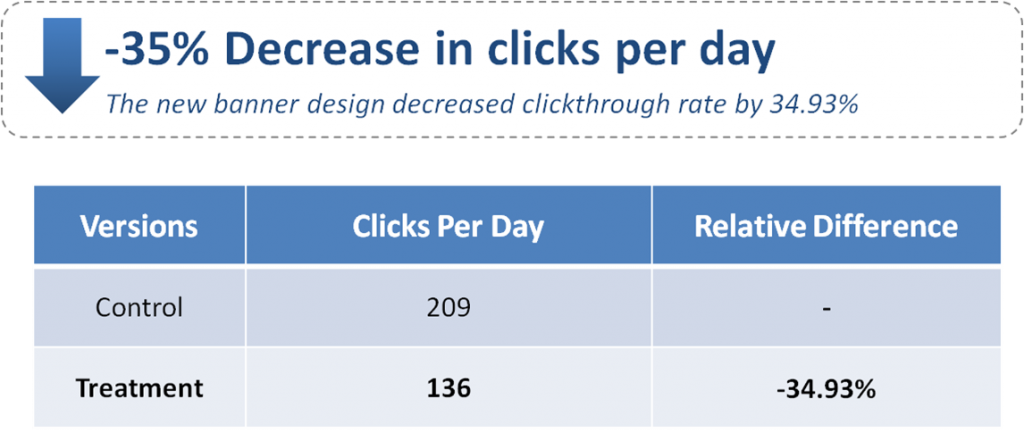
The results were pretty surprising. The yellow banner lost clicks! In fact, it lost 35% of the clicks. At this point, you’re probably wondering what happened. How is it that a banner which is obviously easier to read, and stands out against the site background, loses clicks?
–
What actually happened
Well here’s what we think happened…
In the first banner, the message isn’t as clear. Most of what the visitor sees is the headline for a “Free $50 Gift Card.” And because the picture is crowded under the text, it’s hard to tell that the landing page on the other end of the banner is actually a credit card application form.
In the second banner, thanks to cleaner lines and better contrast, it’s somewhat clearer that on the other side of this banner lies an application form.
The result is, of course, that less people want to click on a banner for a credit card application than a free $50 gift card. The clarity of the messaging, therefore, hurt the number of clicks.
–
“But wait, there’s more!”
Of course if that was the end of the story, we’d simply have to go back to the drawing board with a better product. Lucky for us, there’s a success story buried underneath this apparent loss.
You see, there was another key performance indicator (KPI) that we measured in addition to just daily clicks.
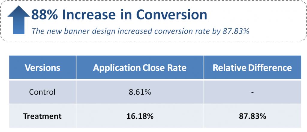
Our goal with this test was to increase actual applications for the credit card itself. By clarifying what was on the other side of the banner, we reduced what we call “curiosity clicks,” and actually increased the number of applications.
In this case, the goal of the banner was actually to get more applications on the landing page, which was ultimately accomplished by the cleaner, clearer design. Here are the results of the page, as they relate to our main KPI (number of applications generated):
–
With the clearer design, we were getting more applications for the card per day.
–
How you can use this to design better banners
So, what can we learn from this?
For starters, the goal of a good banner may not necessarily be to get more clicks – especially if you’re running a pay-per-click ad. In that case, you don’t want to pay for curiosity clicks, as it can be quite detrimental to your overall ROI.
You need to attract the right clicks. The way we did this here was to use our design to more clearly express the value of the landing page offer. Though we weren’t paying for clicks, we still wanted to correctly tap into the proper motivations to increase the chance of improving our Research Partner’s KPI – credit card applications.
In this case, by making the qualifying transactions necessary to get the incentive more prominent, we grabbed the attention of more people who might be interested in a credit card, not just in a free gift.
What was so interesting about this test was that we didn’t really change the wording. All we did was make what was there clearer through our design.
If you can more clearly express the value that is (and isn’t) inherent in your offer, you’ll likely get a lift. In the end, this is a key component of optimization – better expressing the true value of your offer.
–
Related Resources:
Banner Ad Design: The 3 key banner objectives that drove a 285% lift (Web clinic replay)
Traction Marketing: Why a 34.93% decrease in clicks was a good thing
Tricks vs. Testing: The Battle for Internet Supremacy
Landing Page Optimization Workshop: Become a Certified Professional in Landing Page Optimization
–





Awesome result, Paul.
Love the little drama you added to the post. I would have expected to have seen a lift in CTR on the yellow. Luckily you pulled through with an even bigger lift in conversion rate on conv. rate… Really drives home how you have to measure the end goal.
@Rob Kingston
Thanks Rob. Always good to hear. 🙂