Earlier this month, I brought you the first in a series of 2015 Testing Year in Review blog posts. For this next post, we’ll be looking at tests using both KPI macro-yes(s) (conversions) and micro-yes(s) (clickthrough).
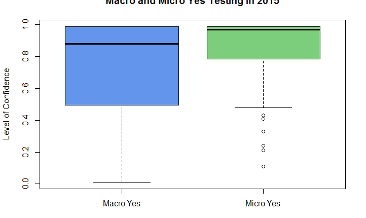
Here are results of the 2015 tests we ran based on the primary test metric and level of confidence achieved. Anything under 95% level of confidence (LOC) is considered inconclusive, meaning the test did not have statistically significant findings. We want all the tests to be above 95% LOC because then we can say (with 95% confidence) that the changes we made are having the impact we want. The size of the boxes represents the range of LOCs, and the black lines are the midpoint, where half the data is above, and half below the line. The box represents the middle 50% of the data.
The big blue box shows the wide range of LOC’s for macro-yes tests. The base of the box is at 50%, and the black line (the median) is at 88%, indicating that less than half of these tests reach 95% level of confidence.
The small green box on the right is micro-yes tests. The range is high and tight, and the median is 97%! This is what we want. Half of these test are above 95% LOC, and the other half stay above 88%. Micro-yes tests are producing statistically significant, actionable insights about our audience.
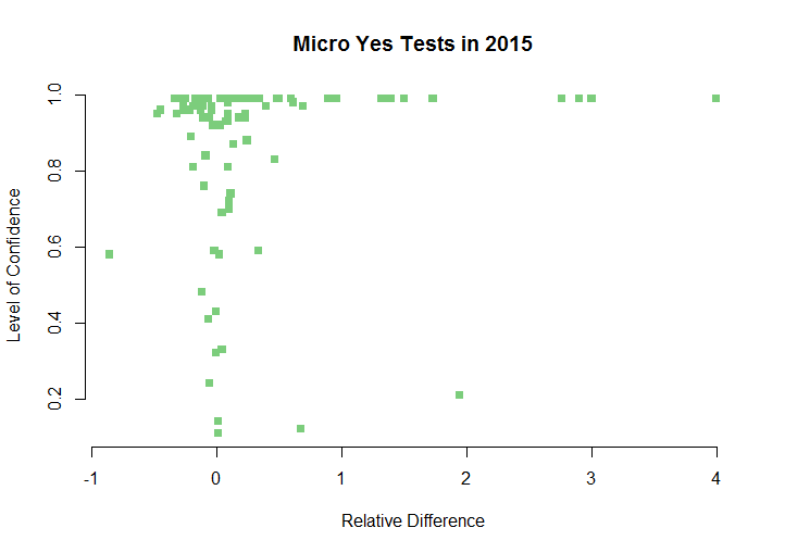
Of course it’s much easier to increase clickthrough on a page than it is to increase the number of actual sales. The problem that these charts expose is, less than half the macro-yes tests are reaching 95% LOC. Let’s look at it another way. In the charts below the level of confidence remains on the left, and the relative difference has been added in to show the direction and magnitude to provide insight into these parameters.
The macro-yes chart looks almost like a random scatter plot of data points with some aggregation at the top, where tests that reached 95% level of confidence start to accumulate.
The micro-yes test data points push to the top of the chart, forming a nearly solid line at the top. In addition, we see that line shoot off the right, indicating these test not only reached 95% LOC, but also had a large relative increase — a win-win! Are the macro-yes tests doing that?
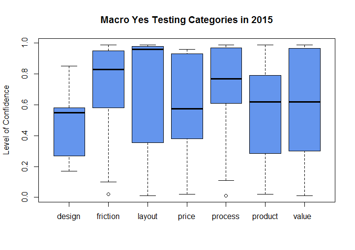
Lastly we can look at the data by testing category. For the macro-yes test we can see the same wide range of distributions among the various categories. Most of the boxes are big, with medians well below 95%. Some of the box plots drop all the way down to 30% LOC.
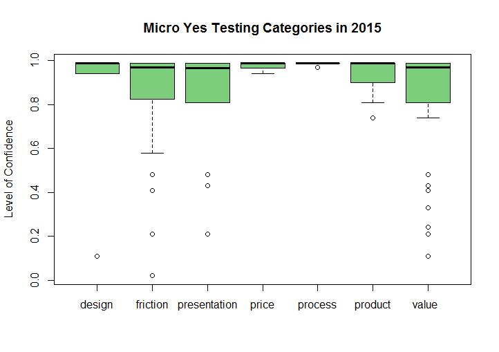
In the micro-yes tests we see straight away all the boxes are pushed high up on the chart. The median level of confidence is 97%! With these tests we are obtaining reliable, reproducible results we can act on with confidence.
Key takeaway
I often see tests that are optimizing a homepage, landing page or some other area high up in the funnel, and tracking macro-yes as the KPI. Naturally we want to impact the bottom line with every change we make, but this approach to testing is not giving us the reproducible results we want. We should always be tracking the macro-yes, but we don’t necessarily need to measure it as the primary metric. With every inconclusive macro-yes test, our time, effort and resources are being wasted.
Meanwhile, micro-yes tests are getting the wins we want, without the attention they deserve. People walk toward a macro-yes one step at a time. Micro-yes tests are like the quiet gardeners who go about their work, clearing the path, pulling the weeds, consistently making small improvements that lead to big changes in the overall look and feel of your website. Let your micro-gardeners prune the tangled vines and overgrown branches. Allow them to provide a clear path for visitors to get to the places you want them to go. The data shows they are good at it, and reliable too.
You might also like
Conversion Rate Optimization: Building to the Ultimate Yes
Landing Page Optimization: 5 factors that lead to (and prevent) conversion
A/B Testing: Split tests are meaningless without the proper sample size


