For a single-product website, the homepage is often the landing page. Let’s look at a recent homepage test with a MECLABS Research Partner to see what lessons you can learn from it to improve your own testing and optimization efforts.
(Please Note: Research Partner name has been blurred to protect competitive advantage.)
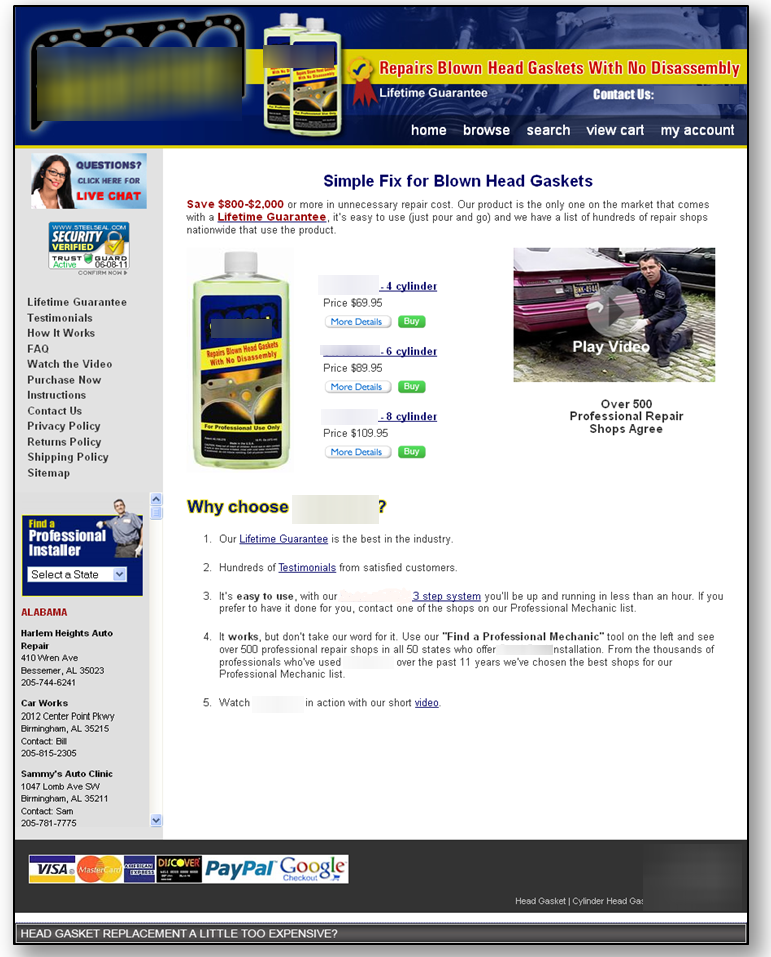
Control

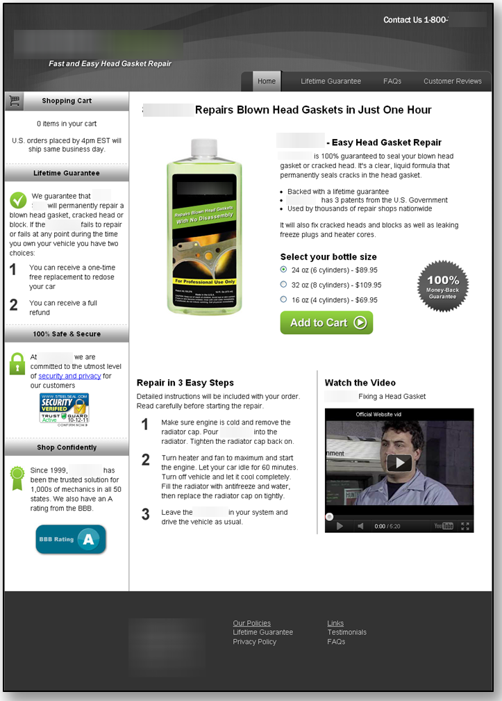
Treatment

Results
The new homepage and cart resulted in a 58% lift. These results validated at a 99% level of confidence.
What You Need to Understand
The homepage was redesigned to follow the user’s thought sequence and to clearly state the value proposition. This added more credibility and value to the page, which resulted in a higher conversion rate.
Another important change, which isn’t readily apparent from the above creative samples, was the optimization of the cart process. A simplified process reduced friction and made it easier for users to buy the product.
There was a total reduction of six steps, with most of those steps being unnecessary and unneeded. The necessary steps were combined into one page on the cart. This created a better user experience and a higher rate of conversion.
Related Resources:
Landing Page Design: Eye path vs. Thought sequence
Landing Page Optimization: How to plan a radical redesign so you get a lift AND a learning
Homepage Optimization: 5 questions every marketing team should ask themselves
Homepage Optimization: No single metric will do
Website Optimization: Testing program leads to 638% increase in new accounts


Daniel,
What was the improvement for the Add To Cart goal of that particular landing page?
Al.
Because of the third party hosting company, we were not able to implement tracking on any metric besides visits and conversion.
The third party was not willing to place any of the Test and Target tracking code on their site.
After this test the client moved to our hosting.