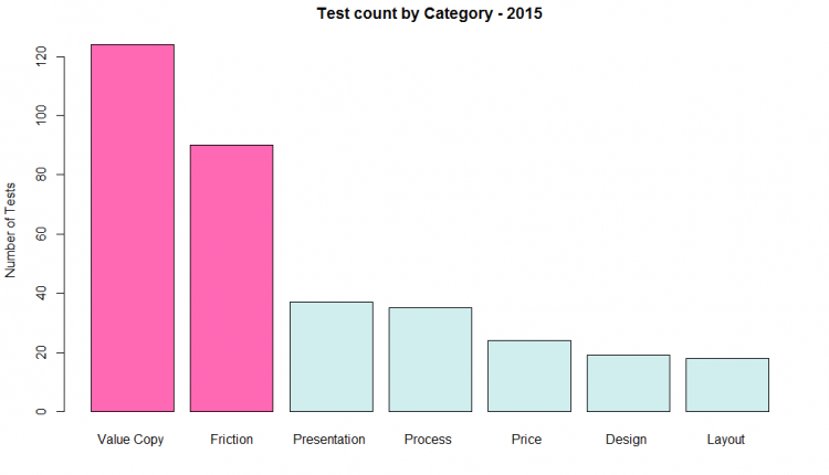
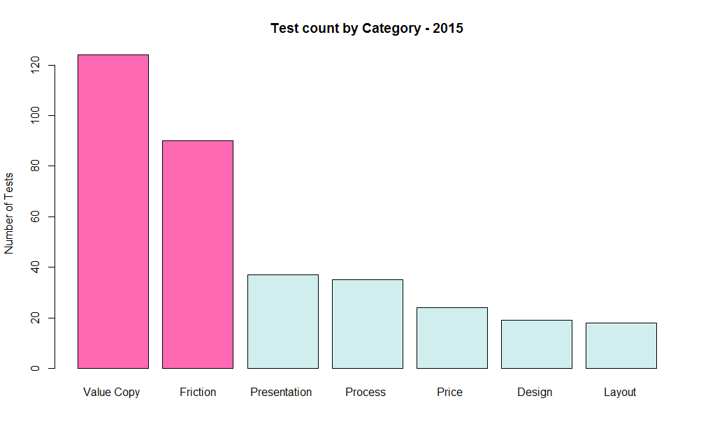
As test database specialist at MECLABS Institute (parent company of MarketingExperiments), I maintain our library of tests, analyze the results and search for insights to inform future testing. The chart below breaks all of our 2015 tests down by category and stacks them by count.
As you can see from the big bars on the left, most of the tests we ran in 2015 focused on value copy and friction.
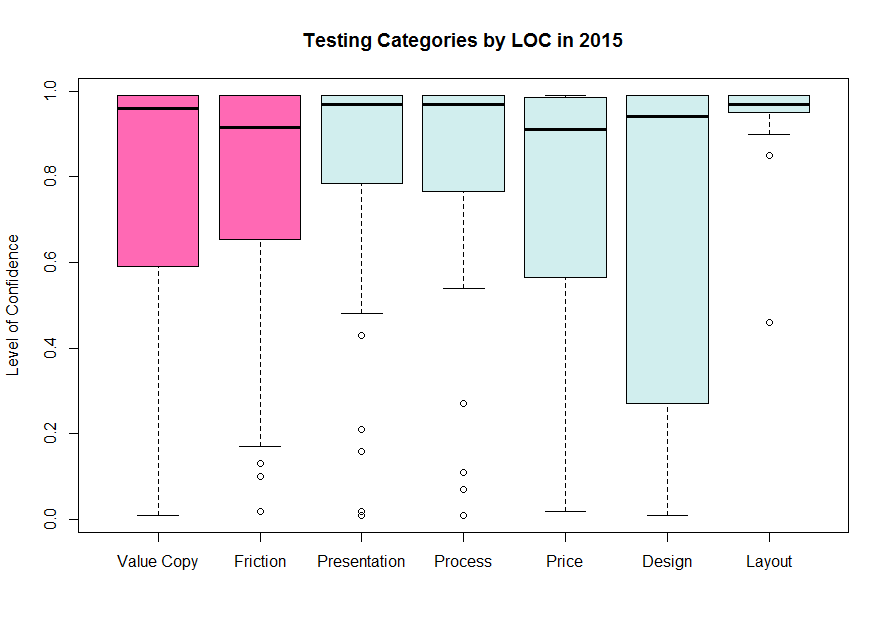
Now look at the outcome of all those tests in the box plot below. This chart measures level of confidence along the left-hand side, and the boxes contain 50% of the data, centered on the midpoint, represented by the black line. Straight away, you can get a good idea of the general performance for each category. Higher level of confidence is better, and we ideally want everything to be above 95%. So how did the value copy and friction tests do?
The box for value copy touches bottom around 60% level of confidence, with friction touching at about 65%. The black line in the middle of the box is called the median. It is the center of the data, where half the data is above, and the other half below.
The median for friction is around 90% LOC. Why is this important to note? Because, if the majority of our tests are either in the value copy or friction categories, and if half of those are falling below 95% level of confidence, that means a high number of tests are inconclusive.
We would want to reduce that number, right? So how do we do that?
Addition by subtraction?
The easiest way to improve the functionality of a website is to remove things. Think of your website as a lush tropical jungle in Central America and your online explorers are trying to reach an ancient Aztec temple. The temple holds all the value, and is the reason people are willing to explore the jungle. The rainforest can be an amazing experience, but the thick under-story and sprawling root systems can become obstacles on the path to the temple. The more you can hack away at the large leaves and ropey vines that tangle people up, the easier it is for them to reach their destination. Reducing friction cuts a clear path and is more straightforward than trying to give people a reason “why” to go to the temple.
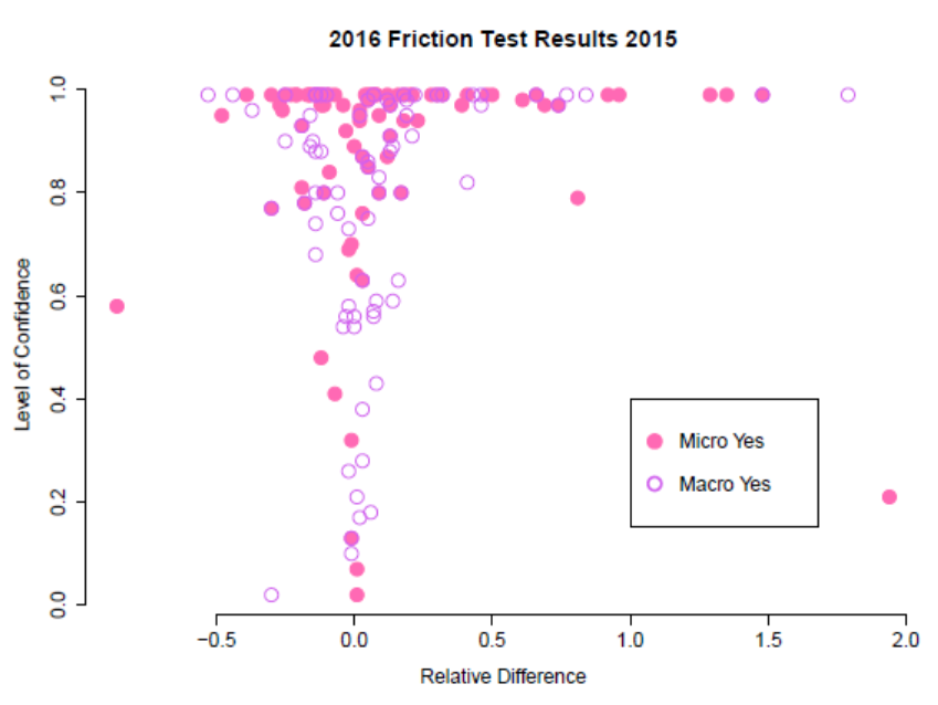
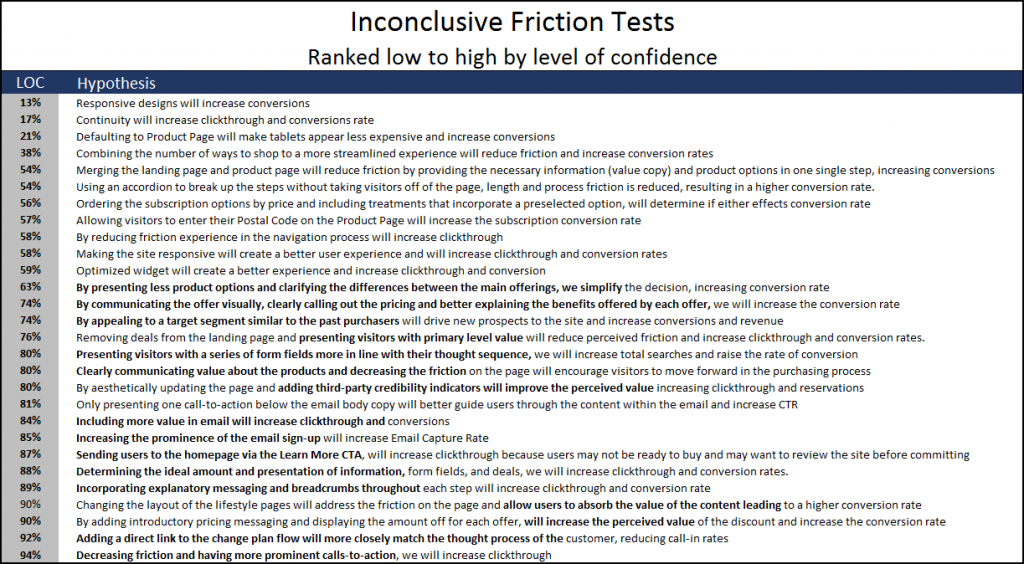
If you chart the friction test results in a scatter plot, the data points bubble up like a glass of champagne, from zero level of confidence at the bottom, to tests that aggregate into a solid line along the top at 99% LOC. This shows the high-success rate for these tests, but also reveals their weakness. What’s going on with all those tests that fell below 95% LOC?
We can get some clarity by looking at the test strategies going into the test, called the hypothesis, and ranking them by the final level of confidence reached during the test period. Tests with low level of confidence will show us what changes made little impact and the ones with high level of confidence that worked best to increase clickthrough and conversion. One thing to look out for is a test that reduces friction to increase conversions. This may seem sensible, but I’ll explain why it is flawed shortly.
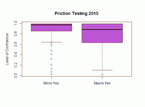 What I’m seeing is that merely removing things does not increase conversions. Reducing steps, simplifying the path and alleviating friction are smart ways to streamline the purchase path and increase clickthrough rate. But reducing friction without increasing motivation does not appear to increase conversions. People are more motivated to convert based on a “why,” not on a “how.” This is why we see a lower success rate for macro-yes friction tests. Friction optimization is a tool to increase clickthrough. This also helps explain why we see a higher success rate for macro-yes friction testing. The chart to the right illustrates these points.
In the heuristic, friction is subtracted from incentive, so increasing incentive could also improve the odds of conversion. But (incentive – friction) only has a multiplier of 2. What other areas could we work on to really magnify the probability of conversion?
Motivation and value are the biggest multipliers in the heuristic. Increasing conversions has more to do with making a change in the mind of the customer. Providing clarity and adding value will do more to increase conversions than reducing friction will. Adding value to increase motivation will have the largest magnifying effect on the probability of conversions.
What strategies made the biggest impact on conversions last year?
The following tests were all conclusive, with a confidence level of at least 95%. I’ve ranked them from low to high by relative difference. Notice how often adding value increases conversions.
Some takeaways from our 2015 testing
- Eliminate friction to increase clickthrough. Use a micro-yes as the main KPI for these tests.
- Reducing the amount of excess copy while retaining the most valuable information makes it easier for visitors to learn why they should choose your product quickly and easily.
- Use plain language to appeal to a broad audience. Be specific when addressing a segmented audience who understands and seeks precise language that directly addresses their issues.
- Be willing to provide extensive details for those who want it. Understand most people just need a headline and some bullet points.
- Add process-level value to guide guests through the funnel. Things like breadcrumbs inform people where they are at and where they need to go. Don’t leave them guessing.
- Adding urgency helps, do it now!
Next time, we’ll look at value copy by ranking the test hypothesis and level of confidence to find out which strategies made the biggest impact on conversions.
You may also like
Copywriting: How to tip the scale so customers act
Strengthen your copy in 35 minutes [From MarketingExperiments Web clinic]
2015 Testing Year in Review: 2 key discoveries to increase clickthrough and conversions


