2015 Year in Review: The most popular posts in optimization, list growth, analytics and digital marketing
Throughout 2015, MarketingExperiments.com has published extensive new research taken from discoveries made by our parent company, MECLABS Institute. We have discussed branding, personalized messaging, subject line sequencing and copy, just to touch on a few topics covered in the last 12 months.
On the blog, we covered a wide range of subjects, from optimization and email marketing to testing strategies, and provided actionable takeaways on topics as varied as designing for user experience, cryptic marketing, the psychological effects of font and cart abandonment.
As you finish building out your marketing campaigns for 2016, read on to discover the most popular posts of 2015, determined by clicks from readers like you.
Top Post of 2015: Email Preheaders Tested: The surprising sensitivity of a single line of text
Back in January, Jon Powell, Senior Manager of Executive Research and Development, MECLABS, wrote about his firsthand experience in pioneering the testing of email preheaders. Jon knew from a friend at Salesforce that preheaders were a hot topic of debate amongst today’s marketers. What should be in a preheader? Should a preheader even be used at all?
When Jon was unable to find even one statistically significant experiment dealing with preheaders — either from the MECLABS research library or on the Internet at large — he decided to take matters into his own hands and oversee several tests himself.
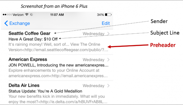
As a reminder, the preheader is the line of preview text you find below the subject line on mobile device email apps and even in the Outlook preview pane.
For Jon’s first test, he wanted to understand if having text in the preheader would make a difference compared to not having text. Using FlintsNotes.com, the personal website of Flint McGlaughlin, CEO and Managing Director, MECLABS, he ran a test.
The Control simply brings in the URL to the first image visible in the email, while the Treatment shows a specific piece of text.
The result? A 104% increase in clicks, with no statistically significant difference in opens.
Jon also ran a second test in order to better understand if the substance, or focus, of the text would make a difference in performance. For this test, the Control brings in some general link text from the email template, while the Treatment uses the first article headline in the newsletter as a teaser.
The second test resulted in a 12% relative decrease in clicks, with no statistically significant difference in opens.
Based on his testing, Jon shared several key insights that readers could leverage when implementing their own preheaders.
- Insight #1: It’s not about having preheader text — it’s about increasing clarity of value for the customer.
- Insight #2: Preheader performance patterns seem to match subject-line performance patterns.
- Insight #3: The size of preheader performance gains and losses appear to be tightly connected with the number of readers using mobile optimized apps to read emails.
For in-depth detail on each insight, check out Jon’s post.
Top Research Category: Copywriting
Throughout 2015, the most popular posts at MarketingExperiments, as determined by readers, focused on copy. Though relatively easy to tweak, we’ve found time and time again that even simple copy changes can often have outsized results. Here are a few actionable highlights from the year.
You only have seven seconds to arrest the attention of your prospect — make every one count!
In November, MarketingExperiments presented one of its most attended Web clinics of the year, focused solely on strengthening your copy. In a follow-up blog post, Andrea Johnson wrote about a test from a business server hosting company that demonstrates just how critical it is to lead any copy with what the customer will value most about your product and nothing else. In other words, we must show customers what’s in it for them immediately.
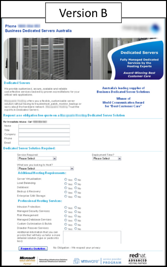
Version A led with value: “Australia’s Most Trusted & Accredited Business Hosting Company.”
Version B did not. It provided an explanation, but no value: “Business Dedicated Servers Australia.”
The Result: Version A achieved 188% more conversions. To read more about this test, or to find answers to questions such as those below, check out Andrea’s full post.
- Does my copy immediately arrest the attention of the prospect?
- Am I sufficiently building the problem before presenting the solution?
- Does my copy clearly express the value of my offer?
- Am I using the proper amount of copy relative to the magnitude of my ask?
- Does my call-to-action align with the expectations of my prospect?
Don’t rely on legacy. Test your copy length.
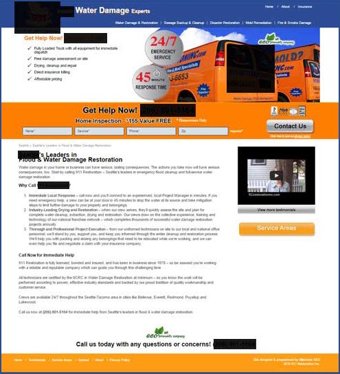
In another post, David Kirkpatrick, former Manager of Editorial Content, MECLABS Institute, shared a test centered on copy length from 911 Restoration, a property disaster recovery business. David’s post featured one paid search test at 911 Restoration on its PPC landing pages. The test involved dramatically reducing the amount of copy on the landing page to discover how that impacted conversion, cost per acquisition and AdWords quality score.
According to Miri Offir, Chief Marketing Officer, 911 Restoration, “The long copy was legacy content we inherited from the SEO team several months ago. After sending paid search clicks to these old long-copy pages for a few months, we decided to test shorter, more-focused copy against our long-copy control sites.”
Control
Treatment
With the shorter landing page copy, the team expected an increase in leads generated due to a simplified user experience.
But what really happened?
The Treatment outperformed the Control in conversion by more than 37% and reduced cost per acquisition by almost 33%.
From this test, the team learned the bots that determine quality score and the humans who actually generate leads are looking for two very different things from a landing page.
Where the bots saw less information and less authority from the shorter landing page, the humans reaching the abbreviated version found the information they were looking for more quickly and called 911 Restoration to take care of their property damage emergency restoration.
Use your headline to your advantage.
Finally, as Andrea Johnson discusses in this September blog post, creating a more powerful headline is one of the easiest ways to boost the effectiveness of any page. It sometimes doesn’t even require the use of developers or fancy graphic design.
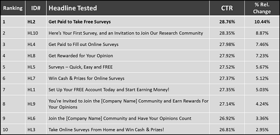
In her post, Andrea describes five key principals to keep in mind when crafting headlines. These principals are framed around a test conducted by a survey company testing 10 headlines against each other. We’ll took a quick look at three of the principals discovered, with the other two principals, as well as supporting tests, available in her post here.
Principle #1: Effective headlines focus first on what the customer gets
Shift your thinking from what you want the customer to do for you and, instead, focus on what you can do for the customer. “Get” is a mindset that achieves this. Connect to what the customer wants first and foremost. Consider the winning headline above. It tells customers that they’re going to “Get Paid to Take Free Surveys.” In fact, three of the top four headlines begin with the word “get,” demonstrating the importance of focusing on what you will provide to the customer.
Principle #2: Effective headlines align with the customer’s current motivation
Don’t ask customers to do too much too soon. Think about what they want to do right now. In the case of the winning headline, that’s getting paid to take free surveys. They want to make money but they don’t want to join, set up an account or take a survey, as indicated in the worst-performing headlines. Headlines should never lead by asking the customer to do work.
Principle #3: Effective headlines make the strongest point first
You want to lead with the information that will be most compelling to the customer. The winning headline put “get paid” at the start, whereas the losing headline had “win cash & prizes” at the end. Clearly, most customers won’t read through five to eight words to find out what’s in it for them. Each word of a headline is essentially a micro-yes that must convince the customer to continue on to the next step in your sales funnel.
You might also like
MarketingSherpa Summit 2016 — At the Bellagio in Las Vegas, February 22-24
Strengthen Your Copy in 35 Minutes: Proven strategies to boost the effectiveness of your words [MarketingExperiments Web clinic replay]
Copywriting: 5 proven discoveries that strengthen copy
Landing Page Optimization: Conversion increased 37% by reducing copy
Copywriting: See immediate lifts by applying these 5 principles to your headlines


