

The old adage “less is more” holds true when it comes to website optimization. To optimize your website, you need to remember to stick to the goal of your site and not distract your visitors with links and other elements that can stop them from reaching that goal.
In this MarketingExperiments Blog post, we’ll review a recent test from one of MECLABS’ online retail Research Partners and how the team was able to achieve a 10% lift in checkout completion rate by simply removing distracting elements.
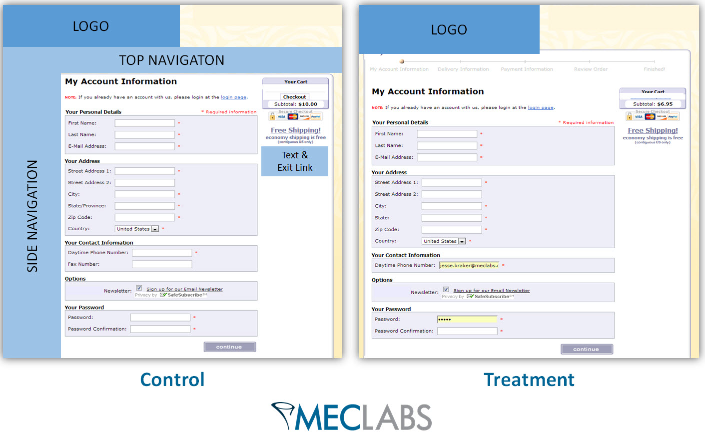
The MECLABS team recently ran a test within the checkout pages for the online retailer.

The goal of the test was to increase the checkout completion rate.
The team identified a number of elements causing friction within the checkout pages and likely distracting visitors from completing the checkout process. They tested a treatment that removed those elements.
(Editor’s Note: For the purposes of the MarketingExperiments testing methodology, friction is defined as “a psychological resistance to a given element in the sales or sign-up process.”)
The most drastic change was removing the static navigation bars – left navigation and top navigation – from the checkout pages.
This removed visually distracting elements from the pages as well as deleted possible exit points for visitors, keeping visitors focused on proceeding through the checkout process.
The team also took out a page within the checkout process that was simply confirming the visitor had created an account.
This step was unnecessary and forced visitors to make one extra click to proceed through the funnel, giving them an additional opportunity to abandon the funnel, and again, distracted them from the goal of the checkout pages.
What you need to know
By simply removing friction-causing elements from the checkout pages, the team was able to increase the checkout completion rate by 10%, which equated to a 19.95% increase in revenue per visit to the checkout process.
When optimizing your website, you should evaluate each page element and consider whether it is helping the goal of your site or distracting visitors. Any potentially distracting element is an opportunity to test how your pages perform with those elements removed.
Always remember that less is more when it comes to your website. Keep your pages focused and remove any elements that prevent visitors from completing your goals for the site, such as completing a checkout.
You may also like
Accordion-Style Checkouts Tested
Landing Page Optimization: Does your product page have buyability?
E-commerce: Category page test increases order rates 20%
Email Marketing: Simple design change to incentive raises clickthrough rate from the dead by 48%
Excellent post. Less is more is one way of saying it, just what you need is another. Even a slight increase in conversions can translate into much higher sales and earnings. Thanks.
Great post, too many times do I see websites far too crowded with various plugins and widgets. It’s just not needed and takes the users attention away instantly. Thanks for sharing.
It definitely seems like the mantra for 2014 is less is more. Websites with all those bells and whistles were distracting and even took time to load. Both make me want to surf away to the competition.