 Great things happen … when you extend your manufacturer’s protection right away!
I recently wrote a blog post about the audacity of hype – how companies can overreach with their advertising claims … and the potential customers who just don’t believe them.
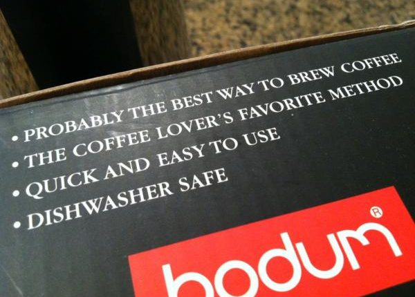
So today, on the flip side, let me address the copywriting that doesn’t say anything at all. Take the above headline, for example. For lack of a better word, let’s call this …
Blandvertising
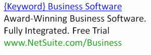
Blandvertising is a wishy-washy marketing claim. Like the italicized headline above, it wants to mean something … but it just doesn’t mean anything.
Maybe because the marketer didn’t want to have to deal with Legal. Or maybe because the marketing manager or copywriter had an empty text box in InDesign and just had to throw something in there.
This background noise, this elevator music copywriting is a total waste of your marketing budget. If you’re paying for the opportunity to say something, whether with a direct mail piece, a PPC ad, on product packaging, or just on your website … then actually say something.
But what exactly? You’re crazy busy. Perhaps you’re not a writer. And you have an empty text box staring you in the face. What do you put in there?
Through our testing, we have found that …
Specificity converts
“We know from our foundational Offer/Response-Optimization principles of ‘clarity trumps persuasion’ and ‘specificity converts,’ that the clearer and more specific subject line — i.e., the one with the ‘15% Off…’ copy — should convert better,” said Bob Kemper, Senior Director of Sciences, MECLABS.
While in that specific quote Bob was focused on subject lines, this principle applies equally well to many marketing media.
So next time you’re staring at the great abyss of an empty text box that needs some copy, increase the specificity of your messages by using quantitative statements, instead of relying on vague qualitative statements, to better communicate value and ultimately generate more response.
To help you out, let me show you a few examples from recent tests …
Before
After
Results
58% increase in conversions
(In fairness, much more than the headline contributed to the lift. You can see the full story at Rapidly Maximizing Conversion: How one company quickly achieved a 58.1% lift with a radical redesign)
Before
After
Results
21% increase in clicks, 272% increase in overall conversion
(See the full story at How to Increase Conversion in 2012: The last 20,000 hours of marketing research distilled into 60 minutes)
Before
First Look at New Products, Technology, and More
After
IADC 2011 – Exclusive First Look at New Products, Technology and More
Results
8.2% increase in open rates
(Read the full story at Email Subject Lines: Longer subject increases opens 8.2%)
Related Resources:
Transparent Marketing: Do your campaigns sound like North Korean propaganda?
Landing Page Optimization: Addressing customer anxiety
This Just Tested: How PPC specificity drove 21% more clicks and cut costs 66%


I always find it difficult to think of a catchy title, something that will grab the audience and obviously convert, so thank you for these pointers, they will be noted!
It is amazing how small changes can make such a large impact on conversions. I appreciate your insight and ideas!
Thanks for the tips.
Just one thing I noticed. when a company claims they’re #1 for something, immediately that hurts any progress they make with persuading me to click on their link or buy their product. It’s pretty difficult to prove you’re #1 in a niche.
This was such a really great post. Please keep up the great work. I really impressed with this site. This is really fantastic.
Thank you for clearly pointing out these guidelines. I just started learning about PPC and with my self-confessed still-thin understanding of its concepts, even an effective ad copy becomes useless when its corresponding landing page doesn’t sell.
Great insights I already see transferable principles for my own and my clients!