I love Sheena Iyengar’s study on the art of choice.
Simply put, the number of choices offered to a customer impacts their ability to make decisions. She illustrated this point during her classic TEDTalk featuring an experiment in a supermarket using jam.
Offer too many choices, and customers become paralyzed to make any decision, or not the one you were hoping for.
Optimizing choice is also why I love A/B testing, as it helps you put these kinds of ideas into real-world practice in your marketing efforts.
In this MarketingExperiments Blog post, we’ll look at two tests recently featured in one of our Web clinics on marketing multiple products plus a valuable checklist that you can apply to your own work.
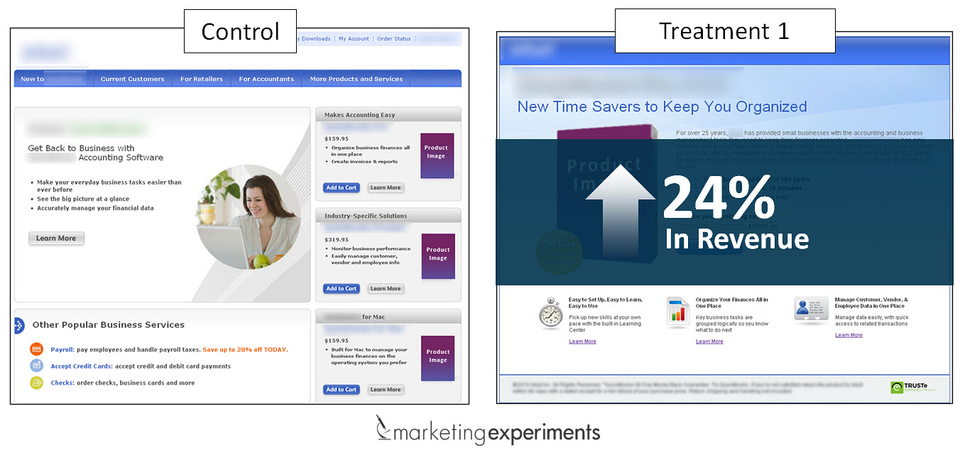
Control
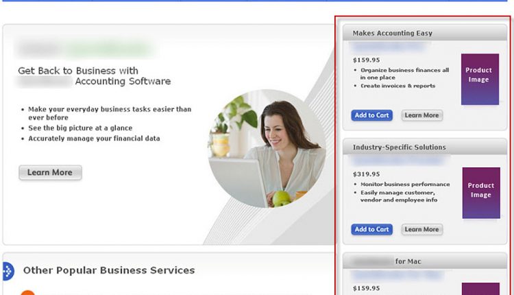
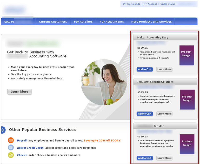
In the control, the MECLABS research team suspected the generic call-to-action in the main eye-path was not creating enough value force to move customers forward in the conversion process.
Treatment
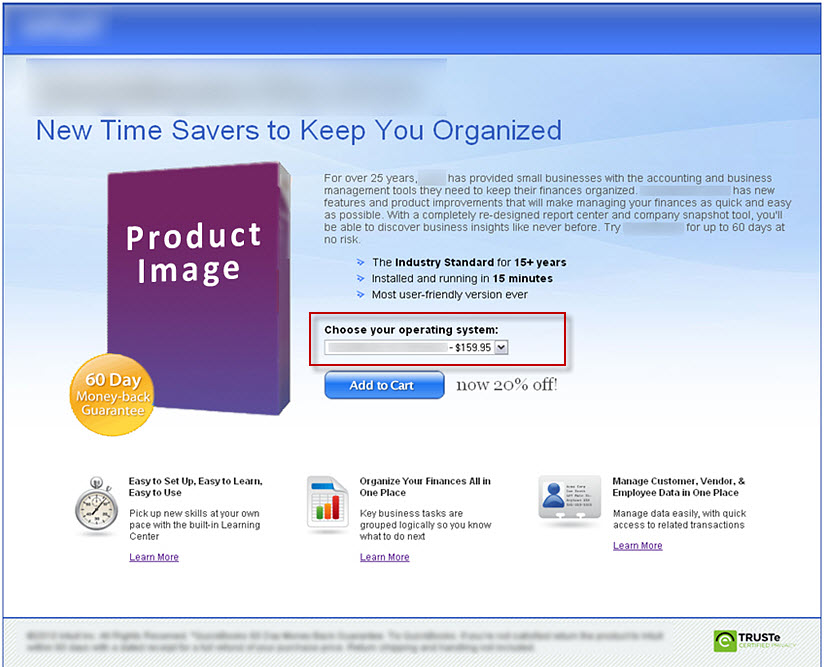
For the treatment, the team also hypothesized that a single product with a drop-down selection would increase conversion by reducing friction in the mind of the customer.
Results
By reducing the overlap of products, the treatment was able to guide customers to the right product for their needs.
Sometimes less is not more
Reducing choices when possible may seem like the best option, but if you’re not careful, you can eliminate too many choices.
Control
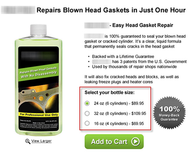
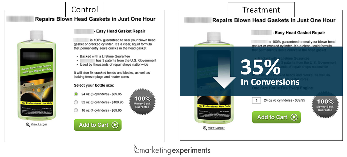
In the control, there were three separate products for three different sizes of engines that could be selected using a radio button.
Treatment
In the treatment, the marketers wanted to understand the effect of reducing the product selection down to a single product.
Results
The result in this experiment was a 35% decrease in conversion as too many choices had been eliminated.
What you need to understand
When you put it all together, there’s a fine line between offering customers too many choices or not enough.
Lucky for us, we have testing and optimization as a process to discover that line in our unique product offerings.
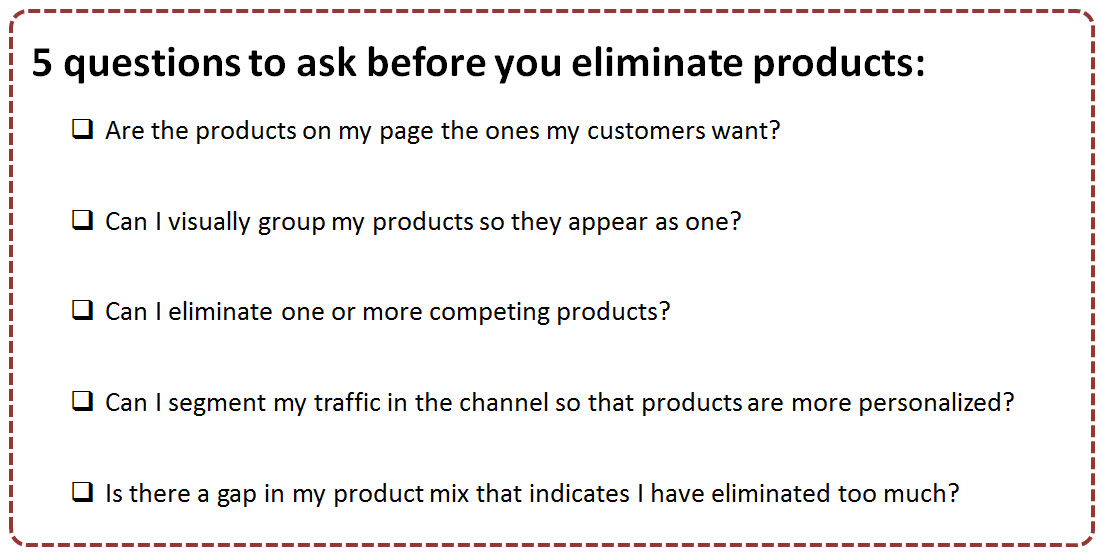
So before you start trimming products or adding more choices, try using the checklist above to assess your multi-product pages.
Hopefully, it will help you add a few great testing ideas to your queue that results in an improved experience for your customers.
You may also like
Landing Page Optimization: Multi-product page increases revenue 70% [More from the blogs]
Online Testing: 3 test options, 3 possible discoveries, 1 live test from Email Summit 2014 [More from the blogs]
Email Marketing: Change in CTA copy increases clickthrough 13% [More from the blogs]


