You spent years creating a valuable email list that gets Kim Johnson to opt in. Then, you craft an amazing email that inspires Kim Johnson to click to the landing page, where your marketing prowess is again on display, and Kim Johnson adds your product to her cart. And then… And then… Nothing. But why? And, what can you do to avoid this scenario as much as possible?
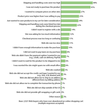
Well, at least you’re not alone – 88% of consumers have abandoned an online shopping cart without completing their transaction, according to a Forrester study. While you cannot eliminate cart abandonment, and many factors are out of your control (some customers just weren’t ready to purchase), you do have the ability to reduce abandonment.
If you want to reduce your shopping cart abandonment rates, follow these seven simple steps:
Step #1: Be upfront about shipping costs and information
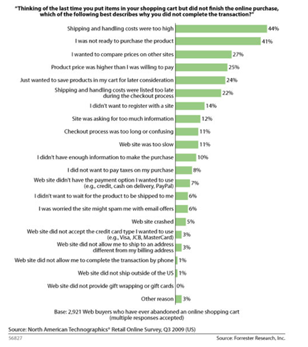
The previously referenced Forrester study found that the number one reason people do not complete their transactions is because “shipping and handling costs were too high.” The number six reason was “shipping and handling costs were listed too late during the checkout process.” Of all the studies I’ve come across that detail reasons people abandon shopping carts, issues with shipping were always in the top three reasons, usually number one.
Not only is it important to be clear and upfront with your customers about how much shipping will cost them, but also how long they should expect shipping to take.
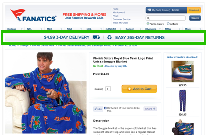
Fanatics.com, a sports apparel website, does this very effectively. It has a persistent bar throughout the site highlighting the cheap and quick shipping, as well as its easy return policy.
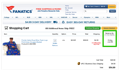
They also answer the question, “When will I get my items?” in the cart preview by specifying an exact day you should expect to “Receive By.”
Step #2: Put your customers at ease
Anxiety is inherently part of the Internet; it is especially high when a user makes an online purchase. During the checkout process, it is usually related to information and payment security. Anxiety is often stimulated by a legitimate concern, but it is disproportionate to the measure of actual risk. As e-commerce marketers, we must anticipate and overcorrect for the user’s anxiety in close proximity to the concern.
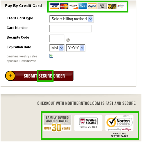
According to an Econsultancy survey, 58% of users say that “concerns about payment security” would deter them from completing their purchase. To correct for this, place third-party security logos near the credit card fields. Northern Tool + Equipment does a very good job of mitigating anxiety here:
Other ways to reduce anxiety include being transparent with your privacy and return policies, as Cabela’s does here:
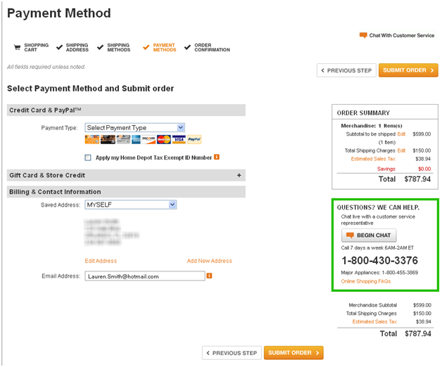
Also, clearly displaying contact information in case customers have a question or problem ordering will alleviate concern, as The Home Depot does here:
Step #3: Don’t require new users to register
Forrester Research reports that 23% of customers would exit the buy process when prompted to register with the site.
Why? Because Internet users suffer from account and password creation fatigue. Bottom line, they just don’t want to do it. In fact, according to Convince&Convert’s research, two out of five people would rather scrub a toilet than create a new password. That’s quite the aversion to creating passwords.
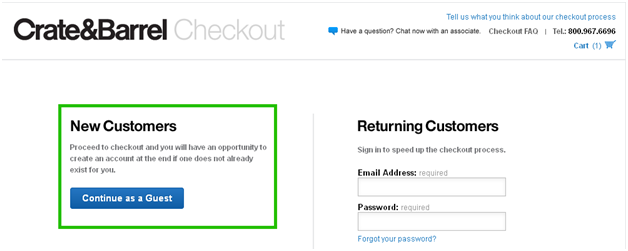
“But I need users to create an account,” you say? No fear, I have your solution! Allow new registers to go through a “Guest Checkout” and complete their purchase, un-annoyed. After you have received their payment, offer to create an account for them, using the information they have already filled out. This way, it is presented as if you are doing them a favor, not asking them to “scrub a toilet!”
Crate&Barrel uses this method:
Step #4: Continue to present value throughout the checkout process
As you can see by now, just because a user has added an item to their cart, doesn’t mean you’ve made the sale. You still have work to do, my friend! It is important to remind the user the value of what they’re purchasing is higher than the cost, or annoyance, of completing the checkout process.
It’s like telling a little kid he has to eat his broccoli before he can have dessert. He doesn’t want to eat it, but if you keep reminding him of the reward, he’ll eat the broccoli. Same deal here.
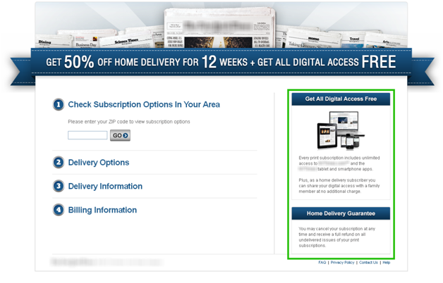
A popular newspaper does this by reminding users they “get all digital access free” with their purchase!
Step #5: Make it quick and easy!
This is all about reducing friction by reducing the length and difficulty of the process. Research shows that the amount of time it takes to complete a form is negatively correlated to conversion rate. (The less time it takes, the higher the conversion rate, and vice versa.)
Some simple ways to reduce friction are as follows:
- Keep the number of fields to a minimum; only ask for what you really need. This means remove phone number unless absolutely necessary. This is one of the biggest conversion rate killers on forms.
- Use the “Same as billing address” checkbox for the shipping address.
- Use a clean and simple layout with left-aligned and clearly labeled fields.
- Use a progress bar to visually indicate where the customer is at in the process.
- Explain confusing or difficult fields with a tool tip. E.g., ⓘ
At the beginning of this post, I prefaced with a little disclaimer that read, “You cannot eliminate cart abandonment.” The fact is, it happens. But should we just accept it and move on? I think not! Use the next two steps to bring those lost sheep back and boost your sales.
Step #6: Use persistent carts
The second reason for abandonment found in the Forrester study was “I was not ready to purchase the product.” While you have little to no control over when a user will be ready to purchase, you can tailor your site to make these users’ shopping experiences seamless when they are ready. Do this by saving their carts and allowing them to return at a later time to purchase.
The importance of this practice is further supported by a study by the National Mail Order Association, which found that 35% of shoppers took more than 12 hours to complete their purchase, and 21% took more than 3 days.
Step #7: Use cart retrieval emails
The survey for MarketingSherpa’s 2012 Email Marketing Benchmark Report asked marketers what types of automated emails their organization deploys. “Shopping cart abandonment” was dead last, at only 11%. What the other 89% of the marketing population must not know is that triggered retrieval emails can significantly increase your conversion rate.
There are many different theories around timing of email messaging, but it is widely agreed upon (and has been tested) that sending a retrieval email immediately is imperative. The longer you wait, the more you lose. To learn more about what and when to send, check out this MarketingSherpa article, “Email Marketing: Reclaim abandoned shopping carts with triggered ‘remarketing’ emails.”
Related Resources:
Optimizing Shopping Carts for the Holidays: 5 last-minute changes you can make to your shopping carts to increase conversion — Free MarketingExperiments Web clinic on Wednesday, November 14, 2012 at 4:00-5:00 p.m. EST
E-commerce Testing: Redesigned order page, shortened shopping cart drive 13.9% lift in conversion
E-commerce: How your peers optimize shopping carts and product pages
Online Cart Abandonment: 12% lift in captured revenue through customer service-focused email remarketing campaign (via MarketingSherpa)




Thanks for putting together this excellent post, Lauren.
I’m 100% behind your statement that sending cart reminder emails immediately is critical. At Rejoiner, we’ve found that there is a window of about 15 minutes post abandoned cart where retailers have an exponentially higher chance to win back the lost sale.
This is yet another reason why “batched” cart abandonment emails aren’t as effective as those delivered in real-time.
Hi Lauren, to add to the mix – yes real time remarketing is highly effective, but at Ve Interactive we find it to be especially so if the abandoned cart has been repopulated too. That way it’s super easy and convenient for the user to click thru, continue and hopefully complete the purchase.
Hi Lauren,
Quite Clean and effective post – I picked up another key learning from the manner in which you have written – visual cues and highlighting the critical bit keeps the user (reader) engaged.
Thanks for the insight!
Regards
Puru
Really nice post, nice to see some statistics too! I use my own shopping cart system for my site, and checkout abandonment is really the only aspect I’m more than often concerned about. Thanks so much for sharing this, really nice tips and advice. I wholeheartedly agree with your section on making sure your customers are at ease. I am guilty, myself, of abandoning checkouts simply because the site asked me for more details than I felt necessary, however when I look back a few days later I realise that they weren’t unnecessary at all, just simply needed to be explained. Thanks again, Adam.
Nice,
Im a big data and visualisation person so nice to see a bit of both in here to concrete points mate. A lot of websites I have worked on see very high shopping cart abandonment.
Do you think its higher when the customers are acquired through advertising means such as PPC rather than organic means?
Interesting stuff to read. Keep it up.