Email testing produces some of the most interesting results I see here at MarketingExperiments. The cause for this is a combination of constantly changing variables.
For one, content within email tends to change more often than your typical landing page. This makes optimizing for content more challenging as different topics are likely to garner different levels of interest from the segments within your email list. So results will change each month based on the content alone – making A/B testing the only reliable method for measuring progress.
In addition, email lists themselves prove to be a challenge, as what works for one list may not work for another list. Even within lists, especially aggregated lists, you will see different results based on the value proposition, content, layout, and calls-to-action (CTAs) used in your email.
And to further complicate matters, you are still dealing with a funnel process in which your email must first reach a user (avoiding spam filters, personal filters, etc.), your subject line must interest the user enough to open the email, your email must display properly (with images on and off) and be compelling enough to achieve a click-through to your landing page where the battle for a conversion wages on.
In today’s world of overloaded email boxes, people declaring email bankruptcy, spam filters and everything else, this game is only getting more difficult – for marketers and users alike.
With that said, I’d like to offer up my own favorite email testing tricks and tips. It’s important to understand that what works for one segment, list, or industry will not necessarily work for another. In fact what works one month for a list may not work next month. It’s an ever-evolving process in which you must always challenge your own best practices to maximize your results.
1. Text-only email
This is my silver bullet of email optimization. In a world where everyone wants their logo, business cards, websites, and emails to be as shiny and pretty as possible, it’s easy to forget that email is a text-based medium.
Out of all the emails you actually read each day, how many are HTML vs. text-only? The important emails you receive each day – the ones from your family, friends, and co-workers – are all likely text-based. This means the HTML emails you receive are most likely not from one these aforementioned groups and thus likely less important to you on a personal level.
Obviously there are caveats to this – such as an email from your bank or a Facebook friend request – but the truth is, when you send an HTML email you are already fighting a certain level of banner blindness. If you currently only send out an HTML email, I’d challenge you to A/B split test against a text-only version of your email and measure the results.
2. Story format
Emails are a form of value exchange. In exchange for someone’s time and interest, you must first provide something of value.
One of the easiest, most interesting ways to provide value in an email is to tell a relevant story. Not only can telling a story create interest in your topic, but it also can provide you with a natural sounding CTA of “Continue Reading” or “Read More” that requires less commitment from the user before clicking through to your landing page.
The downside to the story format is it requires you to have an interesting story to tell as well as an audience willing to read through the text.
3. Big button
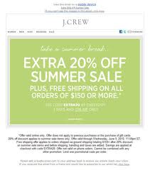
Sometimes if your offer is compelling enough, all you need to do is give people a place to click. It helps if your email list is already familiar with your brand, is interested and familiar with what you’re offering and needs little explanation before clicking through.
For example, our Marketing Director is drawn to J. Crew’s buttons like a moth to a lightbulb…

The focus should be on the value proposition and the CTA copy as this will determine the commitment level required to achieve a click-through. A “Learn More” CTA will bring more clicks, but less qualified traffic than a “Buy Now” CTA. Experiment with this CTA copy to see what works best for your particular audience and dial in the right amount of click-through vs. conversion.
4. Multiple CTAs
I’ve found that when dealing with large, aggregated email lists, including multiple, different CTAs can help increase click-through on the basis that different people will be interested in different aspects of a topic.
For instance, if you are offering a free PDF download on a topic that you hope will encourage people to provide their email address, and you also have a webinar that does the same thing, go ahead and include a link to “View the PDF” and another CTA to “Sign-up for the Webinar.”
What you’ll find is that offering multiple contrasting calls to action will result in a higher click-through rate as some people will be interested in downloading the PDF, while others will prefer the webinar – two different mediums that attract two different groups of people but achieve the same objective.
5. Digest
If you currently send out a longer email newsletter, I’d encourage you to try a digest format. In the digest format you offer several links at the top of the email that either direct users to a particular article on your website or anchor down to an excerpt within the email itself, followed by a CTA to “read more.”
I’ve found digest emails work well when you have a lot of content to offer and you are able to effectively arrange this content so as to attract a wide variety of clicks. It’s a combination of the story format and multiple CTA emails mentioned previously.
Related Resources
Optimize your Email in Three Steps: How one marketer tripled revenue from their house list
Order your custom Email Response Optimization Package


+1 for text only.
Anyone who studies company politics will understand why they are so rare:
“Can we just have our logo”
“We need to include X”
“We must link to Y”
“It looks so boring – can we have some colour”
And before you know it you’ve got an overloaded fairground-ride style of eshot.
@John Hyde :: York, England
Couldn’t agree more.
For many companies, switching from HTML to a text-based email can feel like trading in the Ferrari for a Prius. You know it’s a better fit for you financially, but those Ferrari curves sure are hard to let go…
Thanks for the comment!
Thanks Nathan-
It is always good to ask the questions “how do I do this better?” or “how do I get better results?” I appreciate your insight in an area I only know about on the surface.