I’ll admit that I am a Twitter novice. Compared to social media gurus, some of whom have tremendous experience with the platform (up to two* years!), I am still very much in the learning-by-doing phase. Then again, aren’t we all?
As I try to be informative and give back to the Twittersphere, one of my email-related tweets was picked up by a Florida marketing agency that services several metros nationwide. With our Email Optimization clinic series underway, I was more than happy to provide an analysis of a broad-spectrum campaign that they had planned. Luann, their president, was as excited as I was about making a Twitter connection.
With Luann’s permission, I wanted to share my thoughts and recommendations with our readers. Here is an edited copy of the email response that I sent to her:
Hi Luann,

Here are a few thoughts based on the email message creative I got from Noele, along with the requisite assumptions I’ve made. I hope they will be helpful.
There are two important caveats:
- I don’t believe in best practices. Everything I recommend is normally tested until I find out what really works for the particular product and customer segment.
- I want to be as helpful as possible, so I am not pulling any punches; the comments below are not a reflection on your company’s competence or reputation—just how they are communicated via this email message.
The fundamentals: Optimizing thought sequences
In optimization, our objective is not to create better design or copy. Our objective is to affect different thought sequences, and design and copy are our tools. A useful way to examine the thought sequences we need to address is through three simple questions that arise in the mind of the email recipient immediately, whether consciously or unconsciously:
- Who is sending me this email?
- What is it asking me to do?
- Why should I do it?
Our job is to answer these questions as directly and quickly as possible using copy, graphical elements, and layout of the email.
Without specific information about your list, I am going to assume (based on email content) that it contains a large segment that has never done business with your company and perhaps has never heard of it.
Communicating Efficiently: Make it an easy read
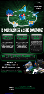
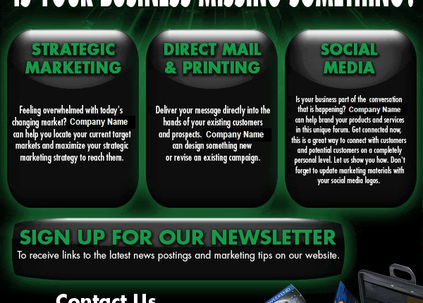
The body of the email appears singularly focused on its graphic design and a clever visual way to represent what you do. I suspect that your target customers would prefer a plain-English explanation instead.
They would also likely appreciate it being summarized into a strong, benefits-focused headline, supported with several key reasons why they should use your company’s services, rather than your competitors’.

I am making an assumption about your target customer segment(s), but from my experience—especially with B2B—black text on a white background works best most of the time. There’s rarely a better way to communicate with busy professionals.
Relying primarily on text, rather than images, will likely work better for you because in default Outlook setup with a preview pane, most people will see blank white boxes instead of your message—and promptly delete it. Alt text helps, but not as much as well-formatted HTML text. You need to make sure that your email degrades gracefully: it needs to read acceptably with images turned off and in plain text.
Communicating Value: Make it clear why you are the best choice
Again, there is no real headline here. The question “Is your business missing something?” is so generic that I can’t imagine it being compelling at all. You can have a successful question-format headline, but it needs to point to a specific problem that you know your customer has.
A great way further to support your value proposition is by telling the reader what your customers say about you. It’s more powerful than anything you say yourself.
There is another challenge with communicating value: you are offering a range of very different services. Sent to a large enough list, this will get you calls, but I would invest some time into 1) trying to segment your list and offer only the most relevant services to each segment, and 2) if you can’t segment or still end up with a large “general” segment, help your reader understand which service is right for them.
Communicating Action: Make it clear what to do next
You don’t want to leave this up to the recipients to figure out. That’s what we call “unsupervised thinking.” You need to do most of the work for them—or you won’t get the click.
There is no clear next step. Here’s what I can picture a recipient thinking: “It looks like you just want me to sign up for the newsletter. It’s the biggest CTA (call to action). But I don’t know who you are. I really don’t care about getting latest news postings on your website. If we already have a relationship, why am I getting this generic email?”
In the end, you are not giving the reader a specific reason to contact you. This goes back to building the problem, explaining why you are the best solution, and telling the reader what they’ll get by clicking where you want them to click.
If this is an email to an unsegmented list, I suggest two options to test:
- Have only one CTA (you can repeat it at the top and at the bottom, but ultimately you should be asking them to do one thing). The job of this email will be to build enough confidence/interest in your company to get a click. Then you can provide options (if relevant) on the landing page.
- Have several distinct offers, making very clear which one applies to which customer segment or specific problem it’s solving (even if you can’t segment the list, you should know what the key segments are). Then the job of this email is to help the reader quickly decide which offer is most relevant, and click on the corresponding CTA.
I hope these insights will be helpful, and I look forward to hearing about the results you were able to achieve with them.
Sincerely,
Boris Grinkot
To see more email optimization ideas, you can listen to the replay of our last live web clinic, where the MarketingExperiments team offered testing ideas for audience-submitted email marketing messages.
* I’m not counting 2007—come on!


Excellent analysis. Since they already invested in creating this design, they should use 10% to at most 20% of their mailing list to split test it against a version more in line with the recommendations made here.
This is really a great analysis. Often times in the world of B2B marketing we get so caught up in trying to get campaigns put together and out so we can check them off the list that we forget some of the basic fundamnetals of effective marketing. I am guilty of it myself even though I wrote an article about it – http://morganmoran.com/2009/10/30/10-ways-to-increase-email-roi/
Thanks for the reminder Boris. I will be sure to check back.
Thank you Gene and Morgan!
@Gene: great point about testing! Especially for emails that are not time-sensitive (there is no special offer that expires, etc.), there’s no reason to send one version to the entire list. First testing at least one alternative on a fraction of the list (sufficient size to get reasonable statistical significance) will allow you to send the best-performing version to the rest of the list. Lesson is: never design just one version of your email if you have a day or two to spare for testing!
@Morgan: Thanks for the link–didn’t know about Tuesday/Wednesday being best marketing email days! I would just caution against looking at high-level aggregate data as a rule that applies to YOUR audience. While in general Tuesdays/Wednesdays may be best, hamster breeders may be most likely to open commercial emails on Thursdays. If you’re selling to hamster breeders, Thursday’s your day 🙂