Email marketers know that the subject line plays a vital role in the open and clickthrough rates of an email. Subject lines are the first micro-yes that a subscriber agrees to in order to continue up the sales funnel. For many, writing a powerful subject line with value-packed words and a sense of urgency will single-handedly increase open rates and lead to higher clickthrough.
However, with marketing emails rendering differently across different email clients — such as Gmail or Outlook — content and images often get corrupted from the marketer’s initial concept to the final result.
Without proper testing and copy editing, discontinuity can become a fast problem for marketers and, even worse, lead to confusion and mistrust with the customer.
In this post, we’ll look at two emails from different travel sites whose subject lines are promising quick deals and the challenges that they face with email marketing.
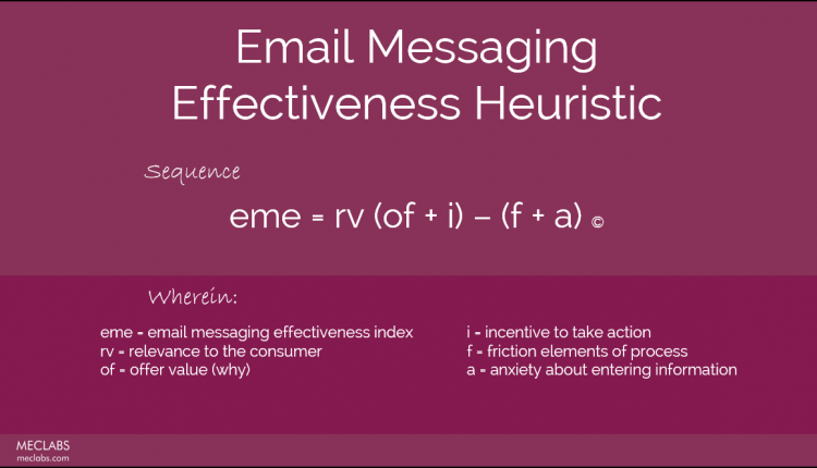
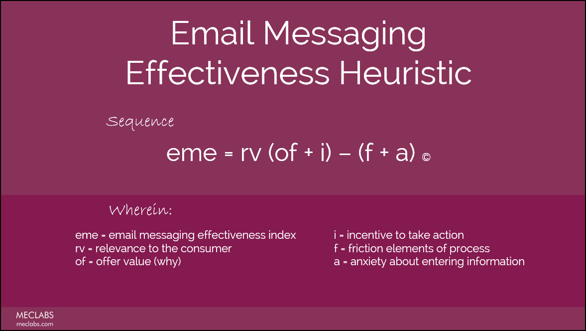
Throughout this post, I’ll be referencing different elements of the emails with respect to the Email Messaging Heuristic:
Example #1: Friction caused by excessive calls-to-action
The first email comes from a budget airline — known for cheap fares but charging for “extras” such as carry-ons, drinks and oxygen (just kidding about that last one).
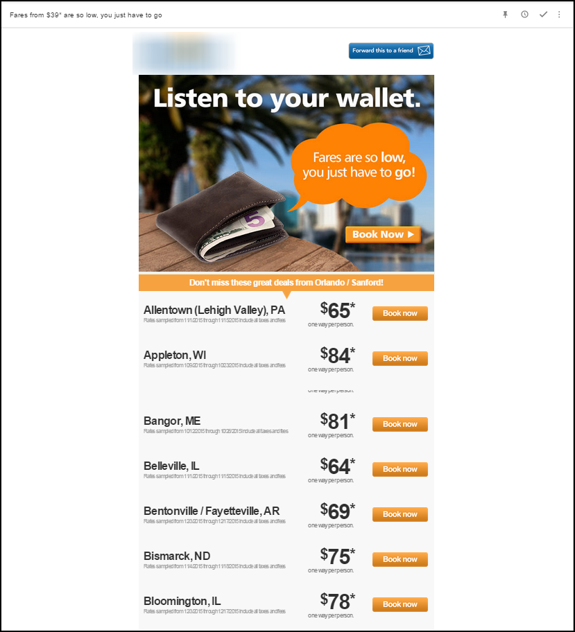
Email Subject Line: Fares from $39* are so low, you just have to go
When I received this email, I was pretty excited to see where I could go for just “$39*.”
The subject line is well-written. It presents an offer value (fares starting at $39) as well as reduces anxiety and friction by stating “you just have to go,” implying that it is a simple, easy process to get these fares.
When I opened the email, I immediately skimmed for the $39 deal. It wasn’t long before I read through the email a few times and noticed that the deal wasn’t on the email.
I was disappointed.
It turned out that the message did not render correctly — probably Gmail trying to save me from the length and scope that the email was trying to cover. However, because the subject line promised the deal and I could not find it in the message that I received, it felt like the sender was not upholding their end of the deal.
I then clicked to open the email in a Web browser and once again, searched for the $39 deal. It was the 40th call-to-action on the email. Specifically, it was number 40 out of 87 primary calls-to-action.
The friction was so overwhelming that it made this email a chore to skim.
One of the challenges that travel sites face, especially budget sites, is that they have many deals and destinations to share — especially if the subscriber has not selected a specific “alert” or deals to and from specific places.
However, without reinforcing the value and incentives throughout the email, the friction becomes overwhelming.
When composing an email, remember that the email is not the landing page; it’s the step before the landing page — where you demonstrate what you can offer, not showcase everything that you have to sell.
Example #2: Emails rendering differently across platforms
The next email comes from Kayak.com, a site that works as a search engine for cost-effective fares and hotels.
Subject Line: Your KAYAK Alert: JAX to KAYAK Top 25 from $97+ (no change)
In the image below, I’ve included an email as it appears in Gmail as well as Outlook. The subject line is very similar to the first example, with two unique differences.
First, notice the specificity of “Top 25” — this increases the relevance of the email and also decreases the anxiety by clearly showing how long the email is and what the reader can expect.
Secondly, although this subject line doesn’t have a phrase like “so low, you have to go,” to lower friction like in the first example, the way that it’s written with “Your KAYAK Alert” and that it indicates “(no change)” reduces anxiety in a way that the first email does not: by insinuating regular updates.
Looking into the body copy, this email immediately ties the promise made in the subject line to the content of the email. This not only reduces anxiety and increases orientation, but, if the email provider decides to cut off the email at a certain length (like we saw in the first example), the subject line still fulfills its promise.
In the Outlook version below, seeing the red “x” boxes and the warning of downloading content might cause anxiety in readers. However, potentially an even greater source of anxiety would stem from not seeing a recognizable logo, which acts as a credibility indicator.
Testing emails and how they are rendered by different email clients should be an essential part of your email marketing strategy.
Whether you’re sending all-image or text-only emails, specific clients and providers have their own influence on whether or not the image will appear, what kinds of fonts are supported, and how logos and icons appear.
Each element of your email, from the subject line to the tiny gray text in your footer, has a decisive impact on how your customer decides to take action on your email. Whether that action is to delete the message before they even open it or to purchase, how you strategically leverage the elements of the email heuristic can impact your customer’s final decision.
Key Takeaways:
- Ensure the promise made in your subject line is fulfilled in an obvious place in your emails
- If your email acts as an update to listings, provide a range of offerings relevant to your customer, not a comprehensive list of all of your products, within your email body copy
- Test your emails across platforms to ensure that credibility indicators and other important elements are not lost
You can follow Jessica Lorenz, Event Content Manager, MECLABS Institute, on Twitter @JessicaPLorenz.
You might also like
Email Messaging Course [From MECLABS, MarketingExperiments’ parent research organization]
MarketingSherpa Summit 2016 — At the Bellagio in Las Vegas, February 22-24


