The Behind-the-scenes Story of How We Optimized Outdoor Advertising That Was Featured in a USA Today Article
Optimization Beyond Digital
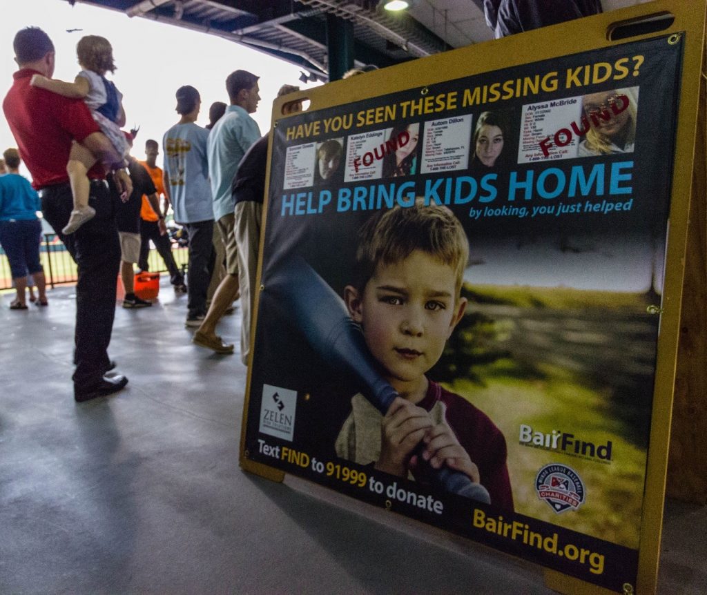
You might have read about The BairFind Foundation in USA Today Sports Weekly magazine recently: Minor league ballpark signs raise awareness on missing kids. We helped optimize the signs discussed and pictured in that article, and I wanted to share our thinking behind those changes so you can get ideas for applying the Conversion Sequence Heuristic to your own outdoor advertising and other non-digital optimization.
Photo credit: Edwine Pierre Louis
More eyes looking equals more children found
BairFind is a Jacksonville-based nonprofit founded by former minor league pitcher Dennis Bair, who has been hard at work helping to find missing children for almost two decades. “It is sports marketing — we are leveraging the power of sports,” is how Dennis described BairFind in the article. “Minor league baseball has been our proving ground. We’re doing something the families cannot do for themselves, which is to get pictures of their missing children out there to millions.”
For the past year or so, MECLABS has taken on BairFind as a Research Partner, although a Research Partner with a unique pro bono relationship due to the foundation’s small size and nonprofit nature.
Before
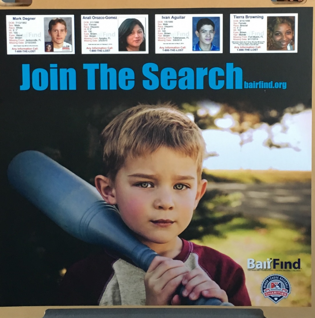
Here is an image of the original BairFind sign. Before you scroll down and see our analysis, you might want to look at the sign yourself and, using your own conversion optimization skills, consider how you might optimize the sign.
In fairness to the all-volunteer team at The BairFind Foundation, the signs were working pretty well — 183 children were located in the 2016 baseball season.
However, as with any conversion optimization scenario, the opportunity always exists to improve the messaging to increase conversion. With any sufficient amount of traffic, your messaging should convert at some level. And in BairFind’s case, that traffic is substantial — 40 million baseball fans.
But this is where it helps to sometimes get an external opinion. Because you live, eat and breathe your product every day, every week, every month, it can be difficult to see your messaging with fresh eyes.
When Dennis first discussed the sign with us in our boardroom, there were a lot of things that were unclear to us, and we had a lot of questions simply because we were outsiders to the world of finding missing children.
In addition, Adam Lapp, Senior Director, Services Operations, MECLABS Institute, led an analysis of the sign using our methodology and MECLABS Conversion Sequence Heuristic. Here are a few key optimization opportunities he identified:
- No clarity around the images of children — What are they? Are they missing? What should I do with them?
- “Join The Search” headline may cause confusion-related friction — What search? How do I join?
- org is small and difficult to see
- Viewers may lack motivation because they feel like they can’t make a big difference
- No clear call-to-action to go anywhere (if you don’t see the small bairfind.org)
- Official minor league baseball charity message might be too small to understand
After
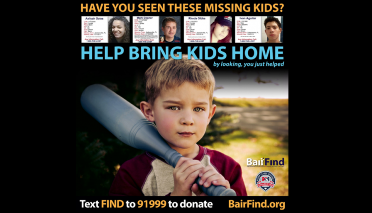
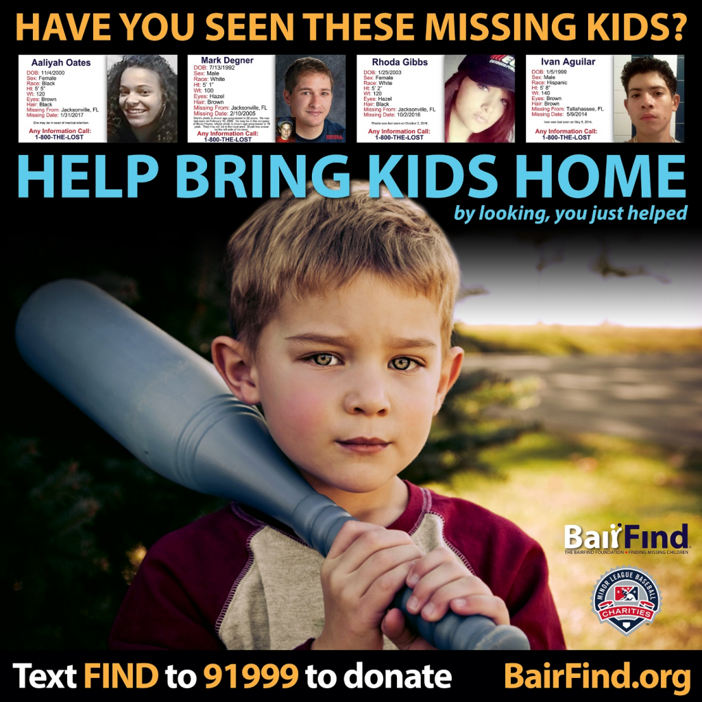
Here is a look at the sign after we optimized it.
A headline was added above the images — “Have you seen these missing kids?” — to provide needed clarity around what the pictures are. The headline solves the previous difficulty/confusion-related friction, and a bright, yellow color was used to attract attention.
“We increased the size of the children’s images because they are truly the most important part of the posters. We squeezed every extra pixel we could out of the available space to increase their prominence and visibility,” said James White, Senior Brand Designer, MECLABS Institute.
The headline was changed to “Help Bring Kids Home” to add clarity to what search the sign is asking them to join. A subhead was added — “by looking, you just helped” — to reinforce their activity.
Messaging was added to the bottom of the sign to solve the issue of no clear call-to-action — “Text FIND to 91999 to donate BairFind.org.” Also, a bright color brings attention to it.
“The new copy at the top and bottom were very important new pieces which immediately conveyed the purpose of the signs and let the viewer know how they can help. We selected a vibrant ochre yellow taken directly from the central image to contrast well against the black background and draw the eye quickly to these important additions,” James said.
Results
“This year, we had big time improvements to the visual aspects of our signs, thanks to MECLABS. MECLABS took our sign, which was very basic, and optimized the photos and really made the sign attractive to look at and made the children’s photos pop. They also helped us to clarify our message. And the feedback from all of the GMs [general managers] of the Minor League Baseball teams, the fans and the league presidents has been 100%: ‘Wow! Holy moly, these signs are sharp!’ Thanks to MECLABS, they are even more impressed with us and even prouder to feature our signs in their ballparks,” Dennis told me.
During the 2016 baseball season, 183 children who were featured on the signs were found.
During the 2017 baseball season so far, 334 children featured on the signs have been found — and there’s still a month left in the season.
[Update: Now that the Minor League Baseball season has ended, we have the final numbers – 403 children featured on the signs have been found.]
Now, unlike a landing page A/B split tested in a controlled environment to ensure there are no validity threats, we can’t be sure that the optimization changes helped find more children. There were other changes as well. For example, BairFind’s network of minor league stadiums featuring the signs grew from 139 to 151.
And more children were featured on the signs. Instead of featuring the same four on each side of the sign, four children were featured on one side of the sign, and a different four children were featured on the other side of the sign. (However, if anyone has ever tried to increase clickthrough in an email or conversions on a website by simply featuring more links or CTAs, you know you might get some increase, but it is incremental and certainly not equal to the amount of new links added).
Applying conversion optimization methodology beyond digital marketing
Overall, the point of this article is not to show an example of a valid experiment, like we normally do. But rather give you some ideas for using core conversion optimization methodologies beyond the landing page.
If you’ve spent any time following MarketingExperiments and the MECLABS Institute, I’m sure you’ve seen how the Conversion Sequence Heuristic can be used to optimize landing pages, emails and PPC ads.
However, the Conversion Sequence isn’t really optimizing any of those digital marketing channels. It’s really being used to optimize a brand’s interaction with a customer’s thought sequence. And those digital channels are merely the avenue to facilitate (and test) that communication.
For example, I’ve used this heuristic when making recruiting trips to universities to show students how the Conversion Sequence can help them pick the best job when entering the workforce. I’ve used it to discuss how PR professionals can optimize their own work. And as shown in this article, we’ve used it to optimize physical, outdoor advertising signs. I’ve even heard talk around the labs of people using the Conversion Heuristic to help optimize their relationship with their kids or spouse. What have you used the Conversion Sequence to optimize? Message me on Twitter @DanielBurstein and let me know.
You can follow Daniel Burstein, Senior Director Content, MarketingExperiments and MECLABS Institute, on Twitter @DanielBurstein.
You might also like
Beyond Landing Pages: Conversion rate optimization strategies
Landing Page Optimization: An Overview Of How One Site Increased Leads By 155%
Participate in a research project and drive conversion increases
Learn more about applying conversion optimization methodology and the MECLABS Conversion Sequence Heuristic here


What a great cause and organization! The imagery and artwork are great, however the sign needs a clearer message and call to action – pick a singular focus. Are you asking for financial donations to support the charity;s effort or are you asking for assistance from the reader (if they have seen one of the children) to either report a missing child or report a sighting of a child. Its tempting to have competing messaging but think about the attention time of a viewer for this medium (2-3 seconds).
Good Luck!
Robert,
I agree with you, in a perfect world, focusing on a single call-to-action would be ideal.
However, there are many times when do to business (or in this case, the organization’s) requirements, you must have more than one call-to-action. When that happens, it helps to make sure that those calls to action aren’t equally weighted, so the prospect knows where to focus, but can discover the secondary call to action as well. As you can see, that is the approach we took in this case.