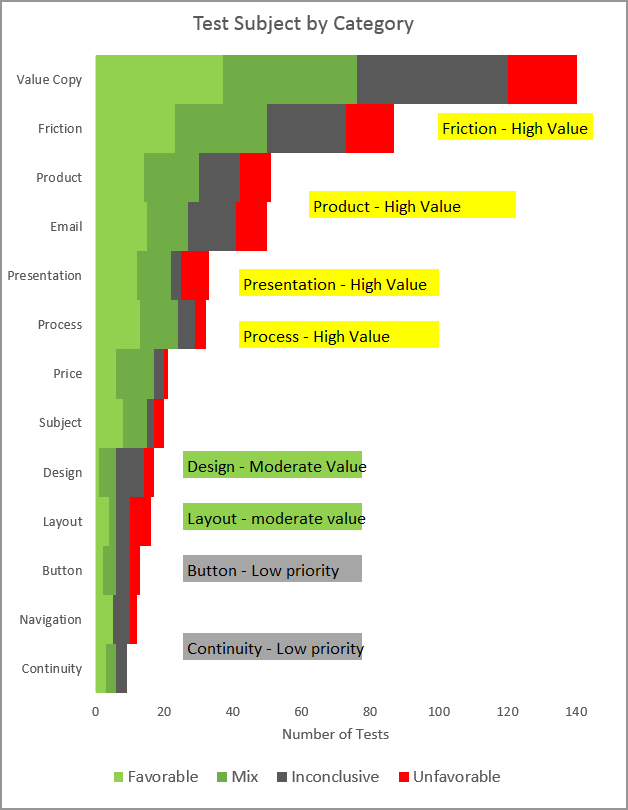
As Test Database Specialist at MECLABS Institute (parent company of MarketingExperiments), my days are spent sifting through thousands of tests, analyzing the results and searching for insights to inform future testing. While looking through our hundreds of tests from 2015, two top testing categories emerged for increasing clickthrough and conversion rates: value copy and friction reduction.
Value copy
Value copy testing stood out in 2015 with high rates of success and low levels of failure. Testing in this area was often successful and appears to be of high value to Internet users. Specifically, improving product descriptions and differentiation had the highest number of favorable tests for MECLABS. Understanding the motivation and pain points of your customers can help you tailor a precise, powerful message that will allow them to discover that your product is perfect for them.
Friction
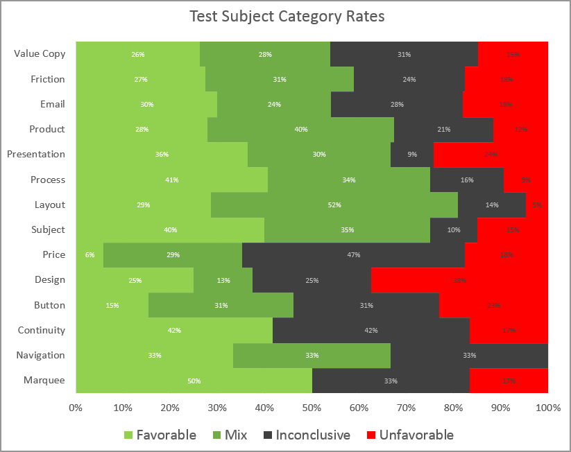
Friction is the second largest category of testing. The chart above shows that reducing friction often results in an increase in clickthrough and conversion rates. Let’s look deeper. Compare presentation to layout and process. Presentation, process and layout all had high success rates last year. Presentation had a 24% failure rate. Layout and process had the lowest failure rate at 5% and 9%. Presentation is the way a site looks, layout is more about how it feels and flows when you use it. The distinction between these two is functionality.
Functionality
Think of your website as a hotel. Part of what people love about a staying at a high-class hotel is the staff’s ability to remove many of the tedious obstacles we encounter in daily life. Excellent service is made up of thoughtful efforts of a well-trained staff. When the staff is able to anticipate and meet our needs, life feels effortless and frees us up to focus on our pleasant surroundings. A well-thought-out website that alleviates friction works the same way. If the online experience is smooth and seamless, it encourages visitors to focus on the product benefits, and how much more wonderful their life becomes once they purchase your product.
Customers are more informed today than at any time in history. They visit your site to learn about your product. Testing has shown that they do not like to be overwhelmed with a wall of text. Instead, they like to have access to information in easy to navigate tabs and drop-downs. A site that provides effortless navigation and easy access to valuable information stands out.
Remove the roadblocks
Once a visitor has been dazzled with your sparkling value copy, they just want to click and convert. All the funnel steps that stand in the way of that conversion are roadblocks. Think of it like driving home after work. You just want to get home, and any impediments that stand in your way start to make you think about all the alternative routes you could be taking. Removing the roadblocks will allow your customer to reach their destination without thinking how much better the other interstate may be. Improvements in functionality that increase access to information and reduce check-out times may be the most effective strategies for increasing clickthrough and conversion rates in 2016.
Examples of product-based testing
In the below table, you’ll find some examples of real-world results from MECLABS’ research lab, as well as result interpretations from our in-house research analysts and scientists. Many of these results not only focus on the value copy itself, but the level of that value.
|
Test Result |
Interpretation |
| Favorable | The addition of product-level value improved visitor’s perception of subscription value |
| Favorable | We saw a significant increase in visitors adding products to their cart likely due to the increased value copy and more prominent quick links that drove more people to category pages |
| Favorable | Control visitors may have struggled due to a lack of product and process-level value, causing an increase in friction and anxiety |
| Favorable | Homepage provided value and credibility for those who does not know [company] well. Homepage may provide easier ways to navigate products search and more products views for visits who are interesting in purchasing more products in one order |
| Favorable | By reducing the difficulty friction of package selection, finding information and page length, we able to get more qualified traffic into the funnel by adding primary-, product- and process-level value to the page |
| Mix | Hotel call-to-action’s functionality effectively reinforced the product-level value proposition and reduced difficulty-based friction; elements of friction still present in Treatment A most likely counteracted anticipated positive effects of the optimized communication of “product-level” value proposition |
| Mix | Results indicate that utilizing a single page to present the benefits and products instead of having a two-step process significantly increases clickthrough rate, suggesting that Treatment A’s experience reduces friction |
| Mix | Adding product level value messaging the different content offered by [newspaper] across each week significantly increased clickthrough rate |
| Mix | The increase in traffic into the Home Delivery funnel by the Treatment is likely due to decreasing friction by removing another perceived step in the visitor’s mind |
| Mix | The large relative decrease recorded by the Treatment indicates that ecommerce landing page visitors are significantly more likely to sign up for a product tour when presented with the image above the form, multiple sources reinforcing credibility and current product messaging in the headline and bullet points |
| Mix | Addition of value copy significantly increased clickthrough rate when the links were buttons, but underperformed when the links were text |
| Mix | Product-level value copy was removed to reduce friction and attempted to increase motivation of visitors to move through the funnel, which resulted in a decrease in the quality of traffic but it wasn’t enough to yield a difference in conversion rate |
| Inconclusive | Video at the product level did not increase the chance of conversions, contrary to perception the additional value of video did not increase the likelihood of conversion |
| Inconclusive | By removing competing CTAs, condensing the product tab and pricing sections and highlighting the information provided in each banner (through naming their tabs), we saw a 31.8% increase in clickthrough to the Try Free Funnel, at a 94% LoC |
| Inconclusive | We saw an increase in clickthrough to the freemium funnel on the Treatment which could be due to the Treatment having the value of the products higher up on the page value proposition |
| Inconclusive | Although the Control email received the higher clickthrough rate, both emails consisted of the same value points. It’s possible that the smaller number of customers that chose to clickthrough to the product page from the treatment are primarily motivated by the price over anything else |
| Inconclusive | Cold-call users are significantly less likely to clickthrough when presented with less calls-to-actions. Although results didn’t validate, normal cold-call and active cold-call users responded positively to the product tour link. Active users (both cold and lead) were not heavily influenced by the removal of multiple text links and buttons, which may indicate that these users are already more likely to read through a large portion of the email before making a decision on the white paper |
| Unfavorable | When attempting to improve the value proposition through the addition product-level value combined with an effort to improve the presentation of value through a refreshed look and feel, we successfully increased the quality of traffic entering the funnel |
| Unfavorable | The large relative decrease recorded by the Treatment indicates that CRM landing page visitors are significantly more likely to sign up for a product tour when presented with more value reinforcing the benefits and credibility of [company’s] CRM platform |
You might also like
Strengthen Your Copy in 35 Minutes: Proven strategies to boost the effectiveness of your words [Web clinic replay]
Landing Page Optimization: What a 29% drop in conversion can teach you about friction
Copywriting: How to tip the scale so customers act
Landing Page Optimization online course [From MECLABS, MarketingExperiments’ parent research organization]


