 I picked just the right moment to sneak quietly into the B2B Summit 2012 pre-Summit workshop on Landing Page Optimization. As I quickly check into foursquare to start my campaign for mayor of the Summit, Dr. Flint McGlaughlin, CEO and Managing Director, MECLABS, begins his teaching on friction.
“Your job as a marketer is to guide the thinking throughout your entire process,” Flint said.
Following Flint’s opening remarks on friction, he presented the audience with a case study that shows how one B2C company, which offers online services, was able to increase its clickthrough rate by 266%.
The goal of the page was to increase the amount of online registrations. To determine which page would produce the most account sign-ups, the team used a variable cluster split test. The test focused on reducing friction by gradually simplifying the amount of competing information. This resulted in the development of two treatments.
(Note: Page has been anonymized to protect Research Partner competitive advantage)
The Control:
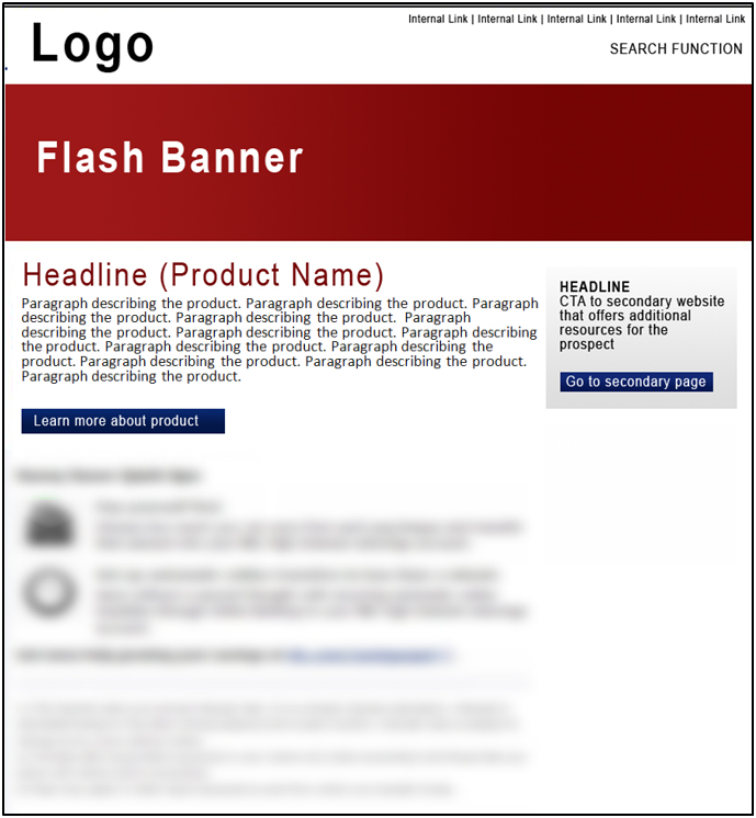
The control page has multiple calls-to-action, which were identified as elements of friction because they compete with one another. The page is also organized into five main blocks of information.

Treatment #1:
Here is a screenshot of treatment #1, which reduced the friction elements from four to two. The page layout has also been simplified from five blocks to two columns.

Treatment #2:
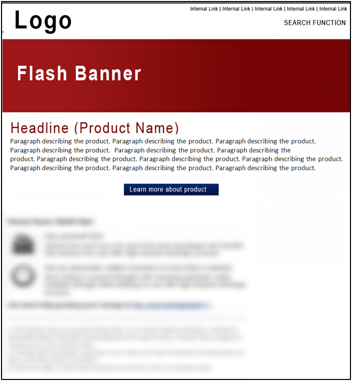
Below, treatment #2 shows an even greater reduction in friction elements, by removing all but one element of friction. This simplified treatment layout includes only a single column, reduced from treatment #1’s two columns.

The Results:
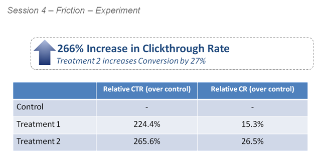
Treatment #2 outperformed the control by a staggering 265.6%, and increased conversion nearly 27% by simplifying the page layout and reducing the amount of competing objectives on the page.
Flint defined friction as it pertains to marketing as “a psychological resistance to a given element in the sales process.” He also provided some key principles that marketers can use to reduce friction on their landing pages.
Principle #1: Increasing conversion starts with reducing friction
One of the most effective ways to increase conversion is by getting rid of as much friction as you can. As Flint explained, “Indeed, our experiments suggest that there is a disproportionately high return on efforts to reduce friction.”
Some friction elements are easier to reduce because they are more obvious. The case study above supports that testing changes to page layout and reducing competing objectives are changes that can be made quickly and easily, while elements of hidden friction require a greater depth of analysis.
Principle #2: The objective is to minimize friction
Flint emphasized that the objective is to minimize friction, for if you eliminate all friction you eliminate the sale. Every sale is an “ask,” and if you’re not asking, then you’re not selling. Friction is illustrated in the workshop as a balance on a fulcrum in which friction elements and incentives exert force on the fulcrum with the abandonment and completion of a conversion at stake.
The fulcrum presents the idea that friction is on every page and in every “ask” which is weighed in the mind of a visitor. Minimizing friction helps to tip the balance in favor of completing your call-to-action.
Principle #3: Overcome remaining friction with incentive
Once friction has been minimized, you seek to overcome the remainder with friction.
“If you are going to ask, you are going to produce friction,” Flint said.
In keeping with the fulcrum example, incentive should be used to overcome the friction left over to further tip the balance in favor of a completion.
Related Resources:
Hidden Friction: The 6 silent killers of conversion (Web clinic replay)
Single-Product Homepage Test: A/B testing generates 58% lift
Homepage Optimization: 5 questions every marketing team should ask themselves


I think this is a really interesting piece of research. As marketeers we know that the line of least resistance is the way to the consumers heart (and money) – but we can be inveterate tinkerers and over-complicate things. This is the proof (not that we should need it) that keep-it-simple works every time!