Product pages are arguably the heart of an ecommerce website.
It’s where potential customers learn about your products in a guided conversation that should deliver value and an overall top-notch customer experience.
Consequently, the elements on those pages are also potentially where you’re losing conversions due to anxiety.
At MarketingExperiments, we define customer anxiety as “a psychological concern stimulated by a given element in the sales or sign-up process.”
So how do you identify and mitigate anxiety on product pages?
In this MarketingExperiments Blog post, I wanted to share a recent experiment where an e-book retailer asked that same question and started testing to discover a way to answer it.
But, before we dive in, let’s view the background notes on the test to put the experiment into context.
Background: A large e-book retailer.
Goal: To increase the overall number of e-book sales.
Research Question: Which attempt to reduce anxiety will result in the highest conversion rate?
Test Design: A/B variable cluster split test
Side by side
The team hypothesized that testing key product page elements could help them determine the true impact of anxiety on a product page.
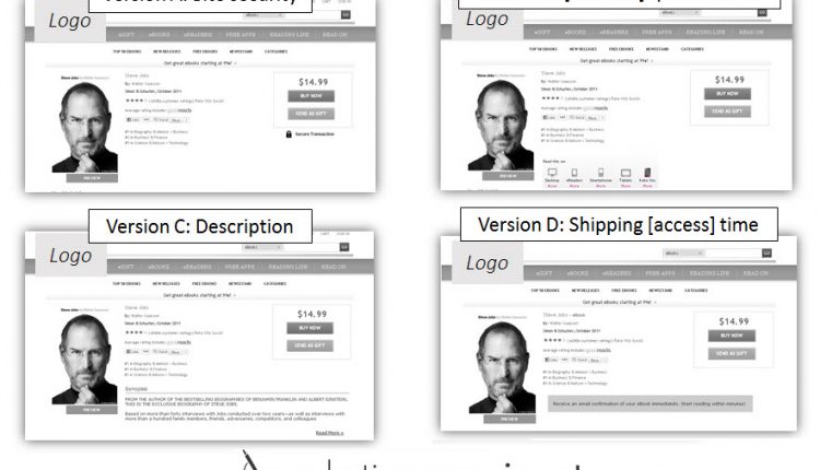
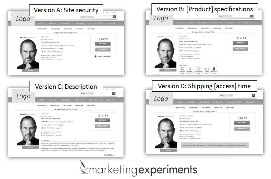
Here is a quick breakdown of the elements the team chose to test in each treatment:
- Version A – Attempted to reduce anxiety by using security seals
- Version B – Highlighted compatibility by illustrating the product is multi-device friendly
- Version C – Provided a synopsis of the content to help customers determine if the e-book would suit their interests at the top of the page
- Version D – Emphasized quick accessibility to the product upon purchase
Results
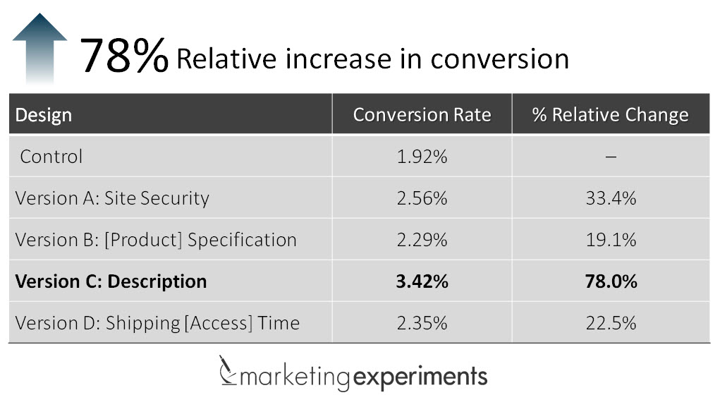
Moving the product description up on the page resulted in a 78% relative increase in conversion.
What you need to understand
Anxiety is lethal to conversion.
However, it can often be corrected with strategic changes to product page elements that mitigate anxiety by overcorrecting for it.
But before you do that, you have to test your way into identifying, isolating and optimizing those elements that are having the biggest impact to conversion.
To learn more about how anxiety impacts conversion, you can watch the on-demand Web clinic replay of “Product Pages Tested.”
You may also like
Web Optimization: 5 steps to create a small testing program [More from the blogs]
Online Optimization: Testing value prop to grow your tribe [More from the blogs]
A/B Testing: The value of choice in decision-making [More from the blogs]


What did the control look like?
Where was the description before it was pushed up?’
I’m a little surprised by the result, but I love the methodology of testing the different anxiety points the shopper could experience. Thank you for sharing!
Hi Megan! The control version of the experiment is discussed in the Web clinic video. Here’s a timestamped link when it’s examined: http://youtu.be/wdcjJveWsjg?t=22m34s
You can also see it on slide 32 from the presentation: http://www.slideshare.net/marketingexperiments/product-pages-tested-how-carefully-poinpointing-customer-anxiety-led-to-a-78-increase-in-conversion
I hope this helps your marketing efforts, thanks for commenting!
Erin Hogg
Copy Editor
MarketingExperiments
I guess the next stage would be to split test synopsis, as its an e-book I would even go a stage further and modify and split test the e-book based on findings of the synopsis a/b tests. Now that would be true digital marketing!